



- الصفحة الرئيسية
- كوارتز
- ألواح الكوارتز
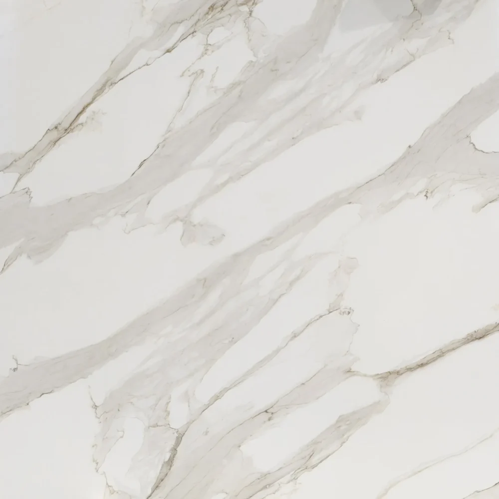
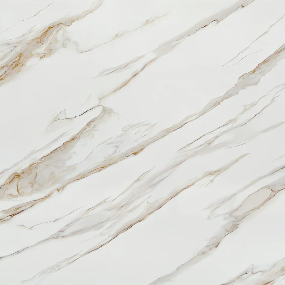
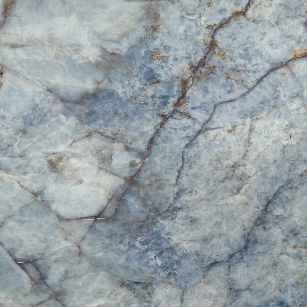
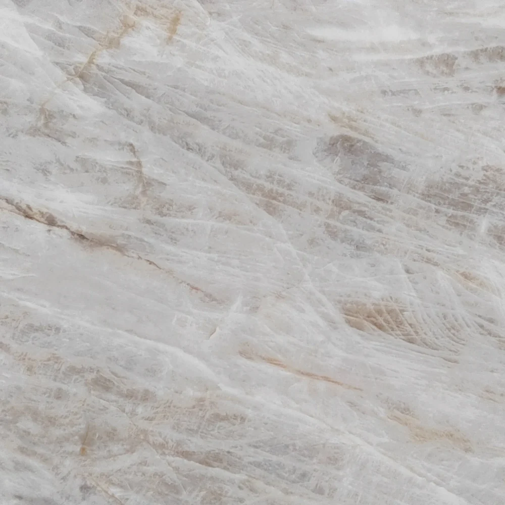
- Light Dove Gray Quartz with Charcoal Flecks GQ-FG520 for wholesale
Light Dove Gray Quartz with Charcoal Flecks GQ-FG520 for wholesale
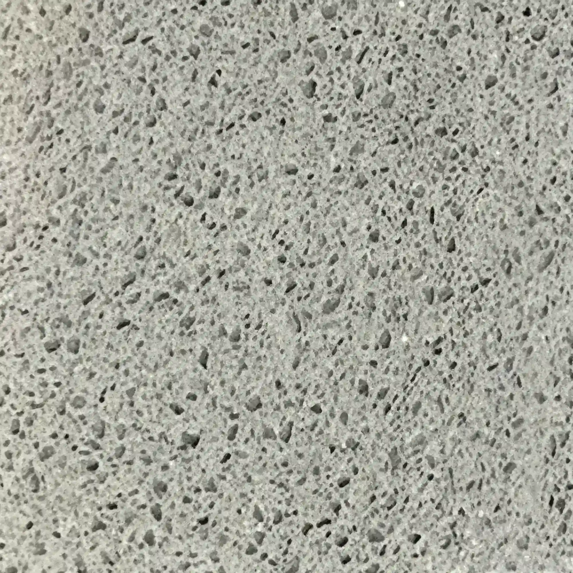
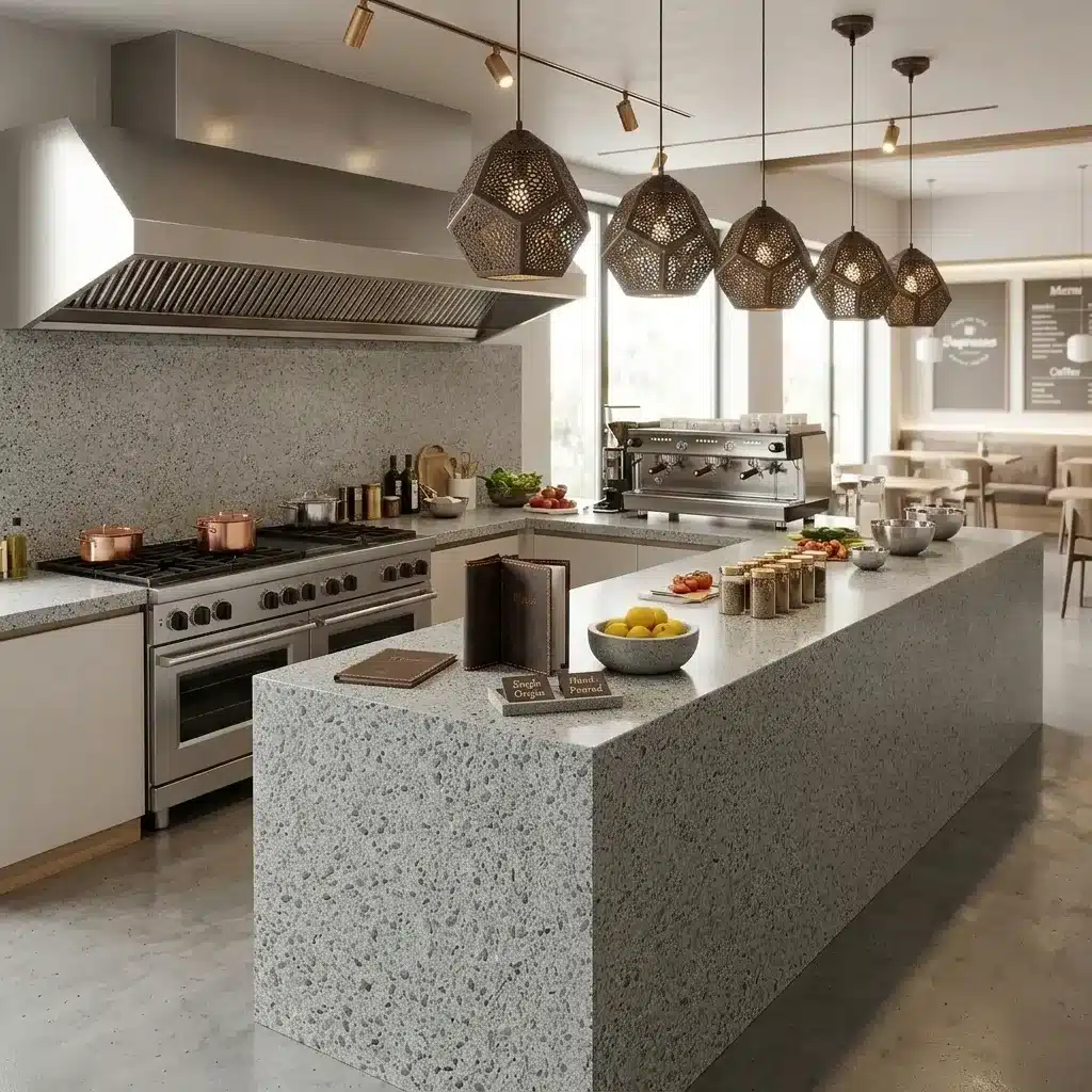
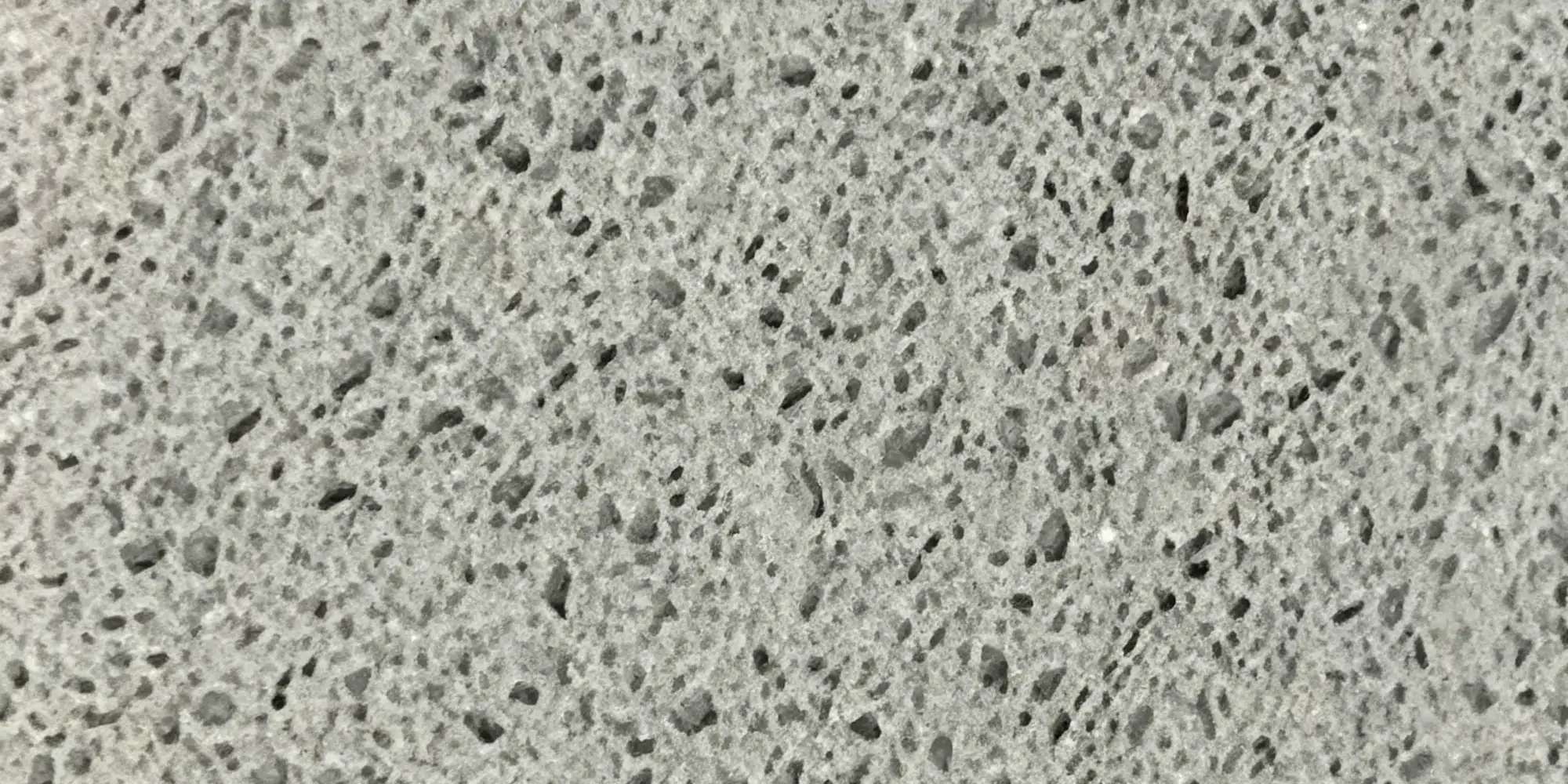
| الألوان الأساسية | Light Dove Gray |
| لون (ألوان) الزخرفة | Dark Charcoal Flecks |
| صياغة | عادي |
| تشطيبات | مصقول / مصقول / سويدي / جلد |
| حجم مخصص | 138 بوصة × 79 بوصة / 126 بوصة × 63 بوصة / قابل للتخصيص |
| سُمك | 20mm/30mm/Customizable |
| أسلوب الحافة | حافة مصقولة مريحة/حافة مصفحة 2+2 سم/حافة مشطوفة |
| Full Body Quartz | نعم |
| متوفر بمطابقة الكتاب | نعم |
| Place of Origin | تايلاند |
| Port of Transportation | تايلاند |
| Packaging | Foam or carton inside + strong wooden crates with reinforced straps outside and fumigation |
| Delivery time | 15-20 days / Express service is negotiable. |
| MOQ | 10 ㎡ |
| Payment terms | 30%T/T after confirm the order and the 70% T/T by copy of B/L |
| أسطح العمل سكني: نعم تجاري: نعم |
| جدار سكني: نعم تجاري: نعم |
| أرضيات سكني: نعم تجاري: نعم |
وصف:
أسئلة متكررة
What to do with gray quartz countertop?
Gray quartz like GQ-FG520 works best when treated as a neutral canvas—not a standalone statement.
Most fabricators will tell you it’s forgiving in layout but unforgiving in mismatched undertones.
In real-world kitchens, cool grays (blue or green base) look flat next to stainless steel and white cabinets unless you add warmth: walnut open shelving, matte black hardware, or a warm-toned tile backsplash.
Polished finishes on darker grays show smudges and water spots more than honed—so consider the finish early.
For bathrooms, avoid pairing it with cool LED vanity lighting unless you’re okay with a clinical feel; warm LEDs or sconces help.
Bookmatching works well here because the veining is usually consistent enough to flow across seams—but only if you get slabs from the same production run.
Installers often recommend dry-laying at least three slabs together before cutting, especially for islands or waterfall edges.
And remember: gray quartz can telegraph substructure imperfections more than busier patterns, so substrate prep matters.
What color Quartz for my gray cabinet kitchen?
It depends entirely on your gray cabinet’s undertone—and how much contrast you want.
If your cabinets lean cool (bluish or ashy), a quartz with silver or soft white veining—like GQ-FG520—holds its ground without competing.
Warm grays (beige or taupe-based) need quartz with caramel, oat, or light brown veining to avoid visual dissonance.
Most contractors avoid solid white quartz with gray cabinets unless the cabinetry has strong texture or grain—otherwise it reads flat.
A better bet is a white quartz with subtle gray movement, not stark contrast.
In high-traffic commercial kitchens, we often steer clients toward full-body printed quartz because the pattern repeats consistently across seams—no surprise mismatches at joints.
Always test samples under your actual kitchen lighting, not showroom fluorescents.
And don’t skip the edge profile: a simple eased edge on gray quartz reads cleaner than a heavy bullnose, which can mute the design intent.
Fabricators report fewer callbacks when the quartz veining direction matches the cabinet grain orientation.
What are experiences with white and gray quartz ?
Homeowners and contractors both like white-and-gray quartz for its clean look—but real-world feedback highlights tradeoffs.
In residential kitchens, it holds up well against coffee, wine, and tomato sauce, no sealing needed.
But installers say it shows fine scratches more than darker stones, especially on polished surfaces near sinks or prep zones.
In hospitality projects, thermal shock from hot pans isn’t an issue, but UV exposure over time can subtly shift cooler grays toward a bluish cast—especially near south-facing windows.
Seam visibility varies: tight, straight seams disappear on low-contrast patterns, but busy veining can make seam lines jump out if bookmatched poorly.
Fabricators also warn that some batches have inconsistent veining density—critical for long runs or waterfall islands.
That’s why most experienced shops request slab photos before cutting.
GQ’s full-body printed quartz helps here: the pattern goes all the way through, so lippage or edge sanding doesn’t expose a different layer.
Still, always dry-lay and approve slabs in natural light—what looks balanced in the warehouse may read too cold or washed-out on-site.
What are the top 5 quartz countertops?
There’s no universal ranking—what works in a condo rarely fits a school cafeteria.
From 20 years of quoting, installing, and troubleshooting quartz, here’s what actually gets specified most: 1) Light gray with soft white veining—versatile, hides seams, works with wood or metal. 2) White quartz with tight gray movement—clean but not sterile, good for healthcare or senior living. 3) Medium gray full-body printed quartz—consistent across large jobs, no batch variation headaches. 4) Off-white quartz with warm beige veining—softens modern spaces without looking dated. 5) Dark charcoal quartz with fine silver flecks—holds up in high-abuse commercial kitchens where scuffs and stains are daily.
None of these are 'better'—they solve different problems.
For example, full-body printed quartz from Thailand factories like Grand Quartz Tech cuts fabrication time on big jobs because you don’t need to match veins across seams.
But for a small custom home, a traditionally veined slab might give more character.
The real pro tip?
Ask your supplier about slab yield—some patterns waste more material during templating, driving up installed cost even if the slab price looks low.