



- Home
- Quartz
- Quartz Slabs
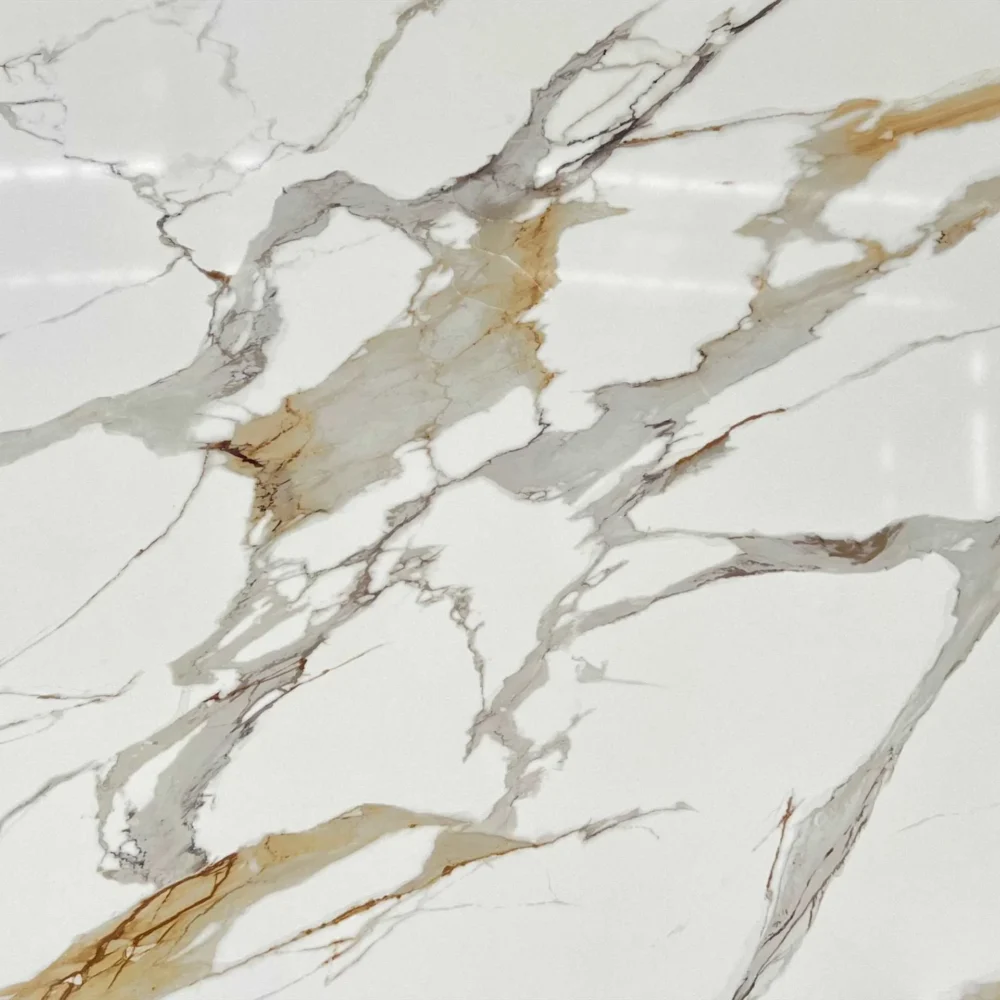
- Calacatta Bvlgari Gold Quartz GQ-T426 for wholesale
Calacatta Bvlgari Gold Quartz GQ-T426 for wholesale
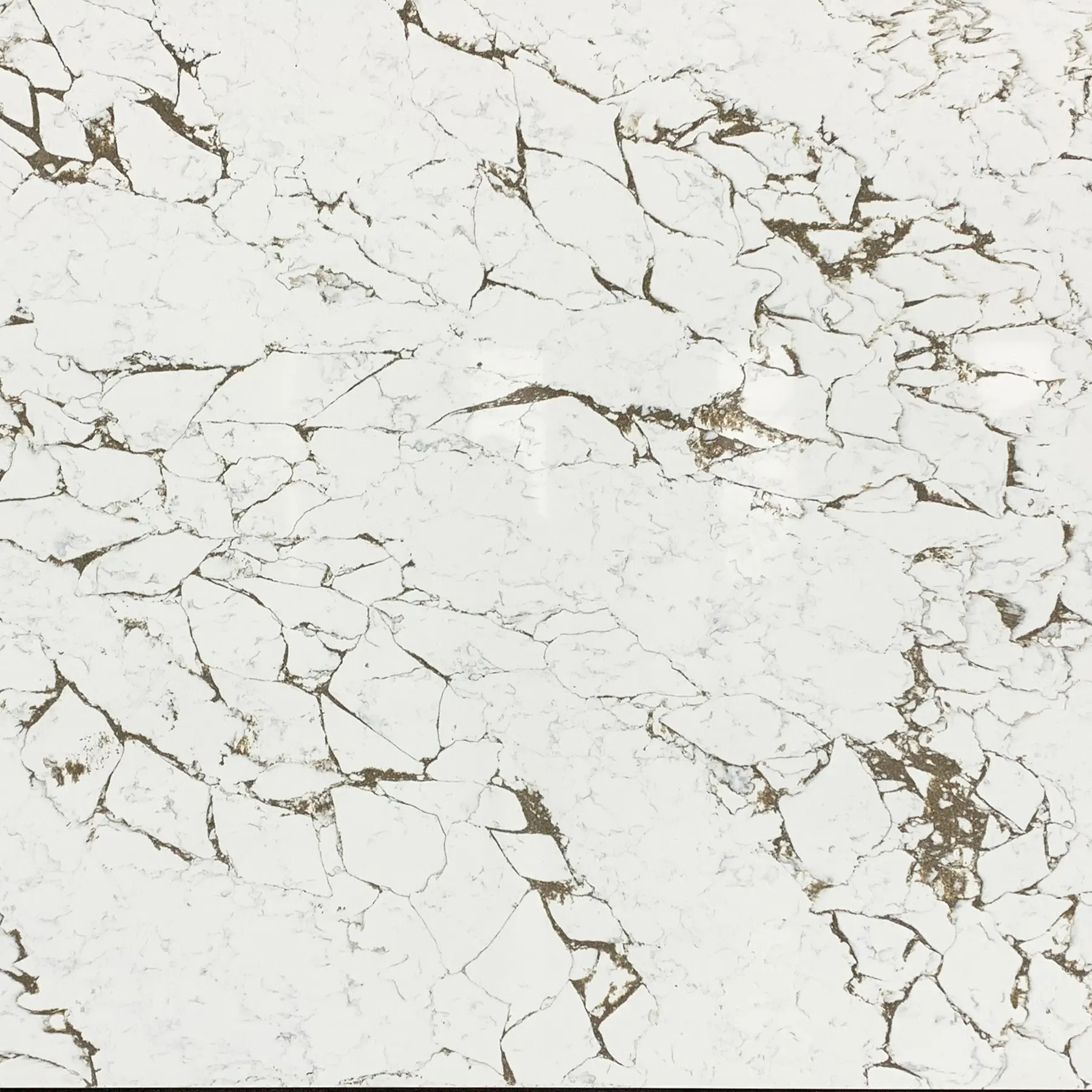

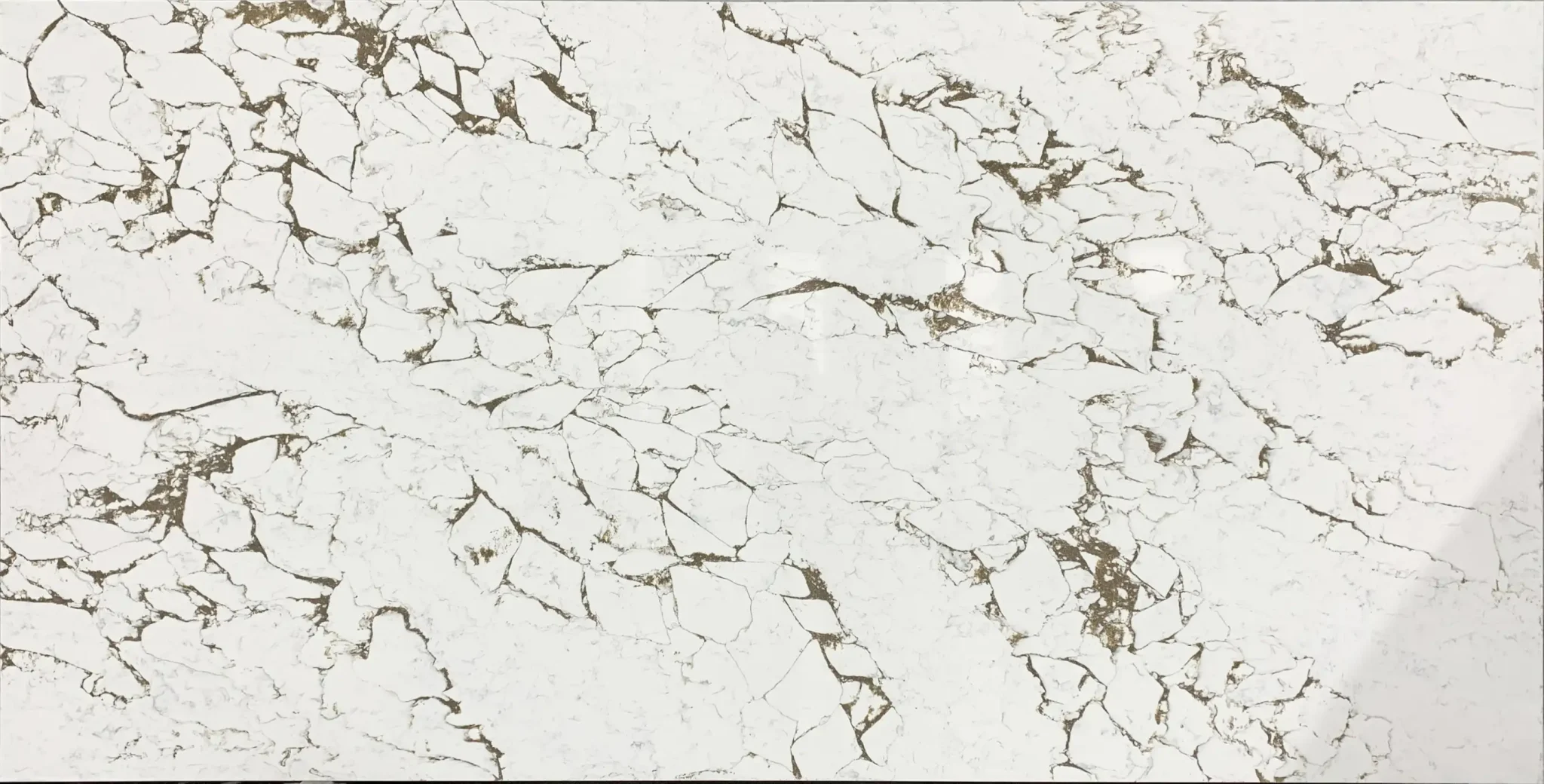
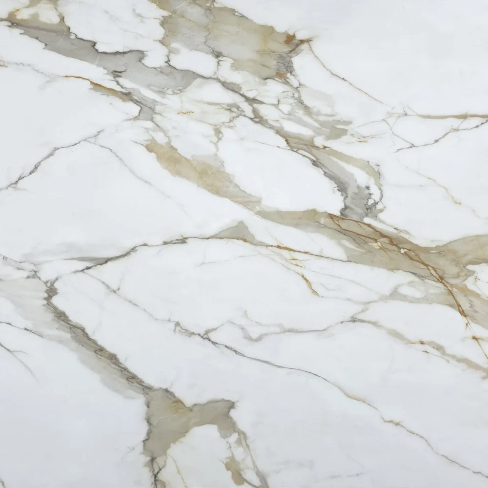
| Primary Color(s) | Crisp Pure White |
| Accent Color(s) | Golden Amber Vein + Russet Brown Crackle |
| Craft | Regular |
| Finishes | Polished / Honed / Suede / Leathered |
| Customized Size | 138″ × 79″ / 126″ × 63″ / Customizable |
| Thickness | 20mm/30mm/Customizable |
| Edge Style | Eased polished edge/2+2cm laminated edge/Mitred edge |
| Full Body Quartz | Yes |
| Bookmatch Available | Yes |
| Place of Origin | Thailand |
| Port of Transportation | Thailand |
| Packaging | Foam or carton inside + strong wooden crates with reinforced straps outside and fumigation |
| Delivery time | 15-20 days / Express service is negotiable. |
| MOQ | 10 ㎡ |
| Payment terms | 30%T/T after confirm the order and the 70% T/T by copy of B/L |
| Countertops Residential: Yes Commercial: Yes |
| Wall Residential: Yes Commercial: Yes |
| Flooring Residential: Yes Commercial: Yes |
Description:
Frequently asked questions
Is Calacatta Gold quartz popular?
Most fabricators will tell you that Calacatta Gold quartz has been a top seller for years, especially in kitchens with white or light-colored cabinets. It’s a favorite for homeowners who want that marble-like elegance without the maintenance. The pattern—white base with bold gold and gray veining—gives a warm, luxurious feel that pairs well with both modern and traditional designs. While trends shift, this style has held steady because it’s versatile. A frequent complaint we hear is that some versions have inconsistent veining, so slab selection matters. At our factory (GQ), we use full-body printed tech to keep patterns consistent across slabs, which helps avoid surprises during installation. In real-world kitchens, it’s rarely out of style because it adapts well to different finishes and lighting.
Is calacatta gold granite or quartz?
Calacatta Gold is typically a quartz countertop, not granite. The name comes from the look—it mimics the famous Calacatta marble from Italy, which has dramatic gold and gray veins on a white background. But engineered quartz versions are more stable, non-porous, and require no sealing. Granite, on the other hand, is natural stone and needs regular sealing to resist stains. Fabricators usually recommend quartz over natural stone for kitchen countertops because it’s tougher and less prone to etching. If you’re looking at a slab labeled 'Calacatta Gold,' it’s almost always quartz unless specified otherwise. At our factory (GQ), we produce full-body printed quartz slabs that replicate the look of natural Calacatta marble with consistent veining and zero silica content for better durability.
Why Calacatta Gold Quartz Will Be the Dominant Trend in 2026?
Installers usually recommend Calacatta Gold quartz because it combines visual richness with practicality—something homeowners want. It’s not just about the look; it’s about performance. In real-world kitchens, people love the warmth of the gold veining against a clean white background, which works with both neutral and bold cabinets. Trends in 2026 are leaning toward timeless materials that don’t feel dated after a few years. Calacatta Gold quartz fits that bill because it’s not flashy but still feels elevated. Plus, with advances in full-body printing, manufacturers like our factory (GQ) can produce consistent, high-definition veining across large slabs—reducing waste and seams. The downside? Some customers expect it to look identical to natural marble, but it’s engineered, so slight variations are normal. Still, its balance of style, durability, and ease of care makes it a safe, long-term choice for most kitchens.
What backsplash goes with Calacatta Gold quartz countertop?
A frequent complaint we hear is that people overthink backsplashes and end up with something that clashes. With Calacatta Gold quartz, the key is to keep it balanced. Most fabricators suggest a white or off-white tile in a matte or satin finish to let the countertop stand out. Subway tiles in white or light gray work well, especially with a thin grout line. For a bolder look, some installers use a small mosaic in a warm tone—like beige or gold—to echo the veining. Avoid dark colors unless you're going for a high-contrast, modern look. If you're using a backsplash with texture, like hand-cut stone or glass, keep the color palette neutral. At our factory (GQ), we’ve seen clients pair it with warm beige or soft ivory tiles, which enhance the golden tones without overpowering the space. Ultimately, it depends on cabinet color and lighting, but consistency in tone is usually the safest bet.