- Home
- Quartz
- Quartz Slabs
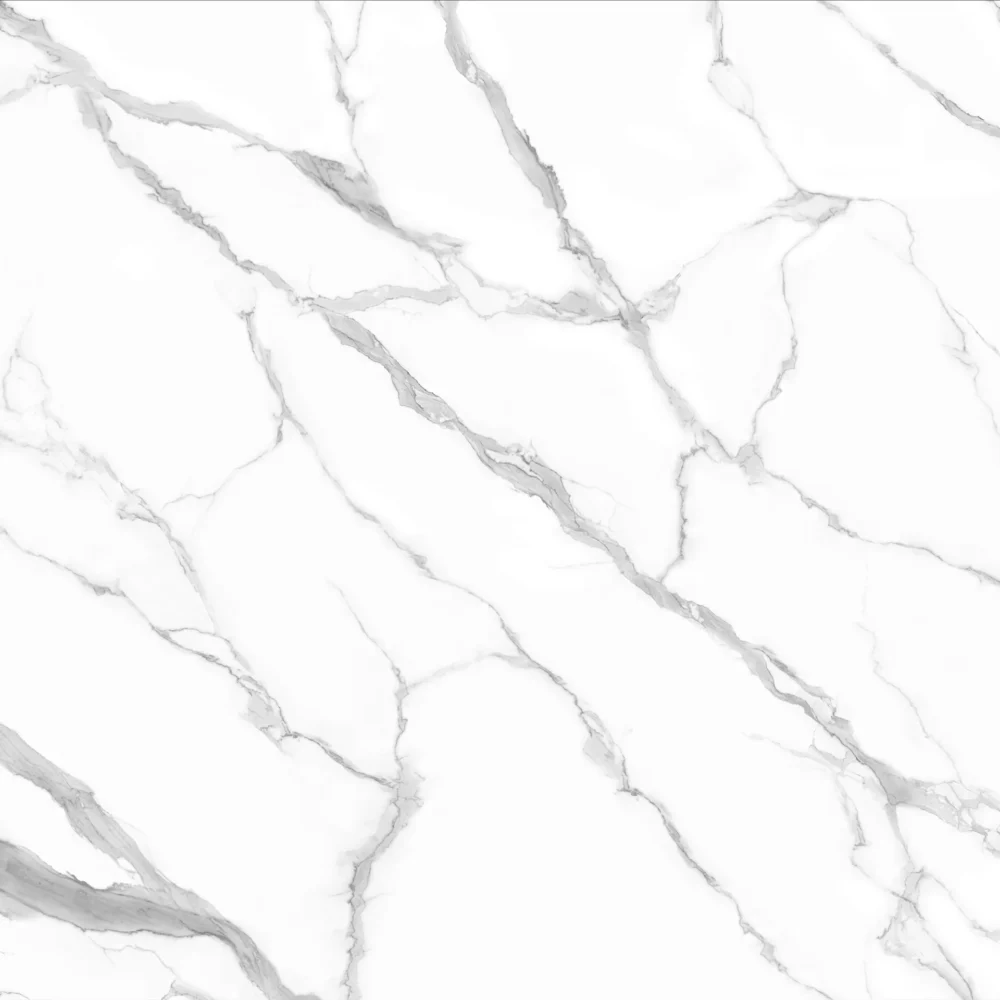
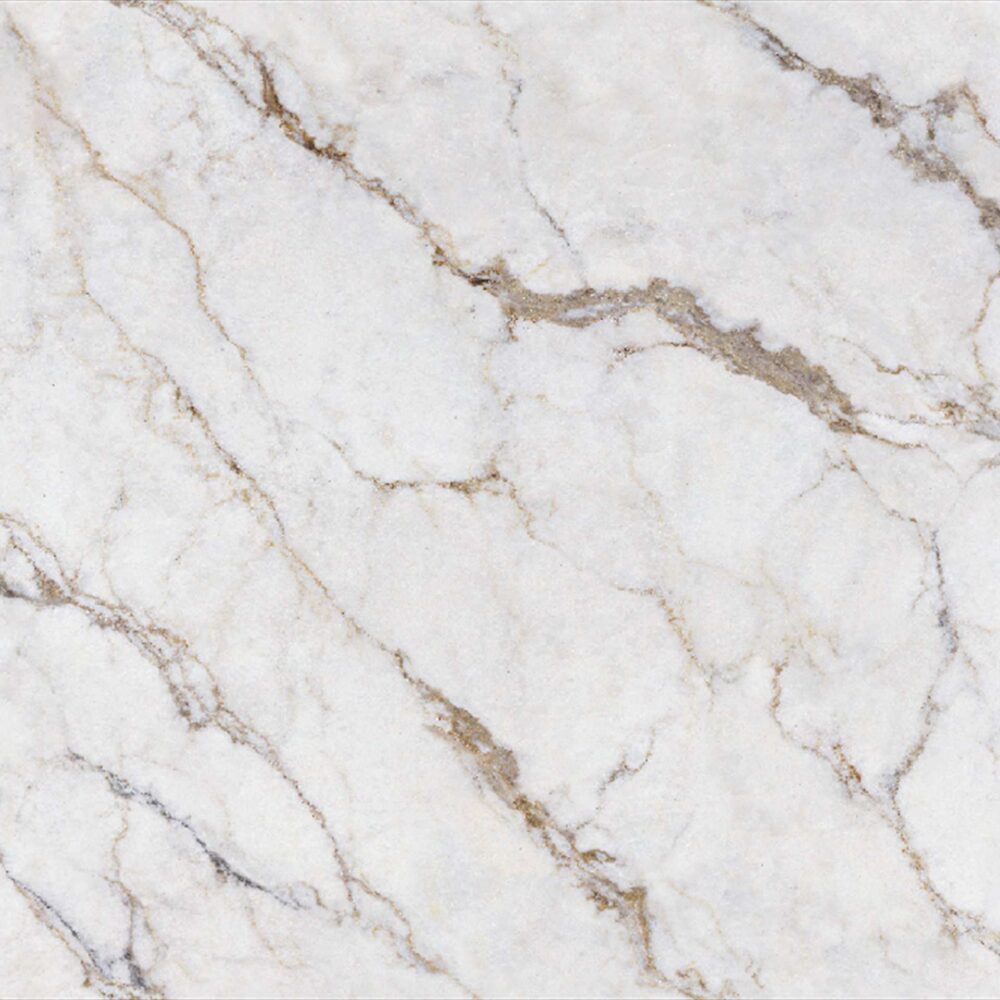
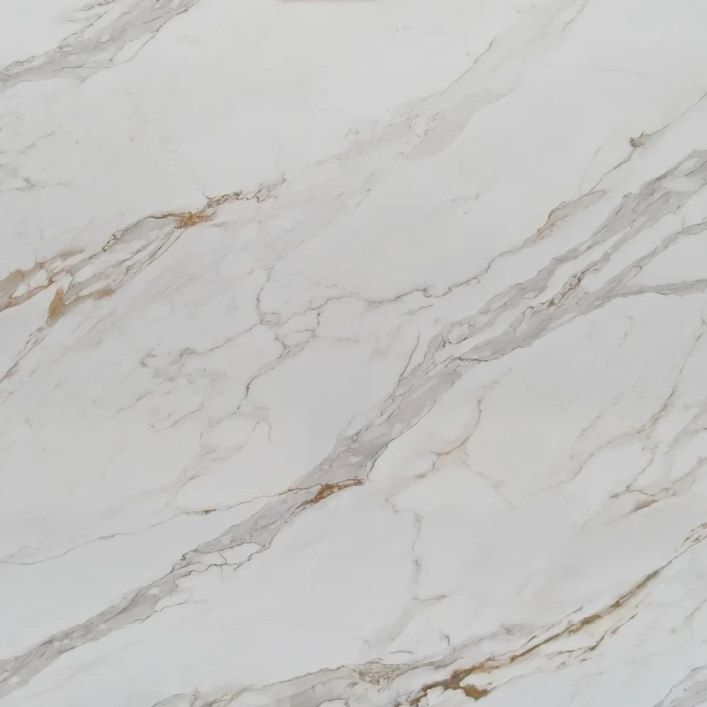
- Calacatta Black Gold Printed Quartz CQ-R0231
Calacatta Black Gold Printed Quartz CQ-R0231


| Primary Color(s) | Dark Onyx Gray |
| Accent Color(s) | Warm Amber Gold |
| Craft | Printed |
| Finishes | Polished / Honed / Suede / Leathered |
| Customized Size | 138″ × 79″ / 126″ × 63″ / Customizable |
| Thickness | 30mm / Customizable |
| Edge Style | Eased polished edge / 2+2cm laminated edge / Mitred edge |
| Country | Thailand |
| Variations | High |
| Full Body Printed Quartz | Yes |
| Bookmatch Available | Yes |
| Countertops Residential: Yes Commercial: Yes |
| Wall Residential: Yes Commercial: Yes |
| Flooring Residential: Yes Commercial: Yes |
Description:
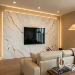
The GQ-R0231 quartz slab presents a striking visual composition with its deep charcoal gray base, accentuated by bold golden veins. These veins, reminiscent of sunlit pathways cutting through a dense forest, traverse the slab in dynamic, linear patterns that seem to dance across the surface. The polished finish enhances the slab’s lustrous sheen, making it a perfect centerpiece for modern interiors seeking to make a bold statement.
Imagine this slab as the focal point of a contemporary office reception desk. The dark base absorbs ambient light, creating a calming atmosphere, while the golden veins catch the eye, guiding visitors through the space with elegance and sophistication. In a chic urban café, the slab serves as a stunning countertop, its intersecting veins inviting patrons to explore the space, while its smooth surface offers a tactile experience that complements its visual allure.
For a small commercial project, envision this quartz slab elevating a boutique hotel’s lobby. Its dramatic appearance sets the tone for a luxurious experience, with the golden veining reflecting the warm glow of overhead lighting, creating an inviting and opulent environment. Paired with minimalist decor and sleek metal fixtures, the GQ-R0231 transforms functional spaces into sophisticated retreats.
Frequently asked questions
Is black quartz better in matte or polished, and is it really more prone to problems?
Black Quartz can perform well in both matte and polished finishes, but the better choice depends more on lifestyle and lighting conditions than on durability alone.
Polished black quartz is typically preferred for luxury kitchens because it reflects light, enhances depth, and makes veining appear more dramatic, especially in marble-look designs, while matte black quartz offers a softer, contemporary appearance that hides fingerprints and glare more effectively.
However, the reason black quartz is often described as “problematic” is not because the material itself is weaker, but because dark surfaces visually exaggerate everyday residue such as dust, water spots, soap film, mineral deposits, and oily fingerprints. In fabrication and post-installation experience, homeowners usually report more visible maintenance issues on polished black surfaces installed near strong window lighting or hard-water areas, whereas matte finishes tend to camouflage these marks better but can sometimes show smudging or cleaning streaks if low-quality resins are used.
From a material science perspective, darker engineered quartz colors absorb more visible light contrast, which makes surface contamination easier for the human eye to detect even though the actual amount of residue is no different from lighter countertops.
Compared with natural Granite or Quartzite, black quartz is still relatively low maintenance because it remains non-porous and does not require periodic sealing, but finish quality matters significantly: high-density slabs with consistent resin distribution and precision polishing generally resist haze, micro-scratches, and long-term wear much better than low-cost products.
In real residential projects, matte black quartz is often the safer recommendation for busy family kitchens because it hides daily wear more naturally, while polished black quartz works best for homeowners prioritizing visual impact and willing to clean surfaces more frequently to maintain that deep reflective appearance.
I'm stuck choosing a quartz countertop — should I follow 2026 trends or pick something more timeless?
If you’re already feeling decision paralysis, lean timeless and let the backsplash, hardware, lighting, or paint carry the trend.
In GrandQuartz Tech, a lot of homeowners get pulled toward bold veining, high-contrast slabs, warm beige tones, or dramatic stone-look quartz because they photograph well, but those are also the choices people tend to second-guess fastest if the rest of the kitchen is busy.
A safer long-term quartz choice is usually a soft white, warm white, light greige, or subtle marble-look pattern with movement that is visible but not screaming. Avoid anything that looks too gray-cool if your floors, cabinets, or light are warm; it can feel dated quickly. Also be careful with ultra-plain solid white quartz because crumbs, seams, and fabrication details can stand out more than people expect.
Before choosing, look at full slabs, not just samples, and put the sample next to your cabinet, floor, and backsplash in natural daylight. If resale matters, pick a quartz that feels calm, works with multiple cabinet colors, and does not lock the kitchen into one very specific design era. The trendier option can work, but only if you genuinely love it in your actual space, not just on grandquartztech.
-1000x1000.webp)