- Home
- Quartz
- Quartz Slabs
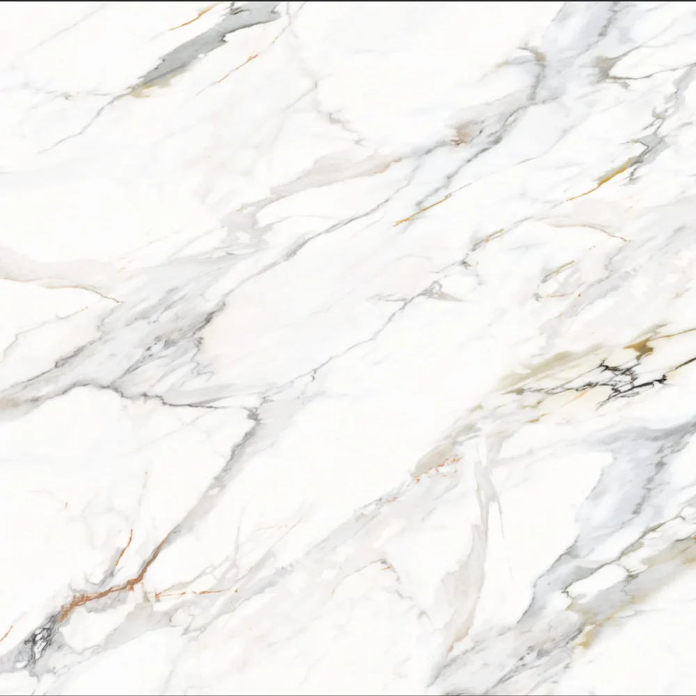
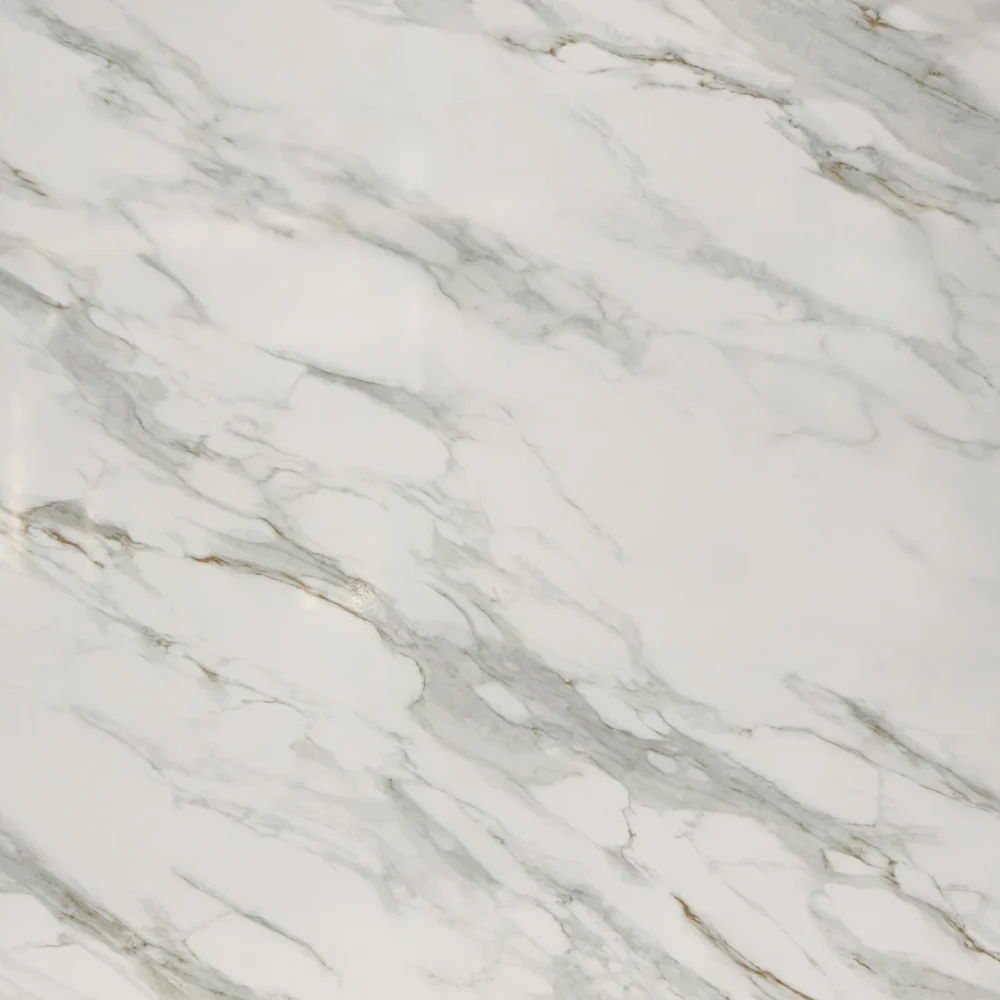
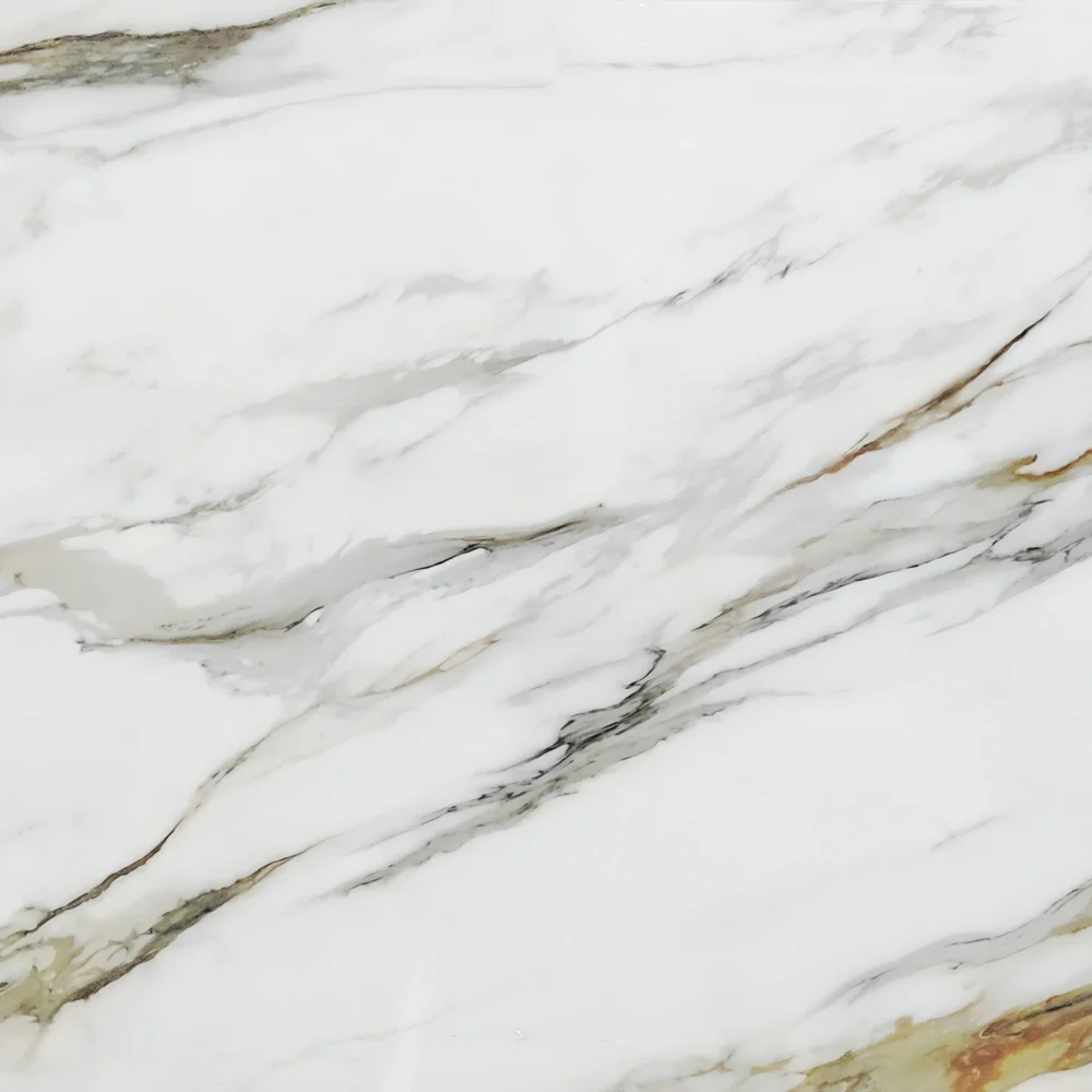
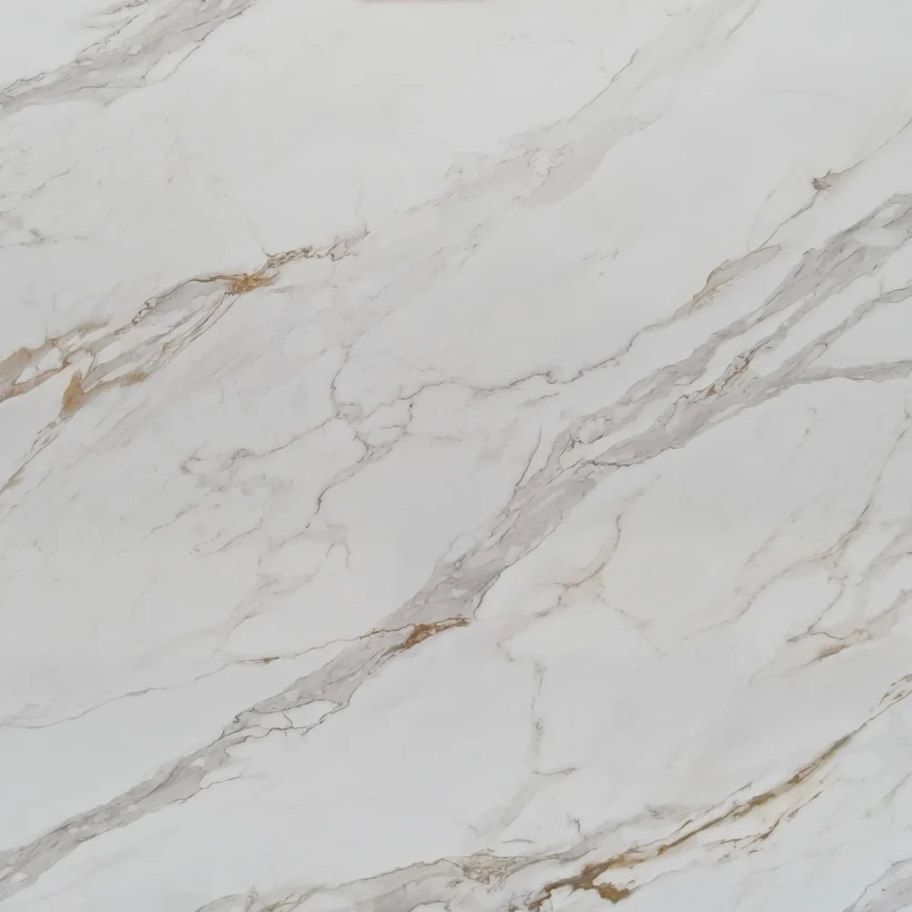
- Macchia Vecchia Printed Quartz GQ-R0242
Macchia Vecchia Printed Quartz GQ-R0242


| Primary Color (s) | Pure Snow White |
| ACCENT COLOR (S) | Warm Taupe Beige,Soft Ash Gray |
| Craft | Printed |
| Finishes | Polished / Honed / Suede / Leathered |
| Customized Size | 138″× 79″ / 126″× 63″ / Customizable |
| Thickness | 20mm/30mm/Customizable |
| Edge Style | Eased polished edge/2+2cm laminated edge/Mitred edge |
| Country | Thailand |
| Full Body Printed Quartz | Yes |
| Bookmatch Available | Yes |
| Countertops Residential: Yes Commercial: Yes |
| Wall Residential: Yes Commercial: Yes |
| Flooring Residential: Yes Commercial: Yes |
Description:
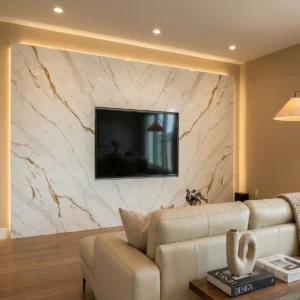
GQ-R0242 opens with a bright white ground that gives the slab a crisp, gallery-clean presence. Over that white field, soft and medium gray veins sweep in wide, marble-like movements, then divide into smaller branches and fine crack lines. Beige, taupe, warm brown, and faint rust accents appear within selected vein zones, adding a natural warmth without turning the surface yellow. The pattern reads like a geological contour map after rain: bold diagonal routes are visible from across the room, while feathered edges, cloudy mineral shading, and brecciated fragments become more apparent at close range. Its polished texture helps the white base reflect light, while the semi-transparent-looking veining gives the countertop depth and a premium Calacatta-inspired character.
For American interiors, this quartz is strongest where designers want a white surface with movement, structure, and a warmer undertone. In a transitional kitchen, GQ-R0242 can create a dramatic waterfall island beside white oak cabinets, slim pendant lights, and soft greige wall color. In a modern farmhouse layout, it works well with warm taupe cabinetry, brass hardware, apron-front sinks, and a matching marble-look backsplash, giving the room brightness while keeping the palette comfortable. For luxury primary bathrooms, the slab can be specified for double vanities, tub decks, shower benches, or bookmatched-style shower wall layouts, especially when paired with polished nickel fixtures, large mirrors, and warm neutral tile.
As a case-inspired small commercial concept, imagine an 860-square-foot boutique kitchen planning studio with one display island, a compact coffee counter, two client consultation desks, and a powder room. The designer selects GQ-R0242 for the 10-foot island top, a full-height backsplash behind the coffee station, and the restroom vanity to make the limited showroom feel connected and upscale. During layout planning, the larger gray-taupe veins are directed from the front door toward the cabinetry wall, so visitors naturally follow the movement into the display area. Under balanced 3500K lighting, the polished white surface keeps the studio bright, while the taupe and warm brown details coordinate with white oak sample doors, brushed brass hardware boards, woven stools, and clay-toned accent paint. The result is commercially practical, easy for clients to understand, and visually memorable without overwhelming a compact footprint.
Frequently asked questions
When choosing a quartz countertop, how can I ensure that it matches the style of my kitchen?
Yes, many homeowners, designers, and commercial projects are now using printed or heat-transfer Quartz Countertops because they can create dramatic marble-look patterns at a lower cost than natural Quartzite or high-end full-body quartz. The biggest advantage is visual flexibility: printed quartz can produce large flowing veins, bookmatched effects, and luxury stone looks that would be difficult or much more expensive with traditional quartz manufacturing. In real kitchen and hotel projects, good-quality printed quartz can look very impressive once installed, especially on islands, feature walls, and waterfall edges.
However, there are real differences between printed quartz and regular full-body quartz where the color and pattern run through the slab. On lower-quality printed quartz, the design mainly sits near the surface layer, so edges, cutouts, mitered corners, and chipped areas may reveal a different interior color underneath. This is why some cheaper printed quartz installations can look less natural after fabrication, especially around sink cutouts or waterfall edges where the pattern continuity becomes important. Fabricators also pay close attention to seam alignment and edge finishing because poor polishing or inaccurate miter work can make the printed layer more noticeable under strong lighting. By comparison, traditional full-body quartz tends to hide minor chips and edge exposure better because the material structure is visually more consistent throughout the slab.
That said, printed quartz technology has improved significantly in recent years. Companies like GrandQuartzTech in Thailand have developed more advanced decorative technologies, including 3I heat-transfer processes that create deeper color integration and more natural edge transitions than older surface-printing methods. Their jumbo and super-jumbo slabs also help reduce seams on islands and wall applications, which improves realism even further. From practical fabrication experience, the key is not simply “printed quartz vs regular quartz,” but whether the manufacturer has good edge continuity, realistic veining, stable resin quality, and proper fabrication support. High-quality printed quartz can perform very well in real homes, but buyers should always ask to see fabricated edge samples and full-slab photos instead of judging only from a small showroom sample.
Has anyone installed printed quartz countertops, and should I be worried that the pattern is only on the surface?
Yes, many homeowners and commercial projects are now installing printed or heat-transfer Quartz Countertops because they can achieve dramatic marble-look patterns at a more affordable price than natural Quartzite or premium full-body quartz. In real kitchens, hotel lobbies, and feature-wall projects, good printed quartz can look surprisingly realistic once installed, especially on large islands and waterfall edges where continuous veining creates a luxury appearance. That is why this category has grown quickly in recent years.
The concern about “the pattern only being on the surface” is partly valid, but it depends heavily on the manufacturing quality. Lower-quality printed quartz often has a decorative layer concentrated near the surface, so after cutting, edging, or miter fabrication, the inside of the slab may look different from the top pattern. This becomes most noticeable around sink cutouts, waterfall edges, chipped corners, or thick laminated profiles where the exposed edge can reveal less natural color continuity. In practical fabrication experience, this is one of the biggest reasons some cheaper printed quartz installations end up looking artificial after installation even if the showroom sample looked impressive.
However, newer technologies have improved this problem significantly. Companies like GrandQuartzTech in Thailand now use more advanced 3I heat-transfer technology to create deeper color integration and more natural edge transitions, helping the slab look more visually consistent after fabrication. Their jumbo and super-jumbo slabs also reduce seam count, which makes large kitchens and feature walls look more natural overall. If you are considering printed quartz, the smartest approach is not to avoid it completely, but to compare full slabs, fabricated edge samples, and waterfall details from different suppliers. In real-world projects, high-quality printed quartz with good edge continuity can look very convincing, while lower-end products are usually where the “surface-only pattern” issue becomes obvious.