- Home
- Quartz
- Quartz Slabs
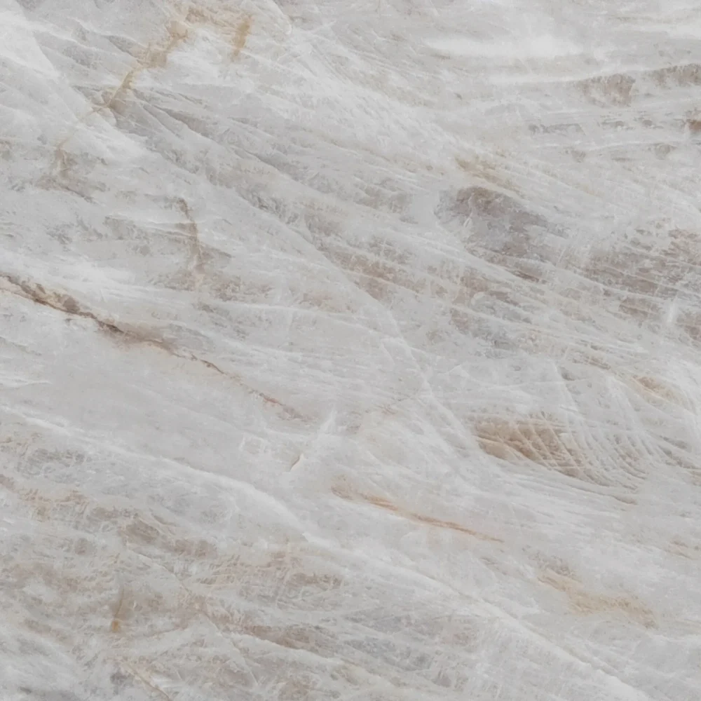
- White Aurora with Champagne and Grey Veins Printed Quartz GQ-R0241
White Aurora with Champagne and Grey Veins Printed Quartz GQ-R0241


| Primary Color(s) | Pure Snow White |
| Accent Color(s) | Warm Honey Gold, Soft Ash Gray |
| Craft | Printed |
| Finishes | Polished / Honed / Suede / Leathered |
| Customized Size | 138″ × 79″ / 126″ × 63″ / Customizable |
| Thickness | 30mm / Customizable |
| Edge Style | Eased polished edge / 2+2cm laminated edge / Mitred edge |
| Country | Thailand |
| Variations | High |
| Full Body Printed Quartz | Yes |
| Bookmatch Available | Yes |
| Countertops Residential: Yes Commercial: Yes |
| Wall Residential: Yes Commercial: Yes |
| Flooring Residential: Yes Commercial: Yes |
Description:
GQ-R0241 is designed around a bright white to soft off-white ground, softened by cloudy gray undertones that keep the surface from reading flat. Across this clean field, warm gold, amber, beige, taupe, and muted gray veins move in broad diagonal sweeps, then break into smaller hairline branches. The main veins have fractured, mineral-like edges, with occasional brown and charcoal accents that add shadow and depth. The visual effect is similar to looking at a polished marble face after natural pressure has opened and filled its fissures: bold from a distance, detailed and layered up close.
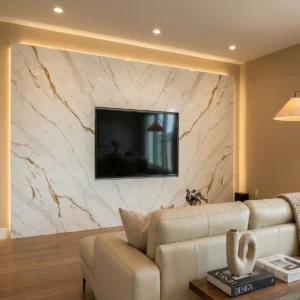
In American design programs, this slab is a strong fit when a white countertop needs a premium focal point rather than a quiet background. In a luxury transitional kitchen, it can define a waterfall island surrounded by white shaker cabinetry, brass pulls, warm oak flooring, and tailored pendant lights. In a traditional primary bathroom, GQ-R0241 works beautifully on double vanities, slab shower walls, or tub surrounds, where polished nickel fixtures and soft cream paint allow the gold and taupe veining to feel elegant instead of flashy. It can also be specified for an upscale modern fireplace surround, especially with warm wood built-ins, neutral upholstery, and low-glare wall lighting that lets the diagonal movement become part of the architecture.
For a case-inspired small commercial concept, picture a 980-square-foot boutique wine and design tasting room with a front sampling counter, two consultation tables, a compact service bar, and a powder room. The designer selects GQ-R0241 for the 11-foot bar top, a matching back counter, and the restroom vanity to create a cohesive luxury material language within a limited footprint. The slabs are oriented so the larger gold-amber veins travel from the entry side toward the display shelving, subtly pulling visitors deeper into the room. Under 3000K warm lighting, the polished white base keeps the space bright, while the amber and taupe veins connect naturally with walnut bottle racks, brushed brass rail details, leather stools, and linen wallcovering. The result feels curated, high-value, and commercially practical without losing the drama expected from a Calacatta-style surface.
Frequently asked questions
How can we choose replacement island cladding and backsplash materials that still look cohesive with the existing feature island instead of looking like a patch repair?
The safest commercial strategy is usually to treat the replacement as part of a broader design update rather than a direct repair attempt. In many successful hospitality and retail projects, designers achieve this by introducing separation points that naturally break visual continuity — such as brushed metal trims, recessed shadow lines, different finish textures, or a shift from polished quartz to matte wall cladding. These elements help the eye understand that the surfaces serve different design functions, which reduces the perception of mismatch.
A practical rule many commercial fabricators follow is simple: if the existing island has heavy movement and dramatic veining, the replacement materials should become quieter and more architectural, not equally busy. Trying to “continue” bold veining across newly fabricated pieces often draws more attention to production differences, seam alignment, and aging inconsistencies. By contrast, using a cleaner backsplash or a subtly contrasting surround allows the original feature island to remain dominant while the surrounding materials support it visually.
Should I do a full-height quartz backsplash, or will it get heat damaged behind the stove?
A full-height quartz backsplash can look great, but behind a stove it needs some caution. Quartz is not solid stone all the way through; it contains resins, and those resins can discolor, scorch, or warp from sustained heat. The riskiest spots are directly behind gas burners, high-output ranges, or slide-in ranges where pans and flames sit close to the wall. Fabricators see more problems in those areas than on regular wall runs. If you want quartz everywhere, check the range manufacturer’s clearance requirements and keep the slab out of direct heat exposure. For a serious cooking area, many installers prefer tile, stainless steel, porcelain slab, or another more heat-tolerant material behind the stove, with quartz used on the rest of the backsplash.
-1000x1000.webp)