



- الصفحة الرئيسية
- المنتجات
- ألواح الكوارتز
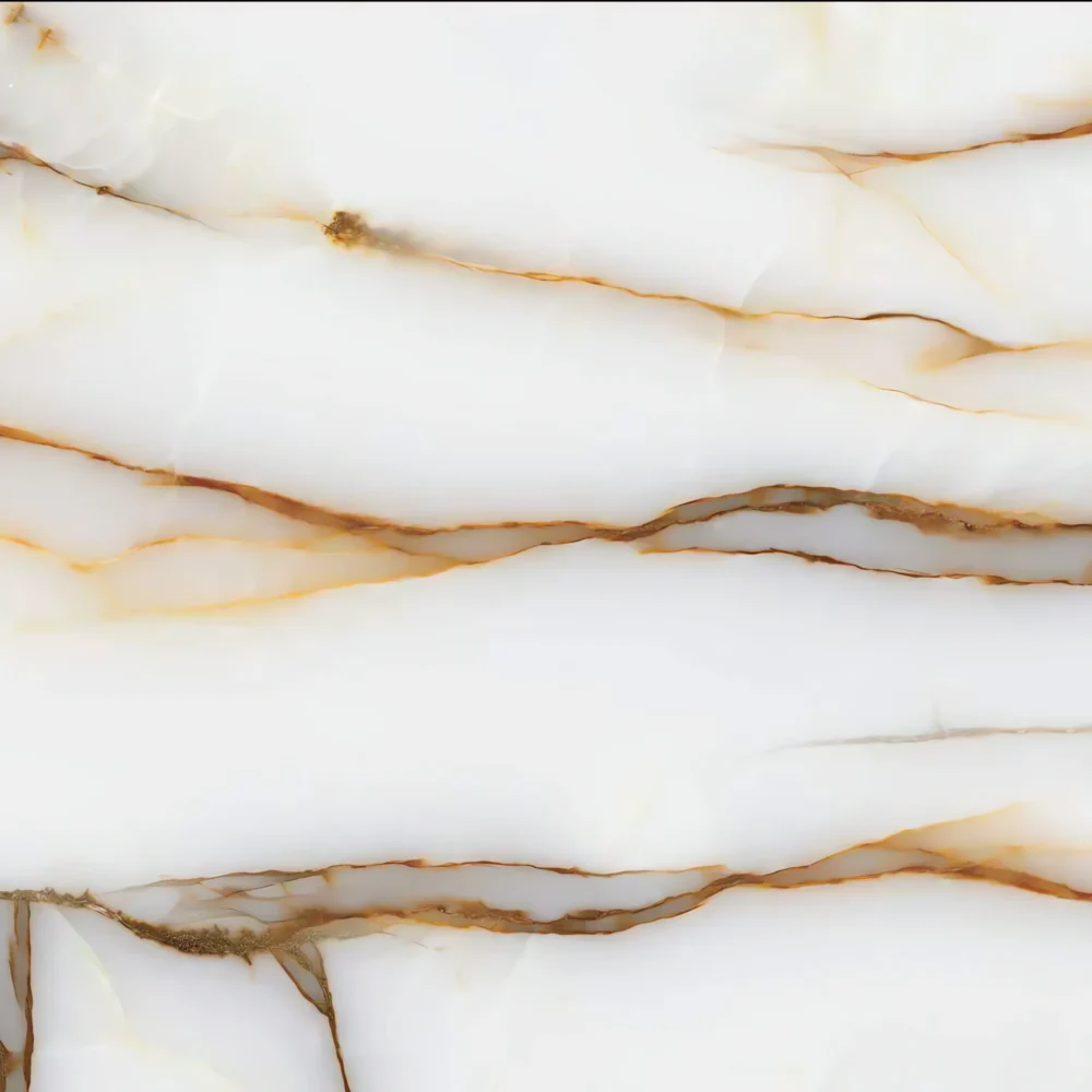
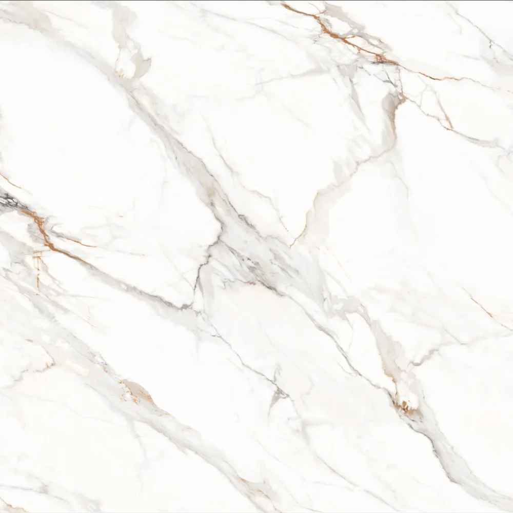
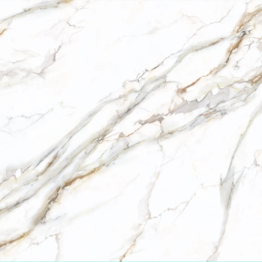
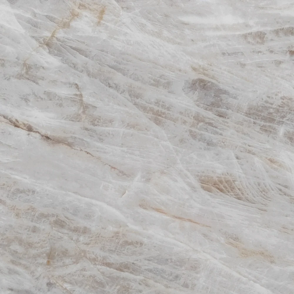
- Calacatta Alpine Quartz GQ-T376 for wholesale
Calacatta Alpine Quartz GQ-T376 for wholesale
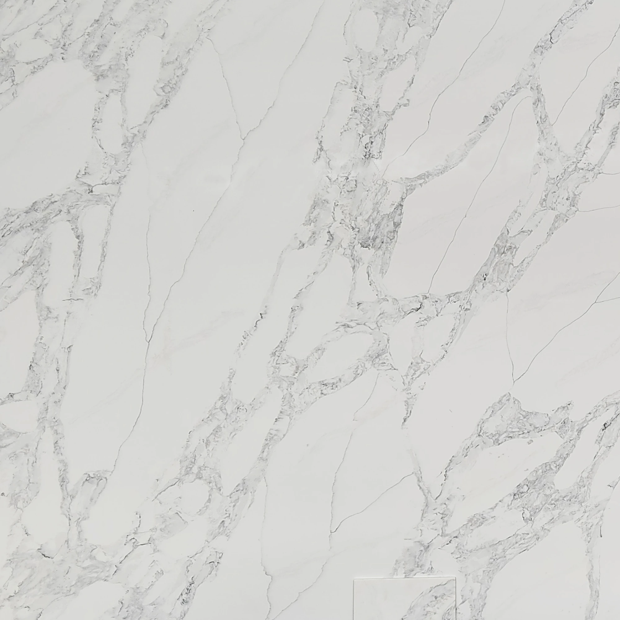
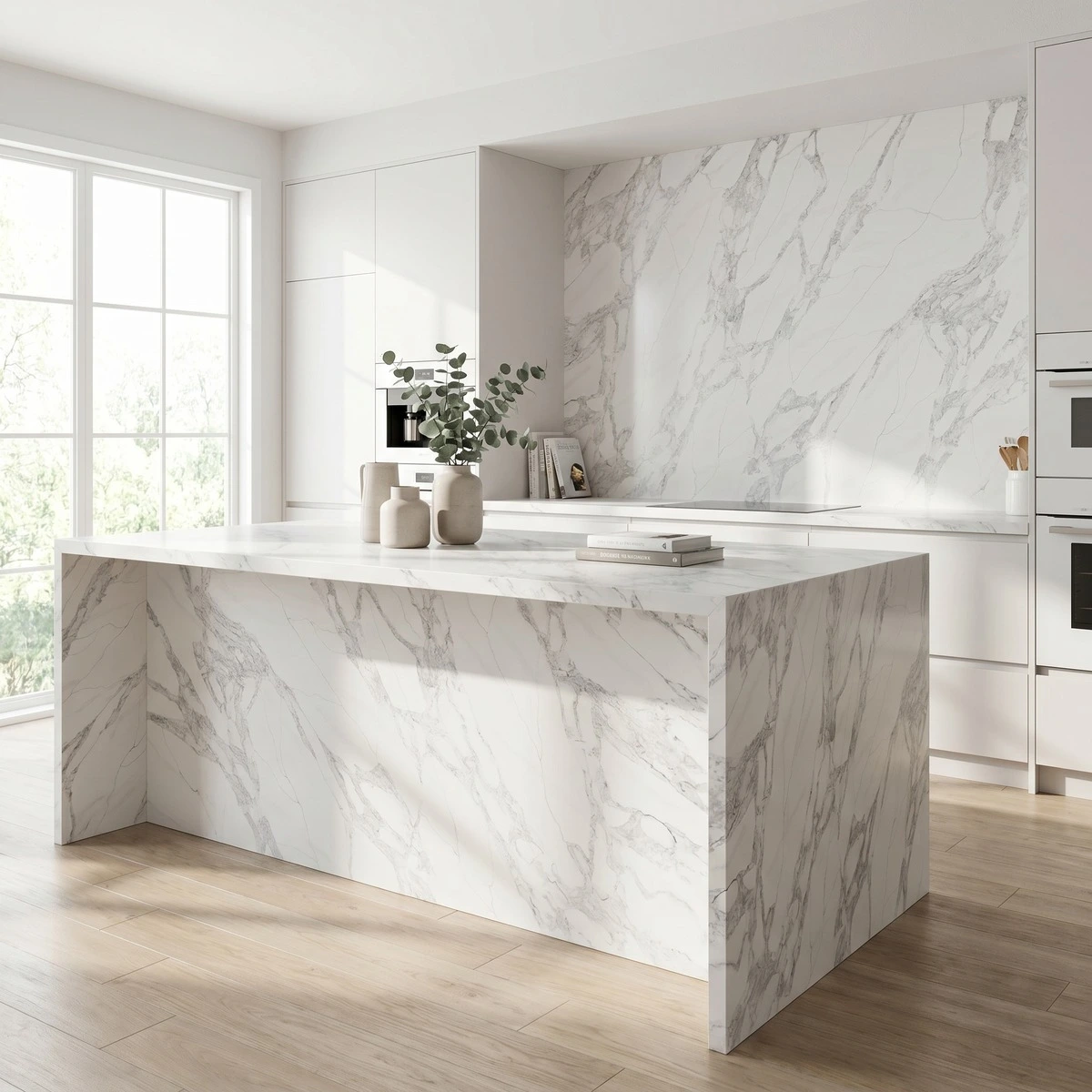
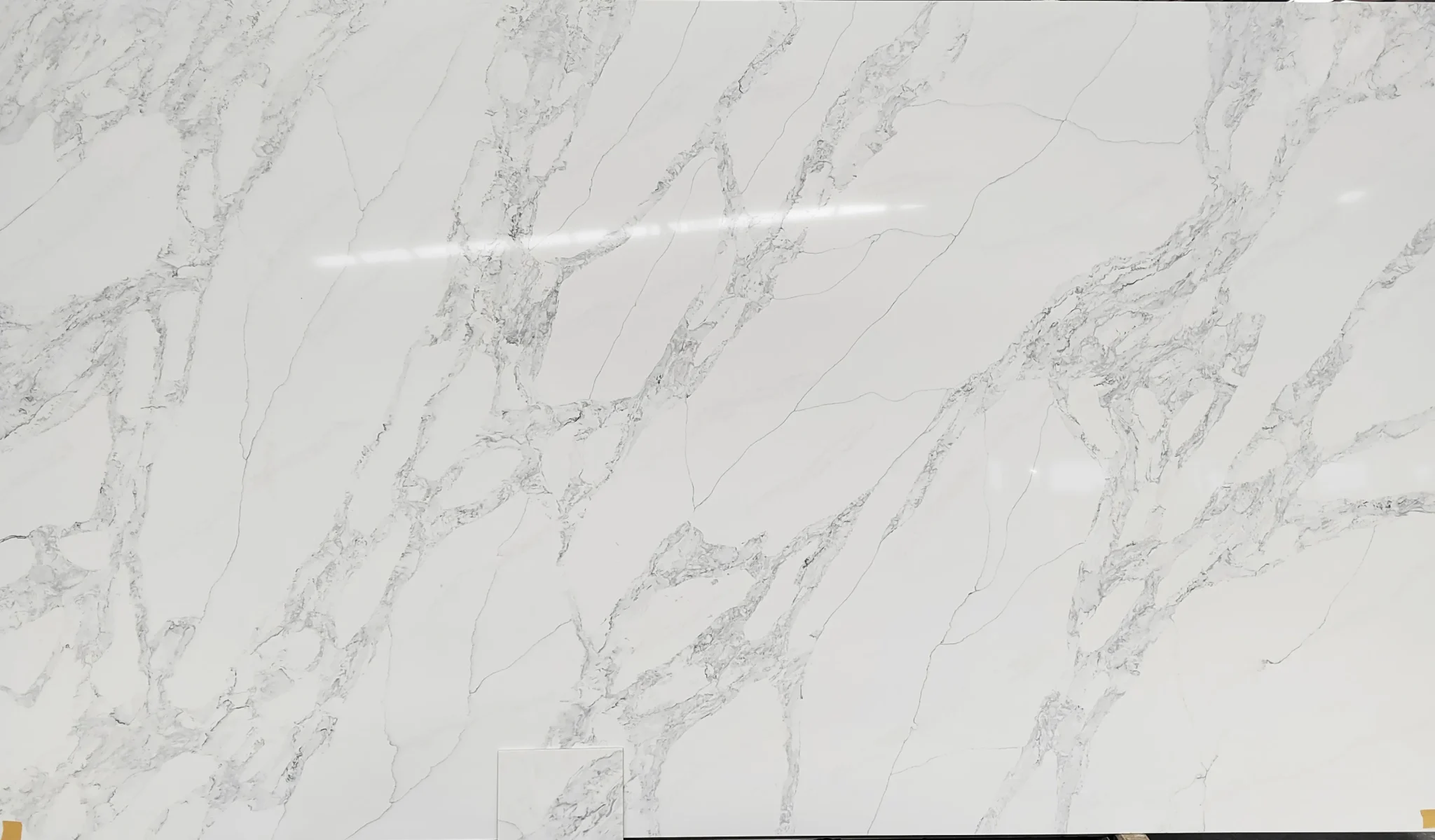
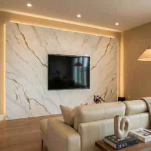
| الألوان الأساسية | أبيض لامع |
| لون (ألوان) الزخرفة | Light to Medium Grey Veins + Faint Charcoal Grey Accents |
| صياغة | عادي |
| تشطيبات | مصقول / مصقول / سويدي / جلد |
| حجم مخصص | 138 بوصة × 79 بوصة / 126 بوصة × 63 بوصة / قابل للتخصيص |
| السماكة | 20mm/30mm/Customizable |
| أسلوب الحافة | حافة مصقولة مريحة/حافة مصفحة 2+2 سم/حافة مشطوفة |
| Full Body Quartz | نعم |
| متوفر بمطابقة الكتاب | نعم |
| Place of Origin | تايلاند |
| Port of Transportation | تايلاند |
| Packaging | Foam or carton inside + strong wooden crates with reinforced straps outside and fumigation |
| Delivery time | 15-20 days / Express service is negotiable. |
| MOQ | 10 ㎡ |
| Payment terms | 30%T/T after confirm the order and the 70% T/T by copy of B/L |
| أسطح العمل سكني: نعم تجاري: نعم |
| جدار سكني: نعم تجاري: نعم |
| أرضيات سكني: نعم تجاري: نعم |
وصف:
أسئلة متكررة
What is the most popular Grand Quartz Tech quartz color?
GQ-T376 — our Calacatta-style print — is consistently the top request across residential and hospitality projects.
It’s not just about looks; fabricators tell me it cuts clean, polishes evenly, and holds up well on both 2cm and 3cm edges.
The warm white base with soft gold-gray veining reads rich without being loud, so it works with oak, painted maple, and even charcoal cabinets.
That said, popularity shifts by region: coastal builders lean into lighter, cooler tones like our Glacier Mist print, while Midwest contractors report steady demand for creamy neutrals like Carrara Mist.
Real-world note: high-contrast veining shows seam lines more than low-variation prints, especially on large islands.
And polished darks?
They’ll show smudges and water spots in busy kitchens — honed or matte finishes hide that better.
If you’re quoting a high-volume project, ask about our jumbo slab sizes (138"x79") — fewer seams, tighter bookmatch, less labor.
But don’t assume every client wants Calacatta.
Some are actively avoiding gold veining now, chasing quieter, more natural quartzite or marble-look alternatives.
Is Grand Quartz Tech cheaper than quartz?
That’s a common mix-up — Grand Quartz Tech *is* quartz.
We’re an engineered quartz manufacturer, not a material category.
So asking if GQ is cheaper than quartz is like asking if Ford is cheaper than cars.
What actually drives cost isn’t the brand name — it’s slab size, finish type, freight from Thailand, order volume, and whether you need custom edge profiles or CNC cutouts.
For example, our full-body printed quartz uses the same resin matrix as other engineered quartz, but because we control the entire process in Chonburi — from raw quartz to finished slab — we avoid middleman markups.
That helps on larger orders, especially when you factor in consistent lead times (20–30 days) and free CAD support.
But if you’re ordering one 126"x63" slab for a small remodel, the landed cost won’t look much different than other B2B quartz suppliers.
The real savings come when you’re doing 50+ slabs for a hotel lobby or multifamily project — that’s where our jumbo sizes, low-silica production lines, and direct factory access start adding up in labor and yield.
How to Choose the Right Quartz Color for Your Kitchen Style?
Start with the cabinet finish and lighting — not the catalog.
In real-world kitchens, a warm white quartz like GQ-T376 can look yellow under 2700K LED, but crisp and clean under 4000K.
If your cabinets are stained walnut or espresso, avoid cool-toned grays — they’ll clash.
Go for creamier bases with taupe or soft gold veining instead.
For white shaker cabinets in a north-facing kitchen, steer clear of high-contrast black veining — it reads harsh without strong light.
And if the space has tile backsplash with movement, pick a quartz with low variation so the two don’t fight.
Most installers will tell you: always dry-lay at least two slabs side-by-side in the actual space, under the same lighting you’ll use daily.
Bookmatched patterns telegraph more on polished finishes — if seam visibility matters, consider our honed or suede options.
Also, keep fabrication in mind: tight-radius curves or waterfall ends work better with consistent, non-directional prints.
Busy veining can make grain alignment tricky during templating.
Which color quartz is best for a kitchen?
There’s no universal ‘best’ — only what holds up in practice.
Warm whites like GQ-T376 are the most requested, but not always the smartest pick.
In a rental property or student housing kitchen?
A mid-tone gray quartz with subtle texture hides scratches and water marks better than polished white.
In a sun-drenched chef’s kitchen with stainless appliances?
A quartzite-look print with natural tonal variation handles glare and wear more gracefully than high-gloss Calacatta.
Contractors I’ve worked with for years say the biggest mistake is choosing based on photos alone — UV exposure fades some resins over time, especially in south-facing installations, and gold veining can yellow slightly if the resin batch isn’t stabilized.
Also, thermal shock matters: placing hot pans directly on polished quartz can cause micro-fractures near seams.
If durability is the priority, go for a full-body printed quartz with consistent density — not just surface-level veining.
And remember: seam placement is often more critical than color.
A well-placed seam on a busy pattern disappears; a poorly placed one on solid white screams ‘patch.’