



- الصفحة الرئيسية
- كوارتز
- ألواح الكوارتز
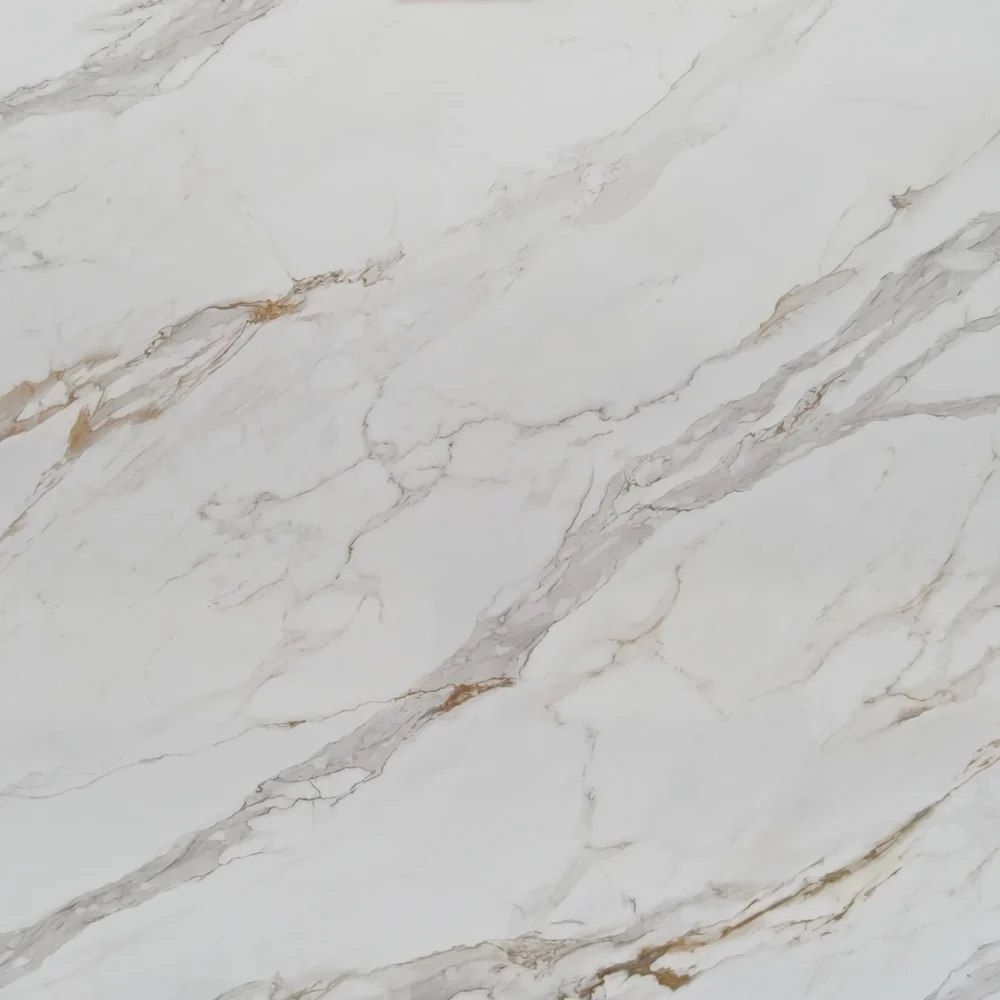
- Calacatta Black Vein Quartz GQ-T287 for Wholesale
Calacatta Black Vein Quartz GQ-T287 for Wholesale
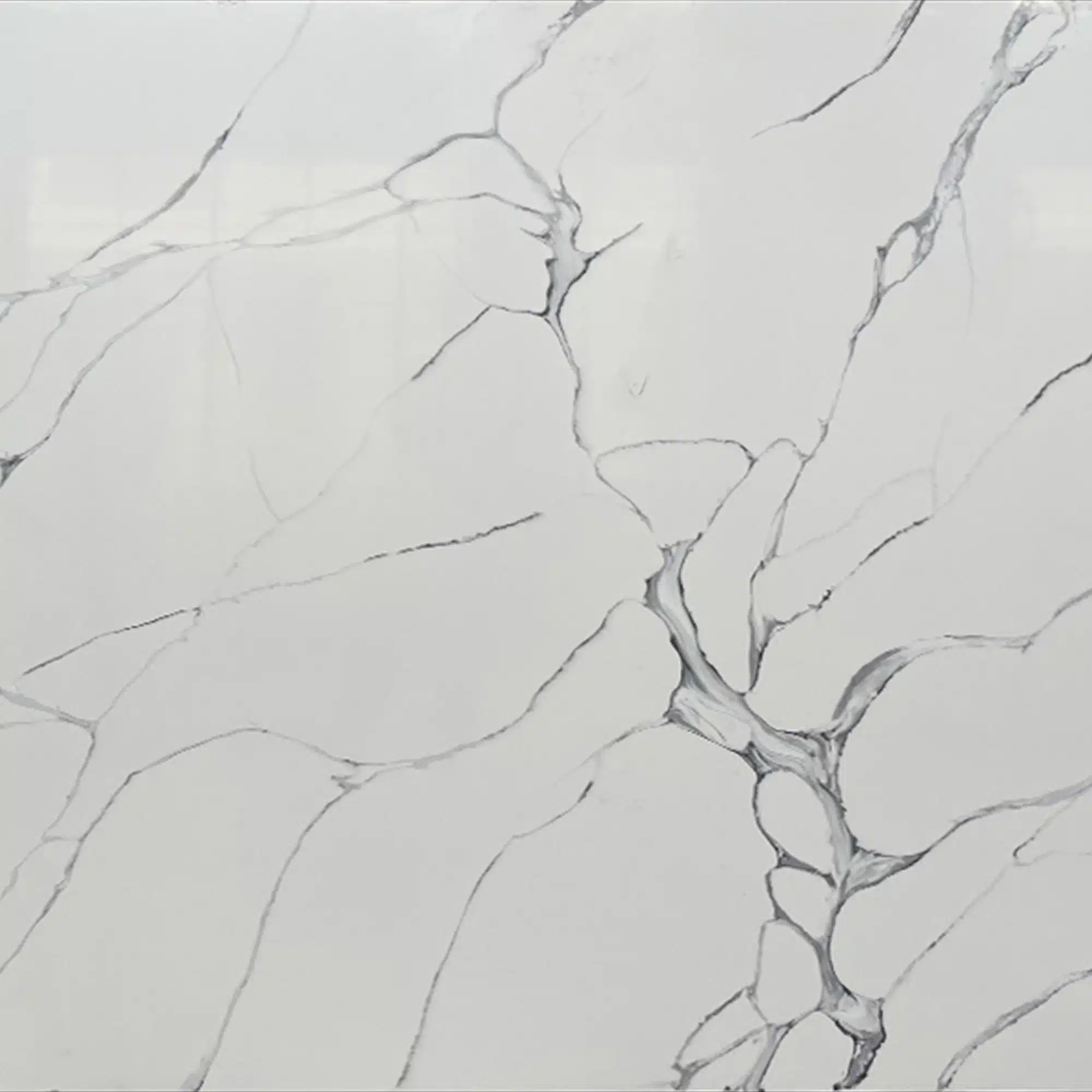
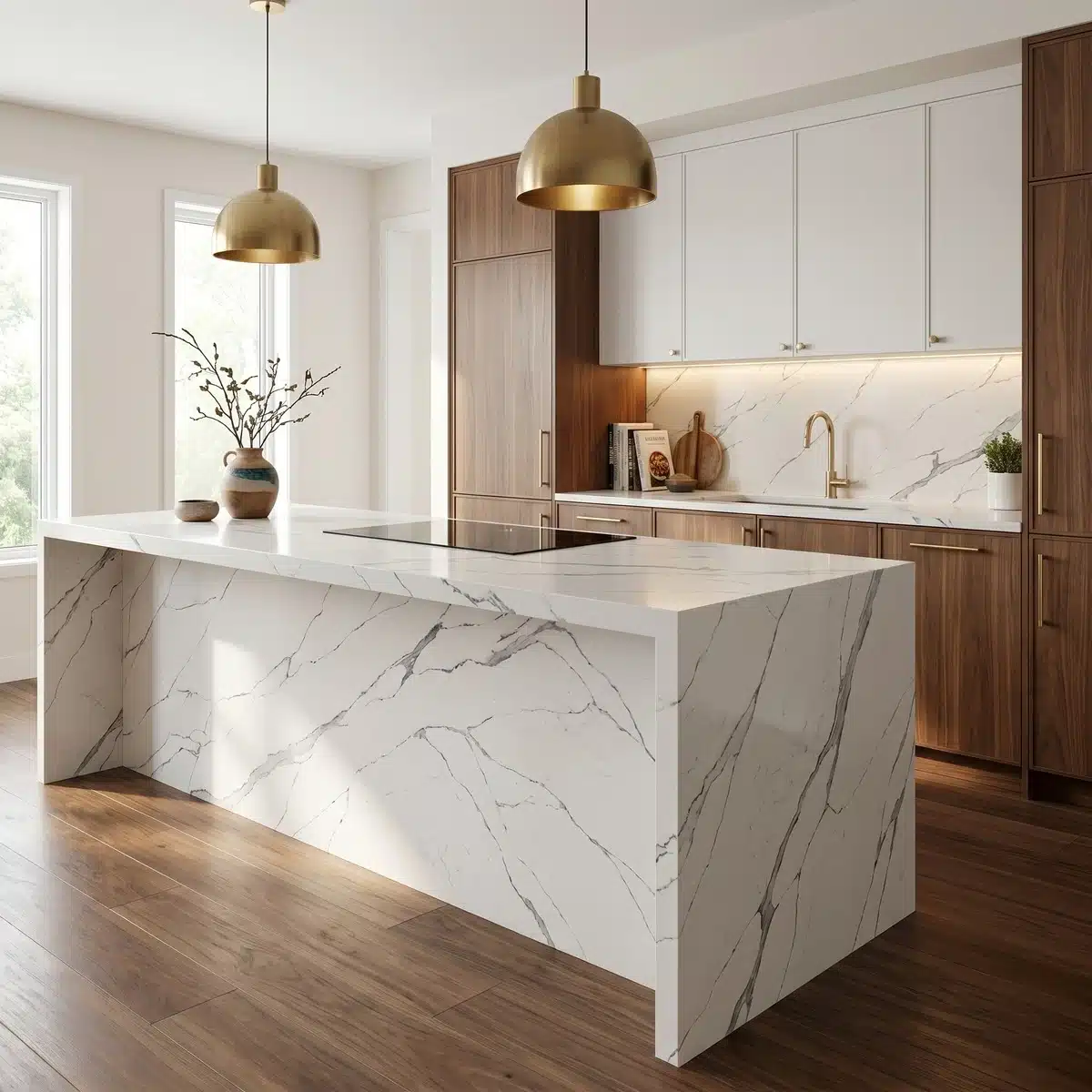
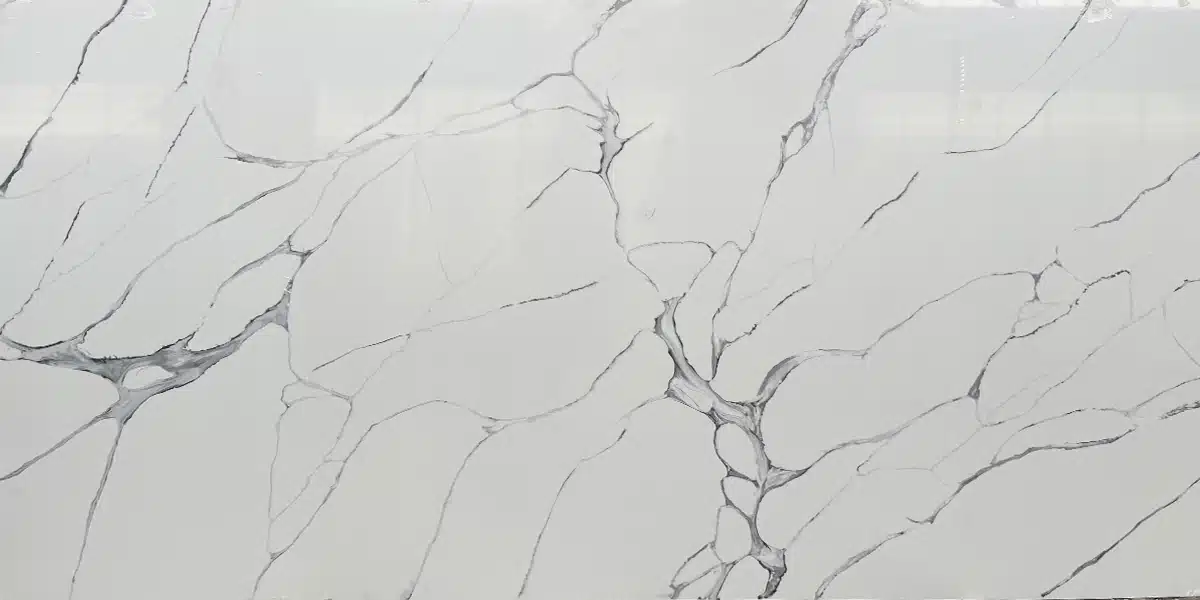
| الألوان الأساسية | أبيض لامع |
| لون (ألوان) الزخرفة | Dark Charcoal Grey + Medium Ash Grey Veins |
| صياغة | عادي |
| تشطيبات | مصقول / مصقول / سويدي / جلد |
| حجم مخصص | 138 بوصة × 79 بوصة / 126 بوصة × 63 بوصة / قابل للتخصيص |
| سُمك | 20mm/30mm/Customizable |
| أسلوب الحافة | حافة مصقولة مريحة/حافة مصفحة 2+2 سم/حافة مشطوفة |
| Full Body Quartz | نعم |
| متوفر بمطابقة الكتاب | نعم |
| Place of Origin | تايلاند |
| Port of Transportation | تايلاند |
| Packaging | Foam or carton inside + strong wooden crates with reinforced straps outside and fumigation |
| Delivery time | 15-20 days / Express service is negotiable. |
| MOQ | 10 ㎡ |
| Payment terms | 30%T/T after confirm the order and the 70% T/T by copy of B/L |
| أسطح العمل سكني: نعم تجاري: نعم |
| جدار سكني: نعم تجاري: نعم |
| أرضيات سكني: نعم تجاري: نعم |
وصف:
أسئلة متكررة
Is veined quartz more expensive?
It depends—but usually yes, veined quartz costs more than solid-color or low-variation slabs.
The price bump comes from design complexity, not just aesthetics.
Full-body printed veined patterns—especially those mimicking rare marbles—require precise ink registration, multiple print passes, and tighter quality control during curing.
That adds time and labor, especially on jumbo or super jumbo sizes where alignment matters across 138-inch lengths.
Most fabricators will tell you the real cost driver isn’t the vein itself, but how consistently it’s reproduced across slabs: tight MOQs, longer lead times, and batch matching all factor in.
In high-volume commercial jobs, that variation can mean extra waste or seam rework.
Veined quartz also tends to show seam telegraphing more, so installers often charge more for layout, dry-lay approval, and bookmatching.
If you’re budget-conscious, consider digitally printed options with lighter veining—they deliver movement without the markup.
Just know: cheaper veining often means surface-only printing, which wears differently under heavy fabrication.
Is a quartz vein in a countertop desirable?
Yes—but desirability hinges on execution, not just presence.
In real-world kitchens and hospitality projects, veins add visual rhythm and break up large surfaces, especially on islands or backsplashes.
Designers lean into them for contrast against flat-panel cabinets or matte tile.
But here’s what installers see daily: poorly registered veins—where the pattern shifts between slabs—make seam alignment harder and increase dry-lay revisions.
Busy patterns also highlight minor fabrication flaws: a slight edge chip or uneven polish shows up faster than on a solid gray.
Polished finishes exaggerate this; honed or suede finishes mute it.
Homeowners often report after a year or two that subtle, organic-looking veins age better than sharp, graphic ones—those can look dated fast.
And while bookmatching helps continuity, it only works if the factory holds tight batch control.
Grand Quartz Tech’s full-body printed lines handle this well, but not all engineered quartz manufacturers do.
Bottom line: veins are desirable when they’re consistent, appropriately scaled, and matched to the project’s scale and finish.
How to tell if a quartz vein has gold?
First, clarify: there’s no real gold in quartz—it’s pigment or metallic ink, and its behavior depends on how it’s applied.
True gold-like veins reflect warm light with depth, not flat yellow.
Look for subtle shimmer—not glitter—that shifts as you walk past the slab.
Under LED or natural light, genuine metallic inks hold tone; cheaper pigments wash out or go brassy.
The best way to verify?
Flip the slab.
If the gold appears only on the top surface—or disappears entirely on the edge—it’s likely surface-printed, not full-body.
That matters because surface veins wear thin during edge profiling or polishing, especially on bullnose or ogee details.
Fabricators will tell you full-body printed gold veins (like those in GQ-T287) survive fabrication better and don’t ‘ghost’ at seams.
Also check consistency: run your finger along the vein—if it feels raised or textured, it’s probably UV-cured ink, not pigment mixed into resin.
That texture can telegraph through thin laminates or affect seaming.
For institutional or high-traffic spaces, insist on SGS-tested colorfastness reports—some metallic inks fade under prolonged UV exposure, especially near windows or skylights.
What quartz has blue veins?
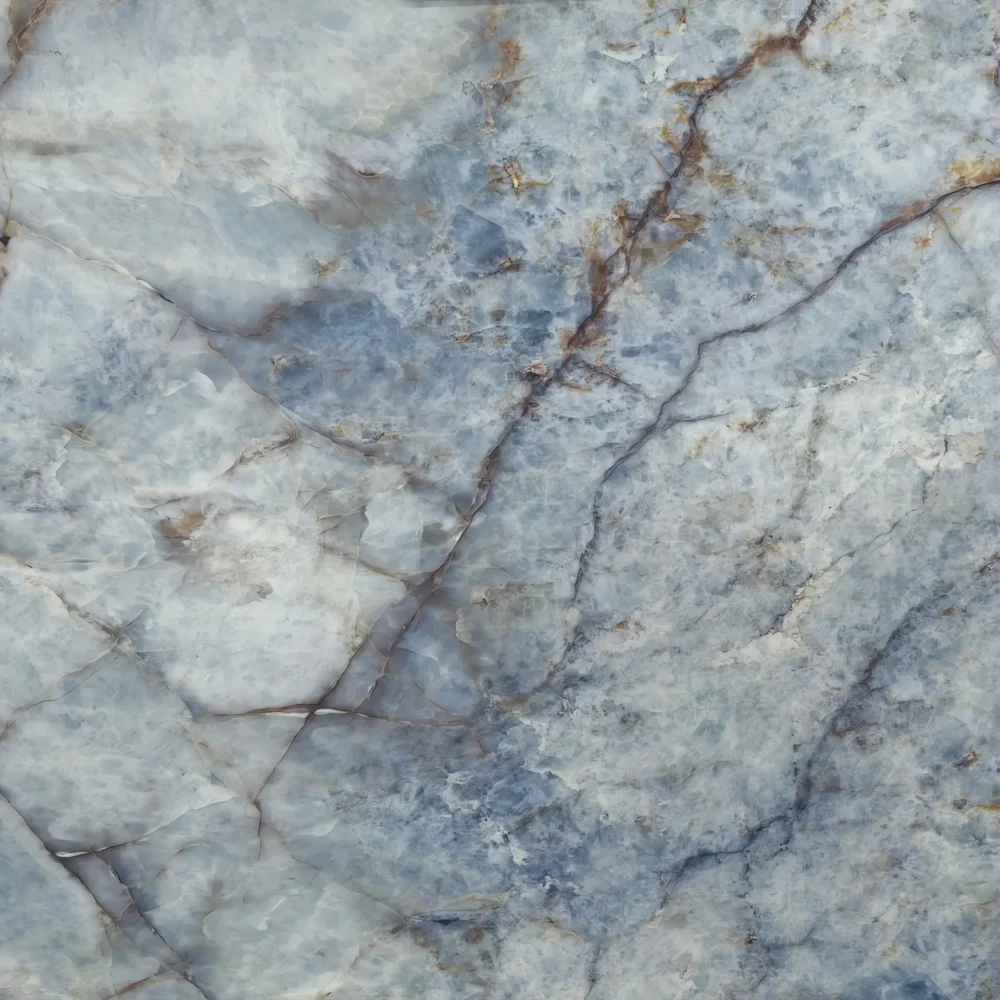
Blue-veined quartz is uncommon in nature, so most options rely on digital printing—and that’s where consistency gets tricky.
You’ll find blue veins mostly in lighter backgrounds: white, soft gray, or icy base tones.
But unlike black or gold veins, blue pigment is sensitive to resin chemistry and UV curing.
Some batches shift toward teal or lavender under different lighting—especially under cool-white LEDs common in retail or office builds.
Installers usually recommend viewing samples in the actual space, not just the showroom, because blue veins can disappear in low-light bathrooms or look overly vibrant in sun-drenched kitchens.
Seam matching is tougher too: blue veining rarely repeats cleanly across slabs, so dry-lay approval becomes non-negotiable.
In commercial projects, ask about batch control—blue pigment lots vary more than neutrals, and mismatched runs mean costly slab rejection.
Grand Quartz Tech prints blue veins using stable, NSF-certified inks, but even then, we advise specifying ‘light-cool’ or ‘deep-navy’ tone codes upfront.
And skip surface-only blue prints—they scratch easier and lose saturation after edge polishing.