



- Start
- Quarz
- Quarzplatten
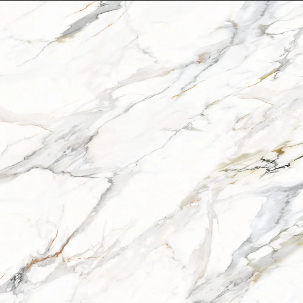
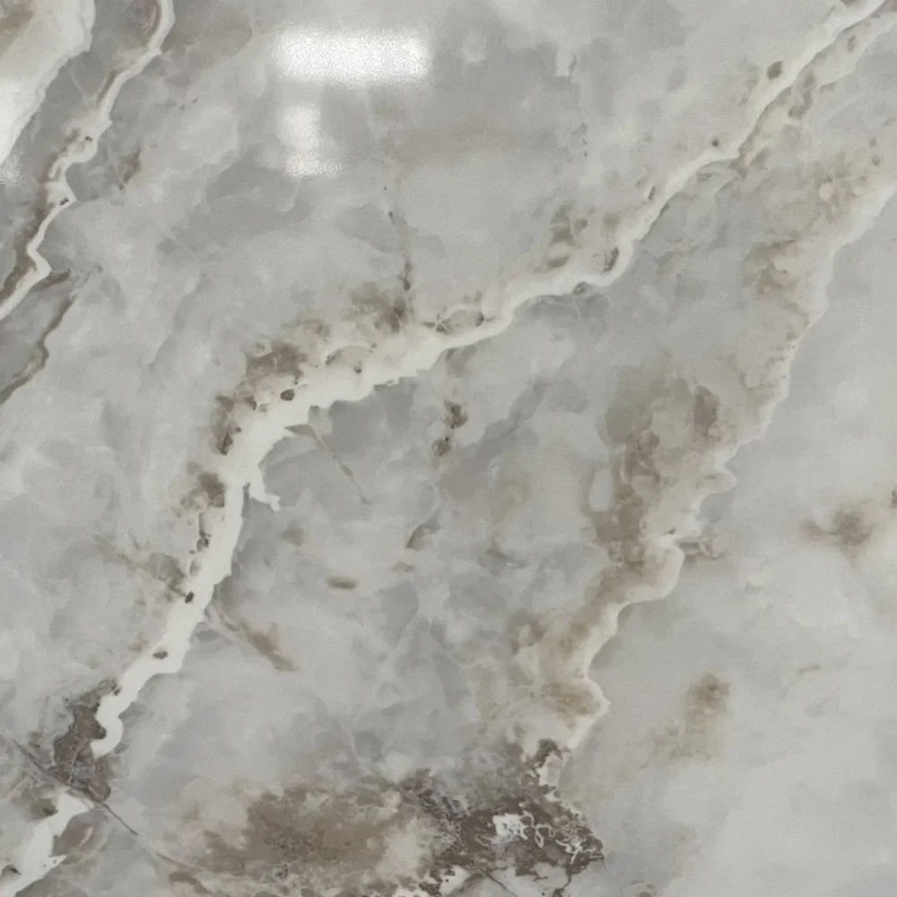
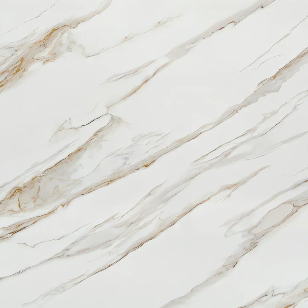
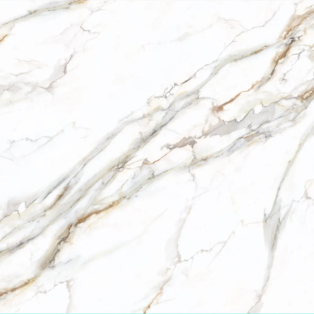
- Belvedere Quartzite Look Quartz GQ-R0258 for Wholesale
Belvedere Quartzite Look Quartz GQ-R0258 for Wholesale
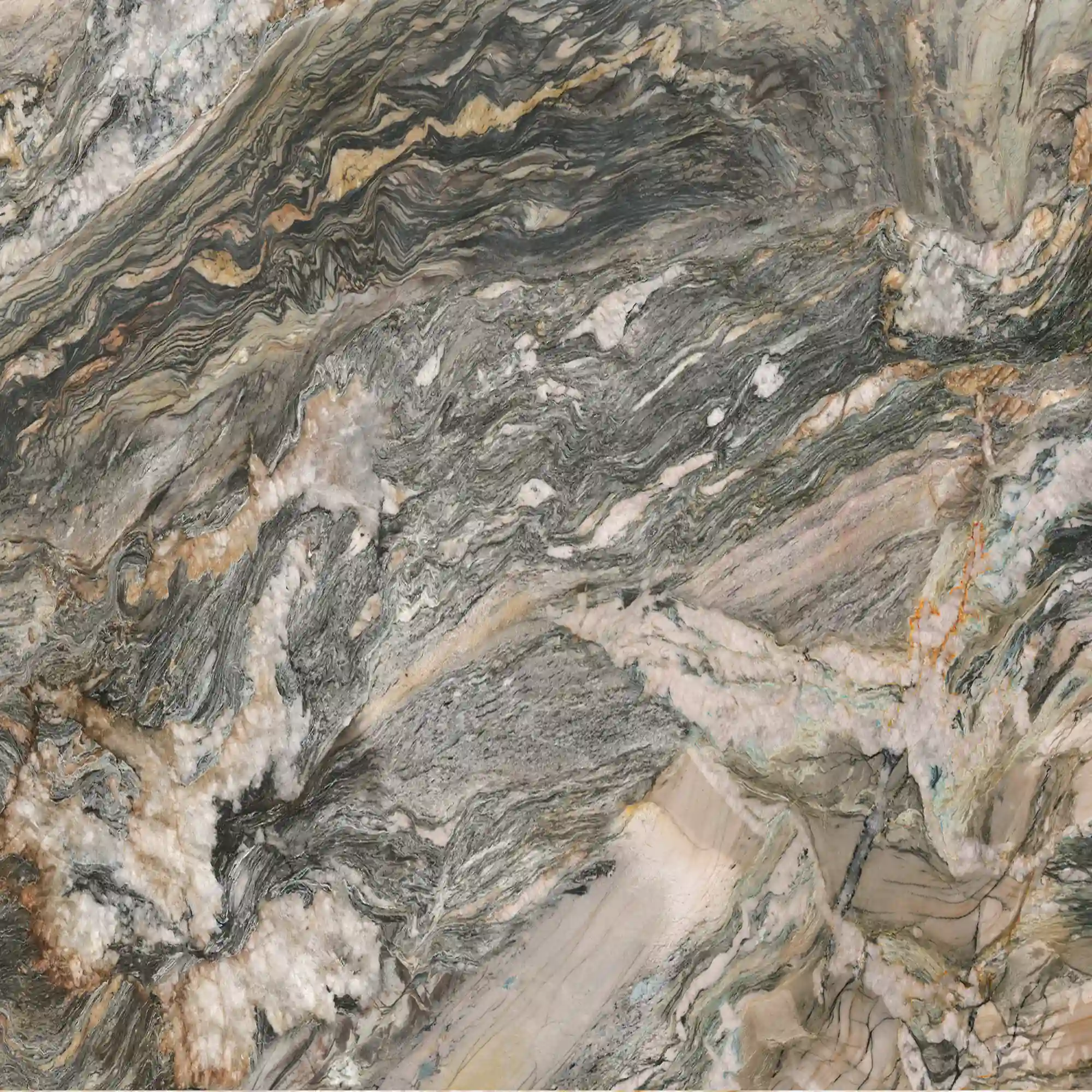
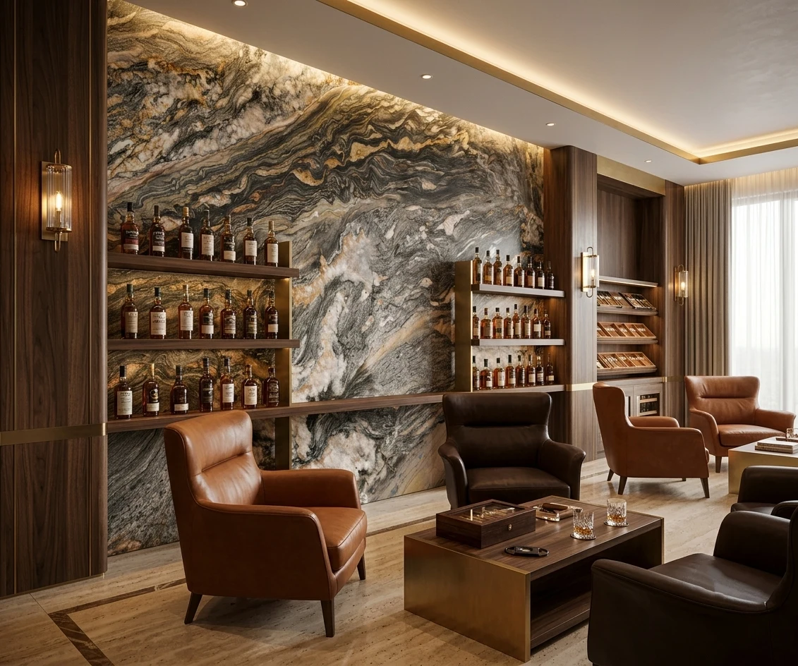
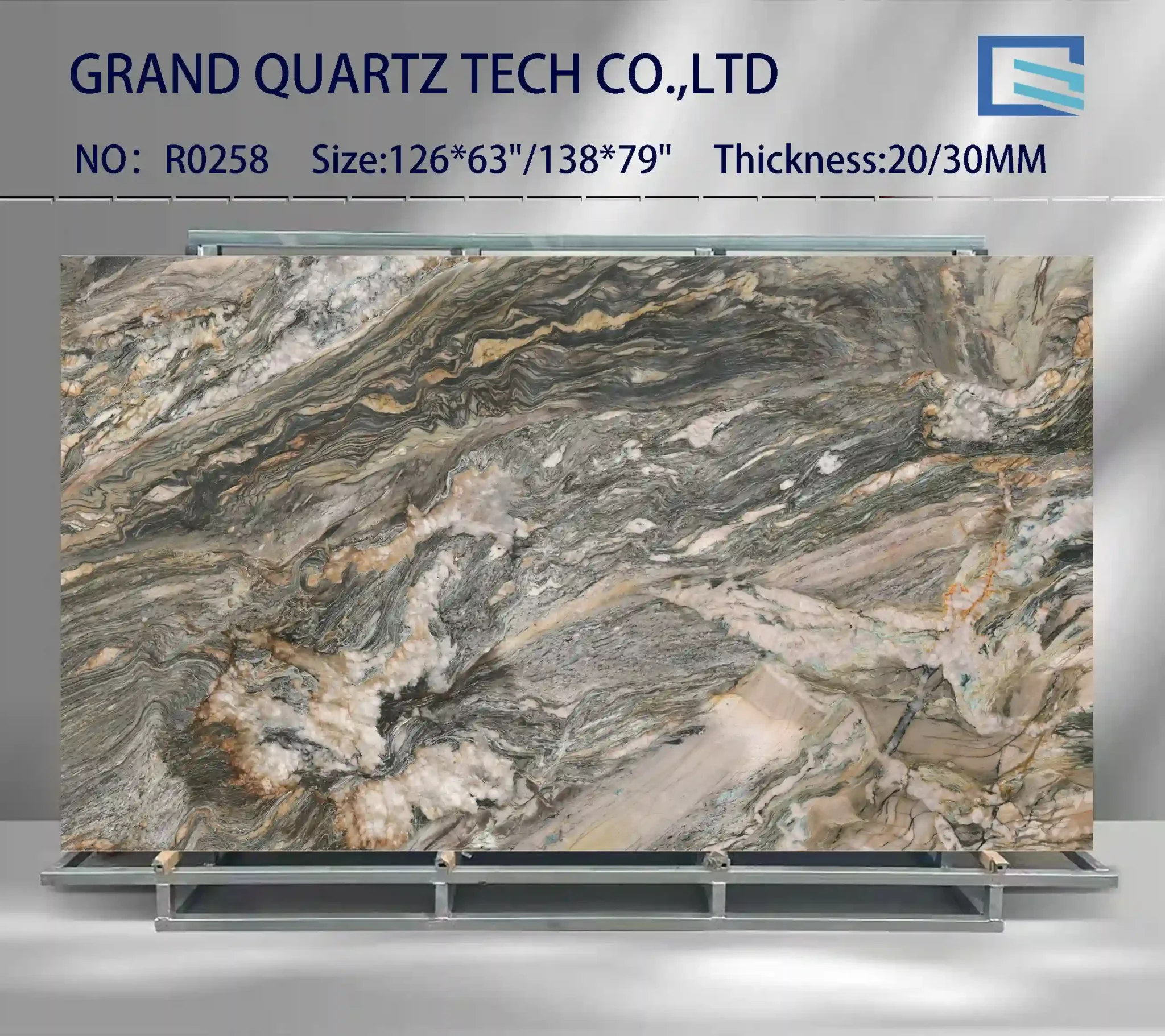
| Primärfarb(en) | Deep Charcoal Grey with Taupe Base |
| Akzentfarbe(n) | Rich Bronze Gold Vein + Cream White Swirl |
| Handwerk | Gedruckt |
| Fertigstellungen | Poliert / Geschliffen / Wildleder / Leder |
| Maßgeschneiderte Größe | 138″ × 79″ / 126″ × 63″ / Anpassbar |
| Dicke | 20mm/30mm/Customizable |
| Randstil | Abgeschrägte polierte Kante/2+2cm lamellierte Kante/Gehrungskante |
| Land | Thailand |
| Vollflächig bedruckter Quarz | Ja |
| Buchungsübereinstimmung verfügbar | Ja |
| Arbeitsplatten Wohngebiet: Ja Gewerblich: Ja |
| Mauer Wohngebiet: Ja Gewerblich: Ja |
| Bodenbelag Wohngebiet: Ja Gewerblich: Ja |
Beschreibung:
Häufig gestellte Fragen
Would love your help- just painted cabinets accessible beige - trying to decide between borghini gold or fusion gold quartz - will use for counter ?
Most fabricators will tell you that when you’re going with a warm beige cabinet, the gold-veined quartzes can either complement or clash depending on how much warmth the stone itself carries.
Borghini Gold usually has more of a warm, amber-gold tone with a softer, less defined veining pattern.
Fusion Gold, on the other hand, tends to have a brighter, more dramatic gold flecking that can read as more metallic and intense.
In real-world kitchens, the difference often comes down to lighting—under cool LED lights, Fusion Gold can look stark against a beige base, while Borghini Gold blends better.
Installers usually recommend testing both with your cabinet paint sample in your actual kitchen lighting.
Also, consider the finish: polished surfaces reflect more light and can make the gold pop too much, while a satin or matte finish helps tone it down.
If you’re using this in a high-traffic area, remember that polished finishes show smudges and fingerprints more easily.
Grand Quartz Tech’s full-body printed slabs offer consistent veining and fewer seams, which helps avoid visible mismatches.
But if you’re in a space with direct sunlight, keep in mind that resin in some gold-accent quartzes can yellow slightly over time—especially if it’s not UV-stabilized.
Always ask for a slab sample before finalizing.
Choosing between borghini gold and fusion gold quartz?
This one’s a common dilemma.
Borghini Gold has a softer, more organic gold veining—like brushed gold through a creamy background.
Fusion Gold is bolder, with more contrast, sharper lines, and a higher concentration of gold flecks that give it a richer, more dramatic look.
Homeowners often report after a year or two that the softer tone of Borghini Gold ages better in homes with natural light, while Fusion Gold can feel overwhelming in small kitchens or rooms with limited lighting.
In commercial spaces, Fusion Gold is used more often because the contrast draws attention.
But for residential use, especially in open-concept layouts, Borghini Gold tends to be more forgiving.
The key is the finish—polished Fusion Gold can look flashy, while honed or matte versions tone it down.
Also, watch out for seam lines: both are prone to telegraphing if not matched carefully.
Grand Quartz Tech’s full-body printed technology helps reduce this issue by keeping the pattern consistent across slabs.
If you’re ordering jumbo or super jumbo slabs (up to 138″x79″), you’ll need fewer seams, which is a big plus for installs.
But always get a dry-lay approval before final fabrication.
And remember—gold accents can show dust and grease more easily, so if you’re not into constant wiping, go with the subtler Borghini.
What quartz looks like quartzite?
A frequent complaint we hear is that many ‘quartzite-look’ quartz products don’t hold up in real-world use—either the veining is too regular, the color is too uniform, or the surface reflects light unnaturally.
The best quartzite look-alikes come from full-body printed quartz, where the pattern is embedded throughout the slab, not just on the surface.
Grand Quartz Tech uses this tech to replicate the natural mineral variations and subtle veining found in real quartzite.
The key is variation—real quartzite has color shifts, mineral deposits, and depth.
Look for slabs with a mix of light and dark grays, with irregular veins that mimic the way quartzite forms.
Some manufacturers use low-silica resins to avoid the ‘plastic’ look under direct light.
Also, finish matters: a honed or leathered surface on quartz can mimic the matte texture of natural quartzite better than a high-gloss polish.
But be cautious—some printed quartz can fade under UV exposure if not properly stabilized.
In high-traffic commercial spaces, the durability of quartz wins over natural quartzite, which can etch or dull over time.
The downside?
Some quartzite-look slabs can telegraph seams more than others, especially in long runs.
Always request a full slab sample and dry-lay mock-up.
If you’re sourcing from a factory like Grand Quartz Tech, their 37-year history in stone means they’ve refined the process to minimize these flaws.
Verwandte Produkte
-

Bedruckter Quarz mit durchgängigem Design GQ-R0217
Weiterlesen -
Bedruckte Quarzplatten mit brauner und tiefgrau-schwarzer Aderung GQ-R0307
Weiterlesen -
Calacatta Weiß Goldader Bedruckte Quarzplatten GQ-R0210 für den Großhandel
Weiterlesen -
Calacatta Gold Engineered Printed Quartz GQ-R0204 Wholesale
Weiterlesen