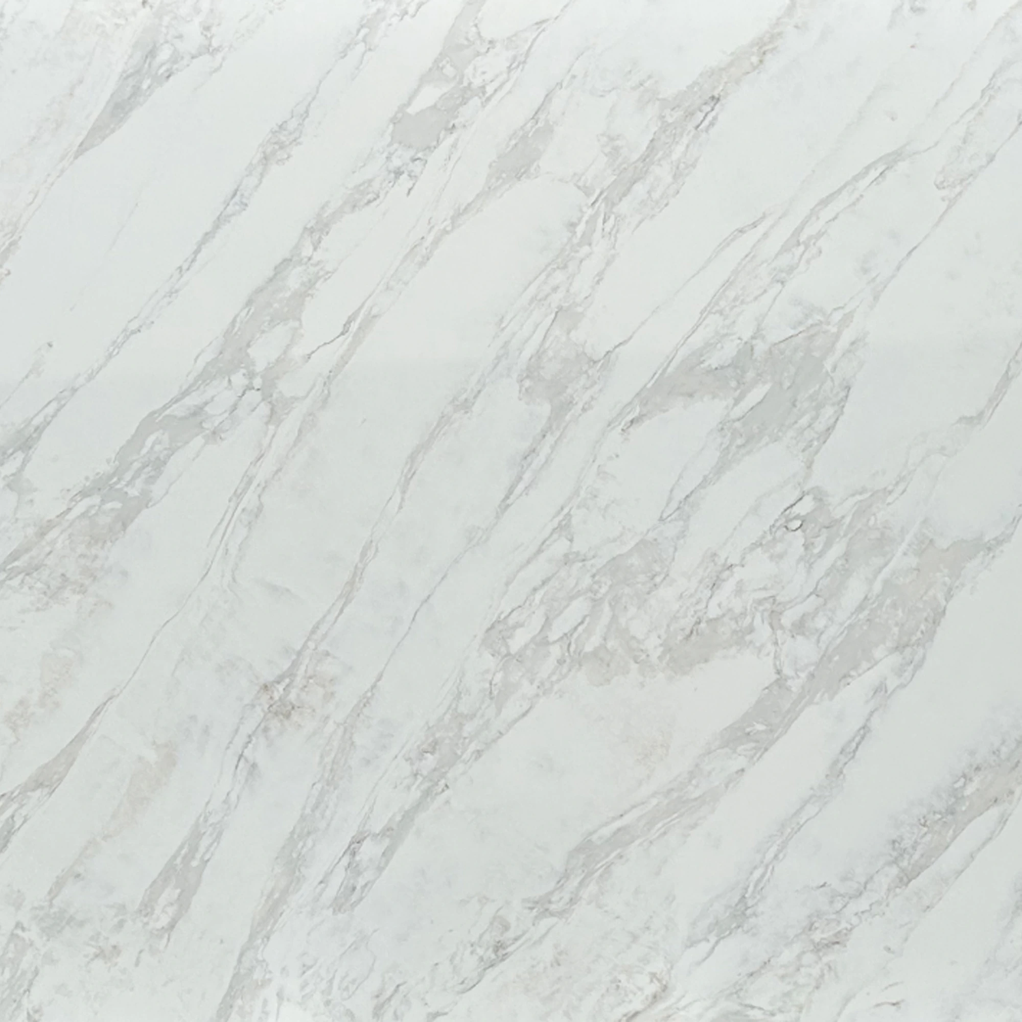
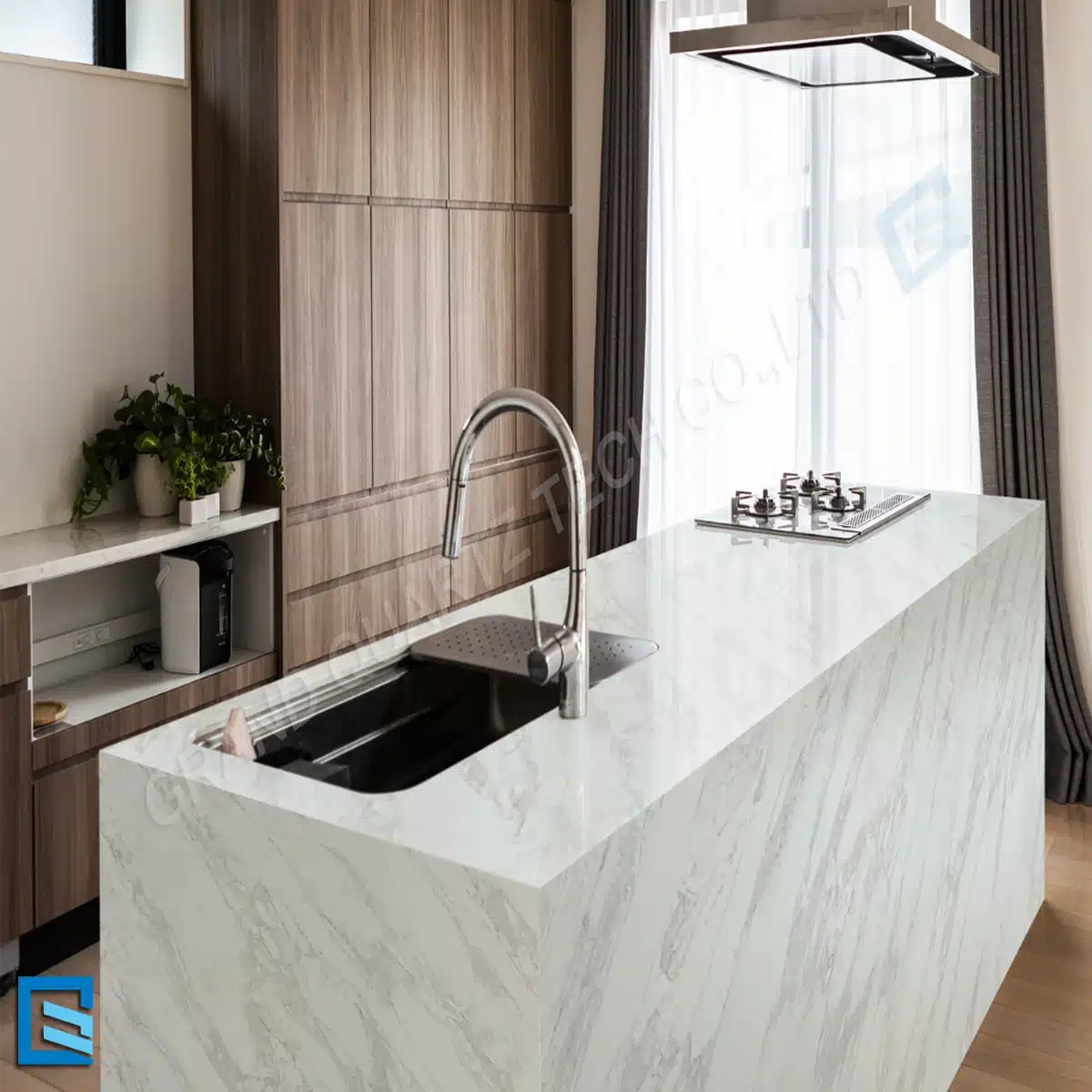
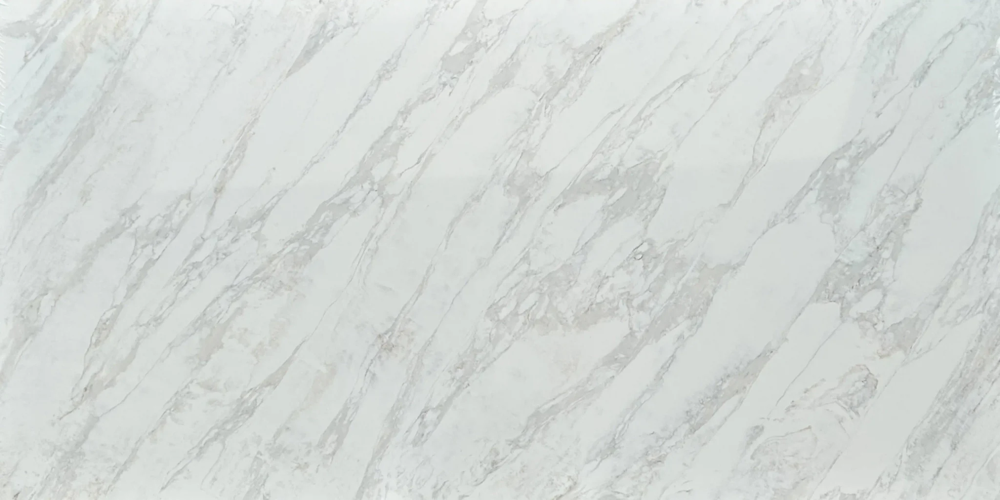
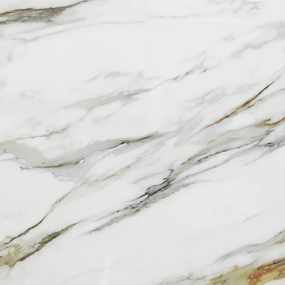
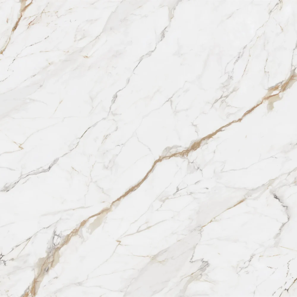
| Primärfarb(en) | Pale Icy White |
| Akzentfarbe(n) | Cool Silver Grey Vein + Faint Warm Gold Trace |
| Handwerk | Regelmäßig |
| Fertigstellungen | Poliert / Geschliffen / Wildleder / Leder |
| Maßgeschneiderte Größe | 138″ × 79″ / 126″ × 63″ / Anpassbar |
| Dicke | 20mm/30mm/Customizable |
| Randstil | Abgeschrägte polierte Kante/2+2cm lamellierte Kante/Gehrungskante |
| Land | Thailand |
| Full Body Quartz | Ja |
| Buchungsübereinstimmung verfügbar | Ja |
| Arbeitsplatten Wohngebiet: Ja Gewerblich: Ja |
| Mauer Wohngebiet: Ja Gewerblich: Ja |
| Bodenbelag Wohngebiet: Ja Gewerblich: Ja |
For 2026, the kitchen color trend leans into warmth and depth—think warm whites, creamy beiges, and soft greys with golden undertones. Warm-toned quartz like T455 or 9060 Quartz Grey is gaining traction because it adds richness without feeling cold. Designers are moving away from stark, clinical whites in favor of colors that feel lived-in and inviting. Deep greens, terracotta, and muted blues are also rising in popularity, especially when paired with warm white quartz countertops. The key is balance: if cabinets go bold, keep the countertop neutral. And don’t forget about material contrast—warm quartz with matte black fixtures or walnut accents creates a modern, layered look that’s both timeless and on-trend.
Avoid overly busy or highly reflective backsplashes with warm white quartz. A glossy, patterned tile with strong contrast will fight the warmth of the countertop and make the kitchen feel chaotic. Also skip anything with dark grout lines—those can look dirty quickly and clash with the clean, neutral tone of warm white quartz. Steer clear of small mosaic tiles unless they’re in a cohesive, tonal palette. Instead, go for matte or satin finishes in similar warm tones—like beige subway, terracotta, or even a soft grey stone. If you want texture, consider a hand-cut stone or a subtle linear pattern. The goal is harmony: the backsplash should complement the quartz, not compete with it. With a warm-toned quartz like 9060 Quartz Grey, a neutral, slightly textured tile works best.
Ihr vertrauenswürdiger Quarz
Manufaktur seit 1989.
Unser Team ist rund um die Uhr verfügbar.