



- Start
- Quarz
- Quarzplatten
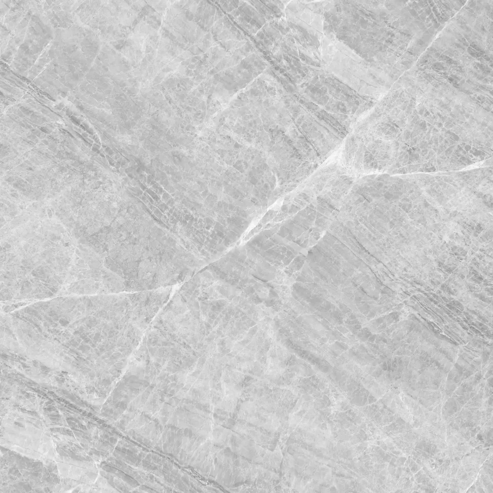
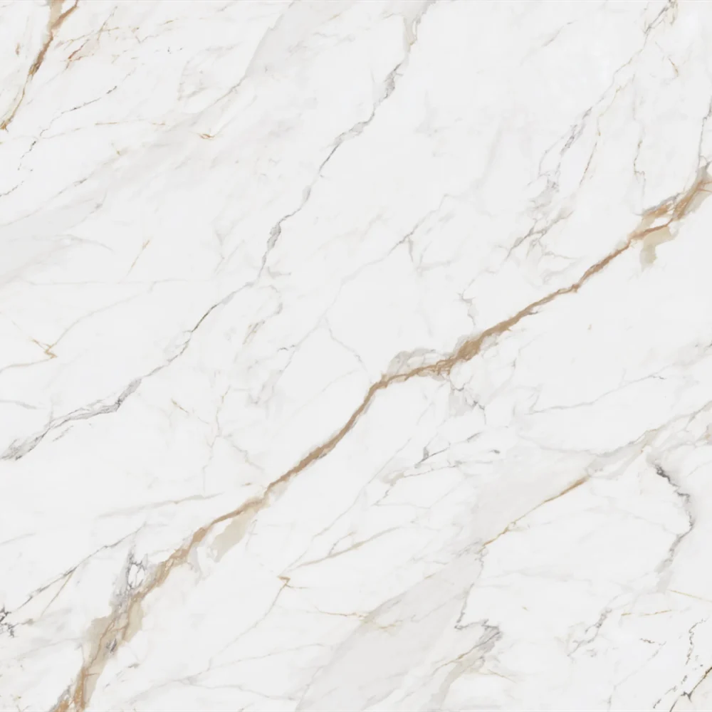
- Calacatta Bianco Lasa Slabs GQ-T380 for Wholesale
Calacatta Bianco Lasa Slabs GQ-T380 for Wholesale

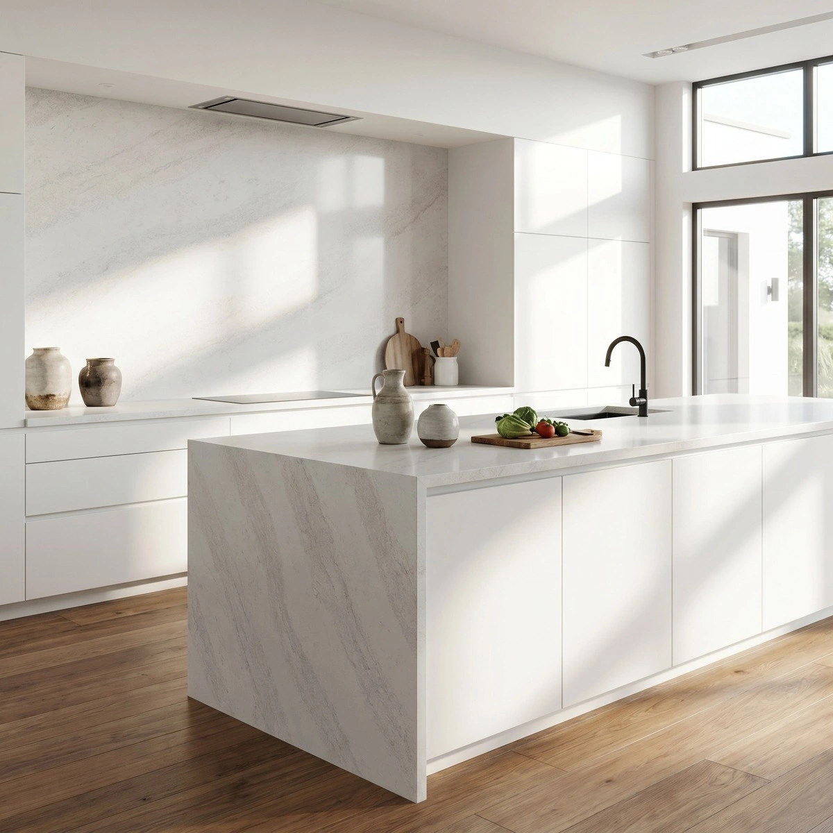

| Primärfarb(en) | Pale Ash Gray |
| Akzentfarbe(n) | Faint Soft Grey Clouding |
| Handwerk | Regelmäßig |
| Fertigstellungen | Poliert / Geschliffen / Wildleder / Leder |
| Maßgeschneiderte Größe | 138″ × 79″ / 126″ × 63″ / Anpassbar |
| Dicke | 20mm/30mm/Customizable |
| Randstil | Abgeschrägte polierte Kante/2+2cm lamellierte Kante/Gehrungskante |
| Land | Thailand |
| Full Body Quartz | Ja |
| Buchungsübereinstimmung verfügbar | Ja |
| Arbeitsplatten Wohngebiet: Ja Gewerblich: Ja |
| Mauer Wohngebiet: Ja Gewerblich: Ja |
| Bodenbelag Wohngebiet: Ja Gewerblich: Ja |
Beschreibung:
Häufig gestellte Fragen
Black quartz countertop: matte/polished? Pros and cons?
Most black quartz countertops you’ll see in kitchens and baths are polished—and there’s a reason.
Polished black quartz delivers that deep, reflective richness people want, especially with veined or marbled designs.
It’s also more forgiving on scratches during daily use and easier for fabricators to finish cleanly.
Matte black quartz does exist, but it’s uncommon—usually only on select slabs or custom orders.
Matte hides fingerprints and water spots better, sure, but it shows etching from acidic cleaners more readily, and scratches can telegraph more because of the texture.
Fabricators often tell me matte requires extra care during polishing and edge profiling—it’s less forgiving than polished.
Also, matte tends to absorb light, so in smaller or darker rooms, it can feel heavy.
Polished black looks sharp under LED lighting, but glare and seam visibility go up—especially on busy patterns.
If you’re bookmatching or running large slabs, polished gives better continuity.
Bottom line: unless you’re aiming for a specific raw or industrial aesthetic, polished is the practical choice for black quartz.
Are grey countertops out of style?
Grey countertops aren’t out of style—they’re just settling into their role as the reliable workhorse of modern design.
In real-world kitchens and baths, greys still dominate because they adapt.
What’s changed isn’t the color itself, but how it’s used.
Pure charcoal greys hold strong in commercial and residential projects where durability and neutrality matter more than trend-chasing.
But most homeowners and designers now lean toward greys with warmth—think storm, ash, or slate tones that carry subtle beige or taupe undertones.
Cold, blue-based greys can look flat next to warm woods or soft wall colors, especially under natural light.
In hospitality or multifamily builds, medium greys are winning for their balance of contrast and calm.
The key isn’t avoiding grey—it’s matching the undertone to your cabinetry, lighting, and finishes.
And if you’re specifying for a project, remember: consistency matters more than novelty.
A well-chosen grey slab holds up over time, especially when paired with solid fabrication and proper seam placement.
What colors go with dark grey countertops?
Dark grey countertops act like a foundation—not a statement piece—so the palette around them needs contrast and warmth to avoid looking monolithic.
For cabinets, warm whites, cream, or greige work best; stark white can read clinical unless balanced with rich wood accents or textured backsplashes.
Walnut, white oak, or cerused maple soften the coolness of dark grey and add visual weight.
Backsplashes?
White subway tile stays timeless, but consider a soft grey or even black tile with a subtle texture to echo the countertop without mirroring it.
Fixtures in brass, matte black, or brushed nickel layer in tone without competing.
In bathrooms, pair dark grey with warm-toned porcelain or honed limestone tiles—not cool-toned marble, which can clash.
One thing installers consistently flag: avoid using the same grey tone in adjacent surfaces (like walls or flooring) unless you’re intentionally going monochromatic.
That creates visual ‘melt’ at seams and edges.
Dark grey works best when it anchors the space, not disappears into it.
And if your slab has blue or green undertones, test accent colors in natural light first—those shifts show up fast once installed.
Hello, we need your help. For our quartzite countertops, which direction of the veins (on the left side) would be better? Option A or B?
Vein direction matters most where the eye lands first—especially along front edges and near sinks.
Without seeing Options A and B, here’s what fabricators and installers rely on: veins should flow upward from the countertop’s front edge toward the backsplash, not downward toward the floor.
If the left-side vein runs vertically, it should rise—like tree trunks—not drop like waterfalls.
Veins flowing down create subconscious tension, especially near sinks or cooktops where the eye lingers.
Also check continuity across seams: if you’re using jumbo slabs (like GQ’s 138" x 79"), vein alignment across multiple pieces becomes critical for a seamless look.
Dry-lay every slab before cutting—take photos from standing height, not overhead.
With printed quartz like GQ’s Quartzite Look line, pattern repeat matters too: misaligned veins across seams will break the illusion.
If Option A keeps the vein path consistent with adjacent slabs and avoids abrupt termination at cut lines, it’s likely the better choice.
And remember: lighting changes everything.
View both options under the actual room lighting—not showroom fluorescents—before finalizing.