



- Start
- Quarz
- Quarzplatten
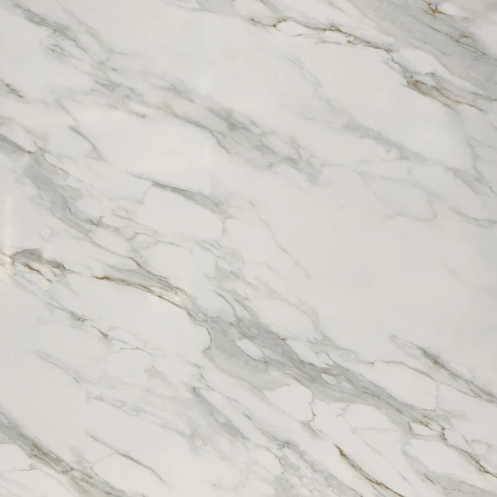
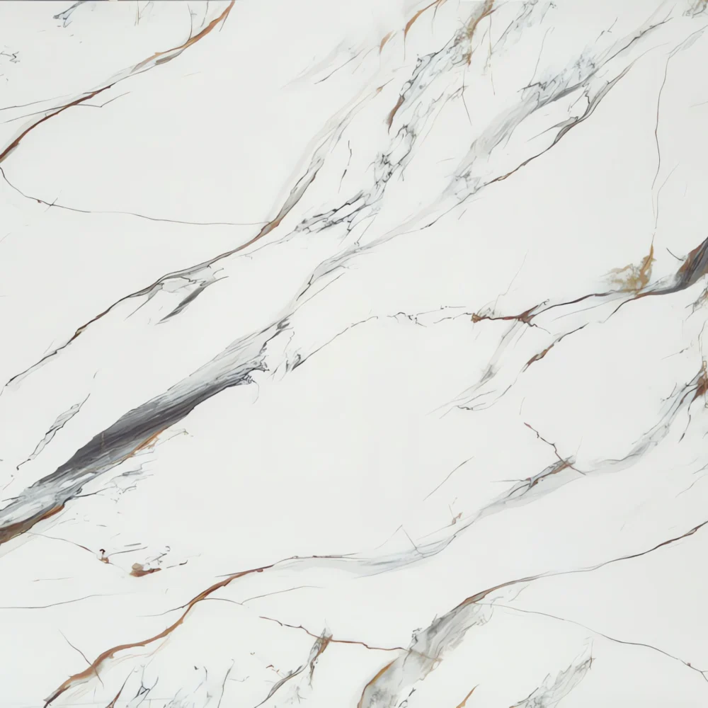
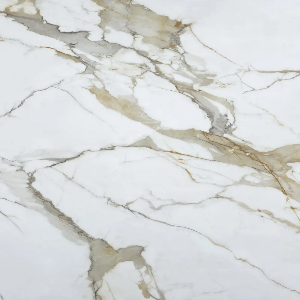
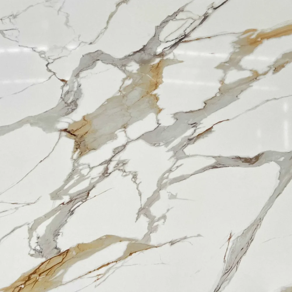
- Calacatta Grey Quartz Countertop GQ-T266 for Wholesale
Calacatta Grey Quartz Countertop GQ-T266 for Wholesale
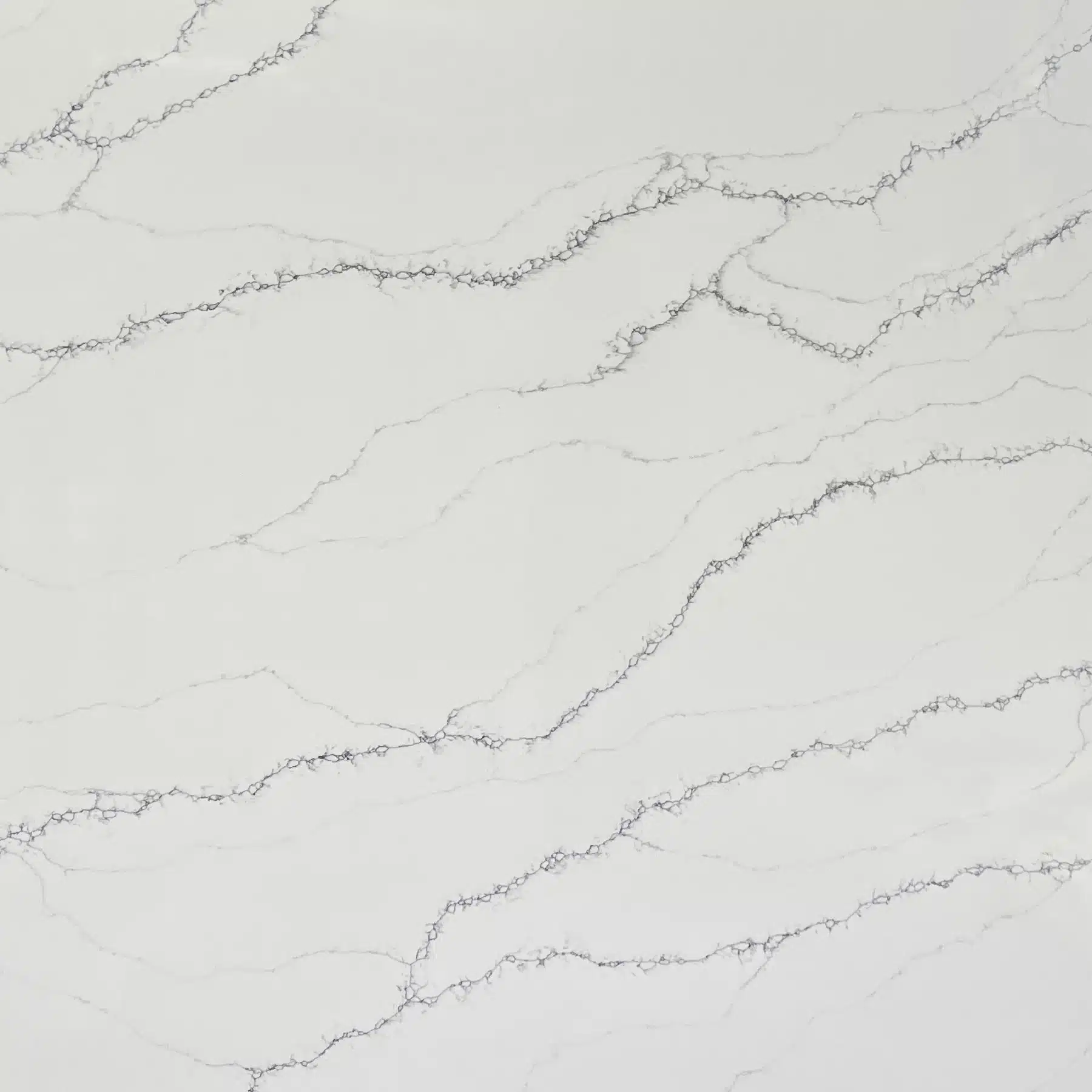
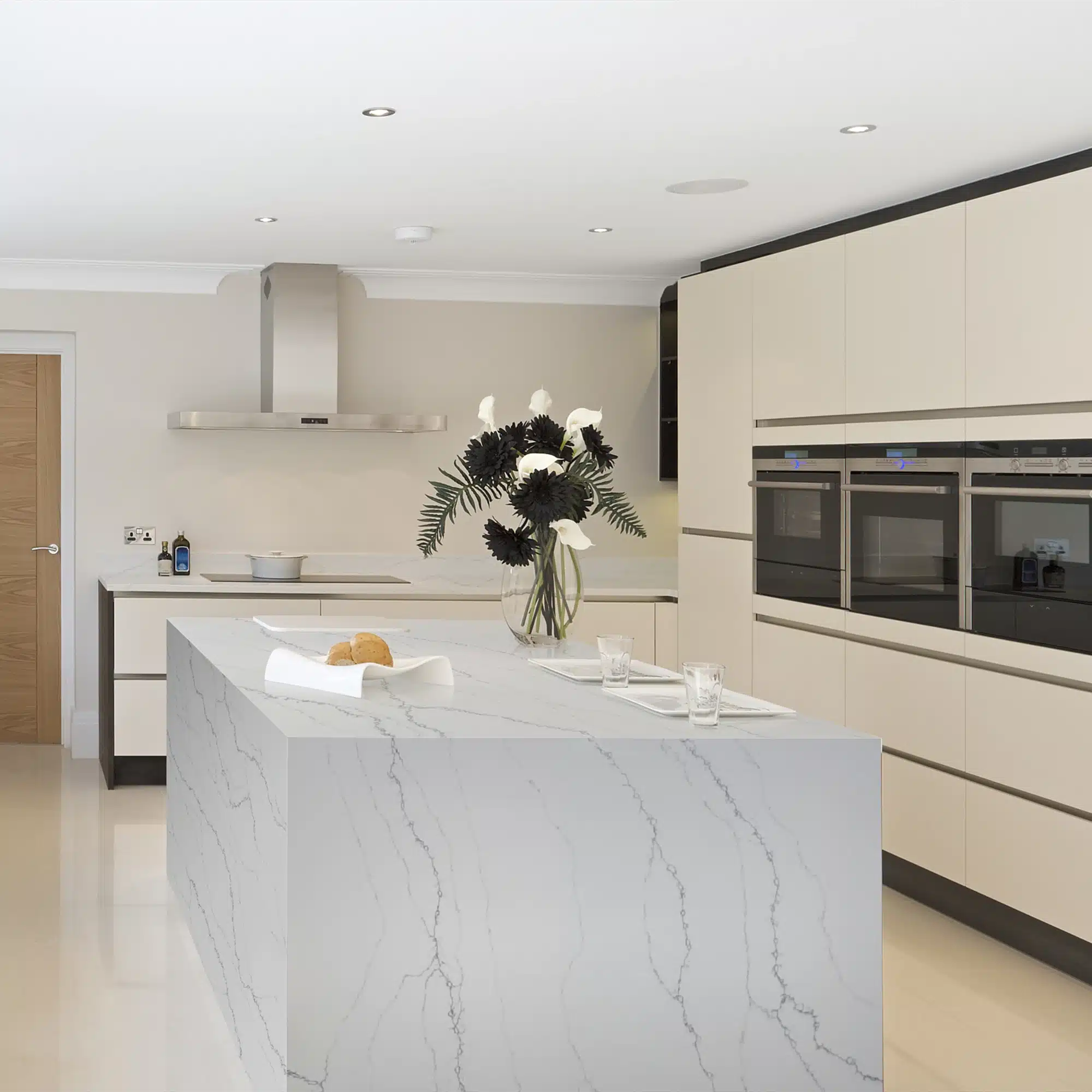
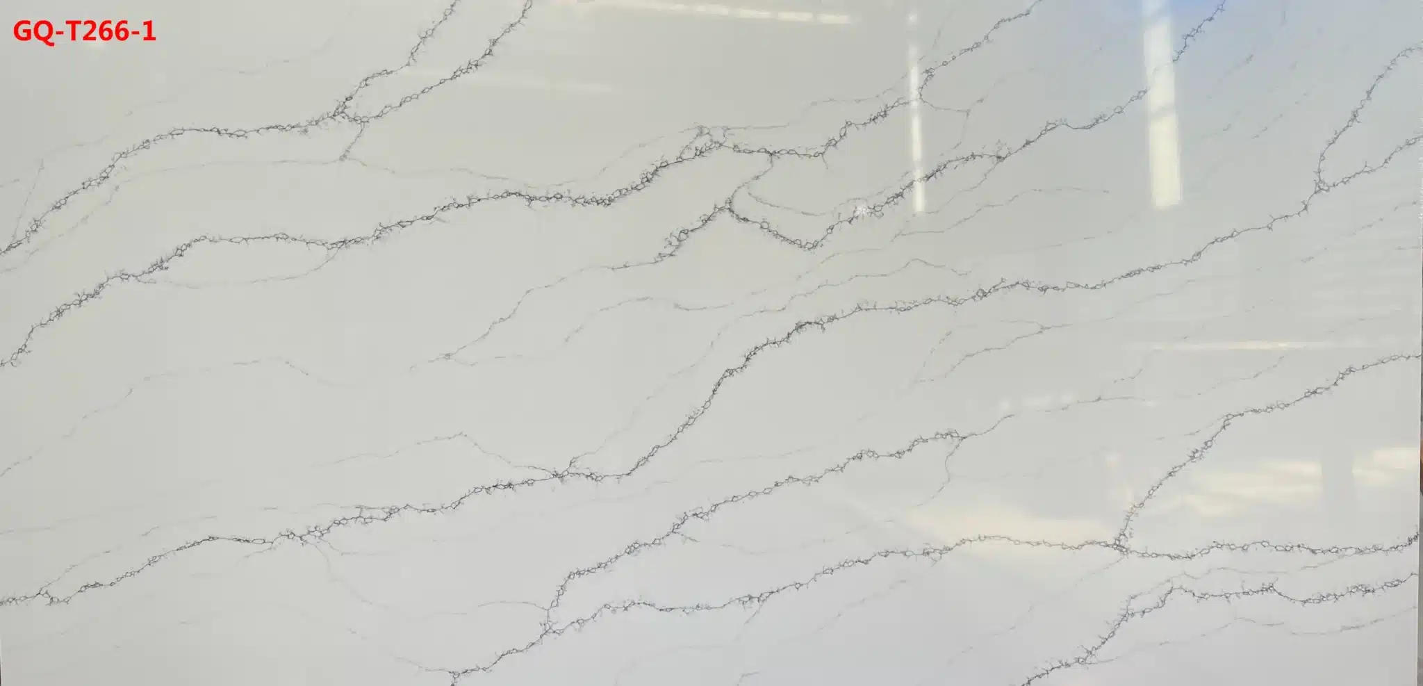
| Primärfarb(en) | Bright Crisp White |
| Akzentfarbe(n) | Medium to Dark Charcoal Grey Veins |
| Handwerk | Regelmäßig |
| Fertigstellungen | Poliert / Geschliffen / Wildleder / Leder |
| Maßgeschneiderte Größe | 138″ × 79″ / 126″ × 63″ / Anpassbar |
| Dicke | 20mm/30mm/Customizable |
| Randstil | Abgeschrägte polierte Kante/2+2cm lamellierte Kante/Gehrungskante |
| Land | Thailand |
| Full Body Quartz | Ja |
| Buchungsübereinstimmung verfügbar | Ja |
| Arbeitsplatten Wohngebiet: Ja Gewerblich: Ja |
| Mauer Wohngebiet: Ja Gewerblich: Ja |
| Bodenbelag Wohngebiet: Ja Gewerblich: Ja |
Beschreibung:
Häufig gestellte Fragen
Has anyone used Calacatta Oro quartz in their kitchen?
Yeah, I’ve installed Calacatta Oro-style quartz in dozens of kitchens over the last five years — not just one brand, but across several engineered quartz manufacturers.
What stands out is how well it holds up in real-world use: no sealing, no etching from coffee or tomato sauce, and consistent performance across both residential and light-commercial projects like boutique cafes.
That bold gold veining on a creamy base delivers a marble-like presence without the maintenance headaches.
But here’s what fabricators don’t always tell clients upfront: vein direction and density shift dramatically between slabs — especially with full-body printed quartz.
If you’re bookmatching or doing large island tops, you’ll need to approve slab layouts before cutting.
And while it reads ‘’ in photos, in practice it can overwhelm smaller spaces or clash with cool-toned cabinets if undertones aren’t matched.
I’ve seen it work best with warm wood tones, matte black fixtures, and soft gray backsplashes — but only after dry-laying three or four options side by side.
GQ-T266, for example, uses Full Body Printed Quartz tech, so the pattern runs through the entire slab — helps with edge consistency and minimizes seam telegraphing on busy veining.
Is Calacatta Oro quartz easy to maintain?
Compared to natural marble, yes — it’s low-maintenance.
But ‘easy’ depends on your finish and habits.
Polished Calacatta Oro quartz shows fingerprints and smudges more than honed or leathered versions, especially on darker gold veins.
Wipe spills quickly — red wine, turmeric, or olive oil left overnight can leave subtle residue that needs mild soap, not just water.
No sealing required, and acidic cleaners won’t etch it, but abrasive pads or bleach-based cleaners will dull the polish over time.
Thermal shock is rarely an issue, but repeated direct contact with hot cookware — especially cast iron or stainless steel pans — can stress the resin binder long-term, particularly near seams or cutouts.
Most installers recommend trivets, even though the spec sheet says ‘heat resistant’.
And here’s the real-world caveat: in high-traffic commercial kitchens, we’ve seen slight yellowing on polished edges after 18–24 months of UV exposure near south-facing windows.
GQ-T266 is made in Thailand on low-silica lines and carries NSF certification, which matters for food prep areas — but that doesn’t change how you clean or protect the surface day-to-day.
What color is calacatta oro quartz?
It’s not a single fixed color — it’s a range.
The base is creamy white, not bright white, with warm undertones that lean toward beige or ivory depending on lighting and slab batch.
The veining is where it gets tricky: gold isn’t just one shade — it runs from pale honey to deep amber, sometimes with faint gray or taupe streaks mixed in.
Some slabs have tight, linear veins; others go wild with branching, painterly strokes.
That variation is intentional — part of the printed quartz design — but it means showroom samples rarely match installed slabs exactly.
In north-facing kitchens, the gold can read muted or even dusty; in southern light, it pops almost metallic.
That’s why dry-lay approval isn’t optional — it’s mandatory.
And keep in mind: edge profiles matter.
A bullnose or ogee on GQ-T266 pulls more warmth from the veins than a simple eased edge.
If your cabinetry has cool grays or blues, test swatches under your actual kitchen lights before locking in.
Warm-toned backsplashes or flooring will anchor the look; cool tones risk making the slab feel disconnected.
What backsplash goes with Calacatta oro quartz?
It depends less on ‘what goes with it’ and more on what you want the eye to do.
Calacatta Oro quartz has strong visual weight — those gold veins draw attention.
So the backsplash should either recede (like a soft white subway tile with warm gray grout) or echo (a brass-inlay mosaic or gold-flecked glass tile).
I avoid high-contrast black tiles unless the space has abundant natural light and tall ceilings — otherwise, it feels top-heavy.
Matte ceramic or textured stone tiles work better than glossy ones because they mute reflection and prevent competing shine with the polished countertop.
Also, consider scale: small mosaics can get lost next to bold veining, while oversized tiles risk flattening the depth.
One thing most contractors overlook: grout color.
Warm-toned grout — think greige or light tan — bridges the gap between cream base and gold veins; cool gray grout creates separation, which can make seams more visible.
GQ-T266’s printed technology means the veins are consistent edge-to-edge, so if you’re matching backsplash veining (like a Calacatta-inspired marble tile), you’ll get closer alignment than with random-natural-stone options.
But always mock it up — lighting, cabinet sheen, and even faucet finish change how the whole composition reads.