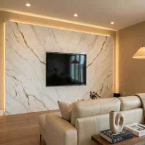




- Start
- Quarz
- Quarzplatten
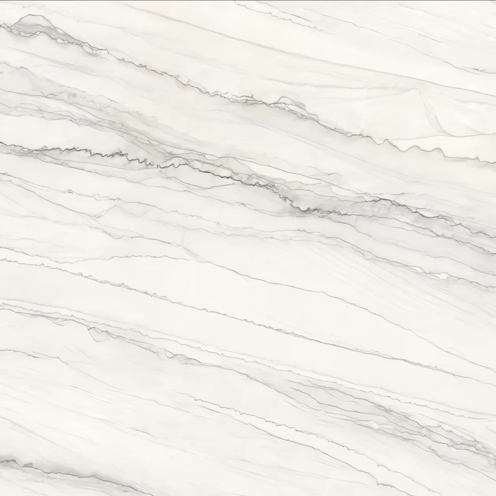
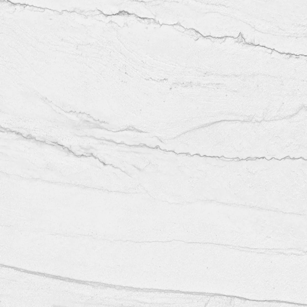
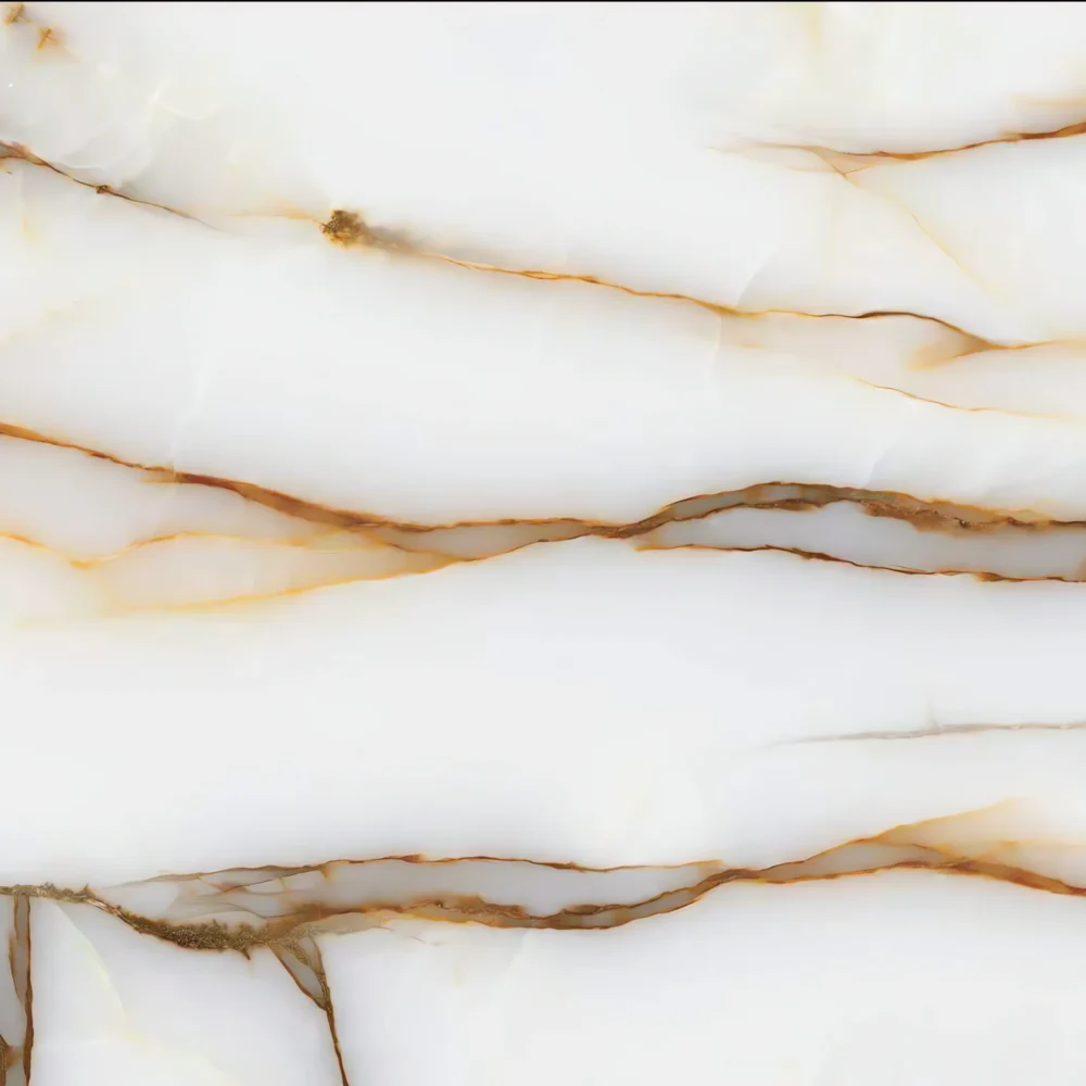
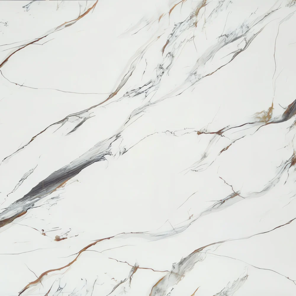
- Calacatta Imperiale Gold Quartz GQ-T377 for Wholesale
Calacatta Imperiale Gold Quartz GQ-T377 for Wholesale

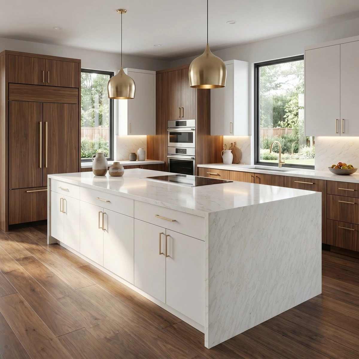

| Primärfarb(en) | Hellweiß |
| Akzentfarbe(n) | Soft Light Gray Veins |
| Handwerk | Regelmäßig |
| Fertigstellungen | Poliert / Geschliffen / Wildleder / Leder |
| Maßgeschneiderte Größe | 138″ × 79″ / 126″ × 63″ / Anpassbar |
| Dicke | 20mm/30mm/Customizable |
| Randstil | Abgeschrägte polierte Kante/2+2cm lamellierte Kante/Gehrungskante |
| Land | Thailand |
| Full Body Quartz | Ja |
| Buchungsübereinstimmung verfügbar | Ja |
| Arbeitsplatten Wohngebiet: Ja Gewerblich: Ja |
| Mauer Wohngebiet: Ja Gewerblich: Ja |
| Bodenbelag Wohngebiet: Ja Gewerblich: Ja |
Beschreibung:
Häufig gestellte Fragen
What is the difference between Calacatta Laza and New Calacatta Laza?
Calacatta Laza and New Calacatta Laza are both Full Body Printed Quartz designs inspired by Calacatta marble—but they’re not just name changes.
The original Calacatta Laza has wider, more fluid veining with higher contrast and subtle tonal shifts across the slab, mimicking how natural stone behaves when bookmatched or dry-laid.
New Calacatta Laza uses updated print registration and pigment control, giving tighter, more linear veins and less batch-to-batch variation.
That makes it easier to match across large commercial jobs or multi-unit residential builds.
Fabricators tell me the original holds up better in high-contrast lighting—less prone to seam telegraphing on busy patterns—while the 'New' version gives cleaner continuity for long island runs or seamless backsplashes.
Neither stains or etches, but polished versions of either will show smudges faster than honed or matte finishes.
If you're specifying for a hospitality project where consistency matters more than character, go New.
For a custom home where clients want that organic marble feel, stick with the original.
And always verify the slab batch before cutting—GQ’s Thailand factory runs both lines on separate dedicated lines, so mixing batches mid-project can throw off the visual rhythm.
Does light colored quartz stain easily?
Light-colored quartz doesn’t stain—not in the way granite or marble does—because it’s non-porous and doesn’t absorb liquids.
But here’s what actually happens in real kitchens: water spots, oil film, coffee residue, and even dried lemon juice leave visible marks on polished white or beige slabs, especially under bright LED lighting.
It’s not staining—it’s surface residue clinging to micro-texture or polish.
Installers see this daily: a client leaves a glass of wine overnight, wipes it once, then wonders why there’s a faint ring.
That’s not absorption—it’s dried tannin sitting on top.
Also, some lower-silica quartz formulations use UV-sensitive resins; prolonged sun exposure near windows can cause very slight yellowing over years—more noticeable on ultra-light tones like pure white.
GQ’s low-silica production lines use stabilized resins, but even then, avoid bleach-based cleaners—they break down binders over time.
Light quartz hides scratches better than dark, and fingerprints vanish faster on honed finishes.
Just don’t treat it like glass—wipe spills within minutes, not hours, and skip abrasive pads on polished surfaces.
How do I choose a quartz countertop color?
Start with your cabinets and lighting—not the showroom sample.
Light oak or white shaker cabinets?
Warm-toned whites like Calacatta Laza or Bianco Drift soften the contrast without going sterile.
Dark walnut or navy cabinets?
You’ve got room for drama—go with deeper veining or soft gray undertones, not stark white.
Gray cabinets?
That’s where things get tricky—cool grays need warm quartz (think gold-veined) to avoid looking flat; warm grays pair best with beige-based whites.
Always test full-size samples *in the space*, at different times of day.
Morning light brings out blue undertones; afternoon sun highlights golds and creams.
And don’t ignore scale: busy veining gets lost on small countertops but sings on 126-inch slabs.
For waterfall edges or bookmatching, insist on Full Body Printed Quartz—GQ’s Thailand facility prints all the way through, so cut edges won’t show a solid core underneath.
Skip the 'just one slab' order if you’re doing a large island—slab variation is real, and dry-laying the exact slabs you’ll install prevents last-minute panic.
What is the most popular color of quartz?
Right now, warm white quartz with soft gray or gold veining leads the market—Calacatta Laza, Bianco Drift, Eternal Calacatta.
Not because it’s trendy, but because it works: hides minor scratches, reflects light well in tight spaces, and bridges design styles from farmhouse to modern.
But popularity shifts fast—and what’s selling isn’t always what’s performing best long-term.
In commercial jobs, installers report fewer callbacks on light greys and soft beiges—they’re forgiving under harsh lighting and don’t show dust or water spots as much as bright white.
Solid charcoal and deep slate are climbing too, especially in condos where clients want contrast against light cabinetry.
What’s fading?
Ultra-cool whites with sharp black veining—they look great in photos but often clash with warm wood floors or LED fixtures in real rooms.
GQ’s Thailand factory runs these patterns on dedicated lines, so availability stays steady—but lead time depends on slab size.
Super jumbo (138" x 79") orders for Calacatta Laza move slower than standard sizes, especially during Q4.
Bottom line: pick for function first—light reflection, seam visibility, and how it reads next to your tile or flooring—not just what’s trending online.