



- Start
- Quarz
- Quarzplatten
- Dark Concrete Gray Quartz Surface GQ-T120 for Wholesale
Dark Concrete Gray Quartz Surface GQ-T120 for Wholesale
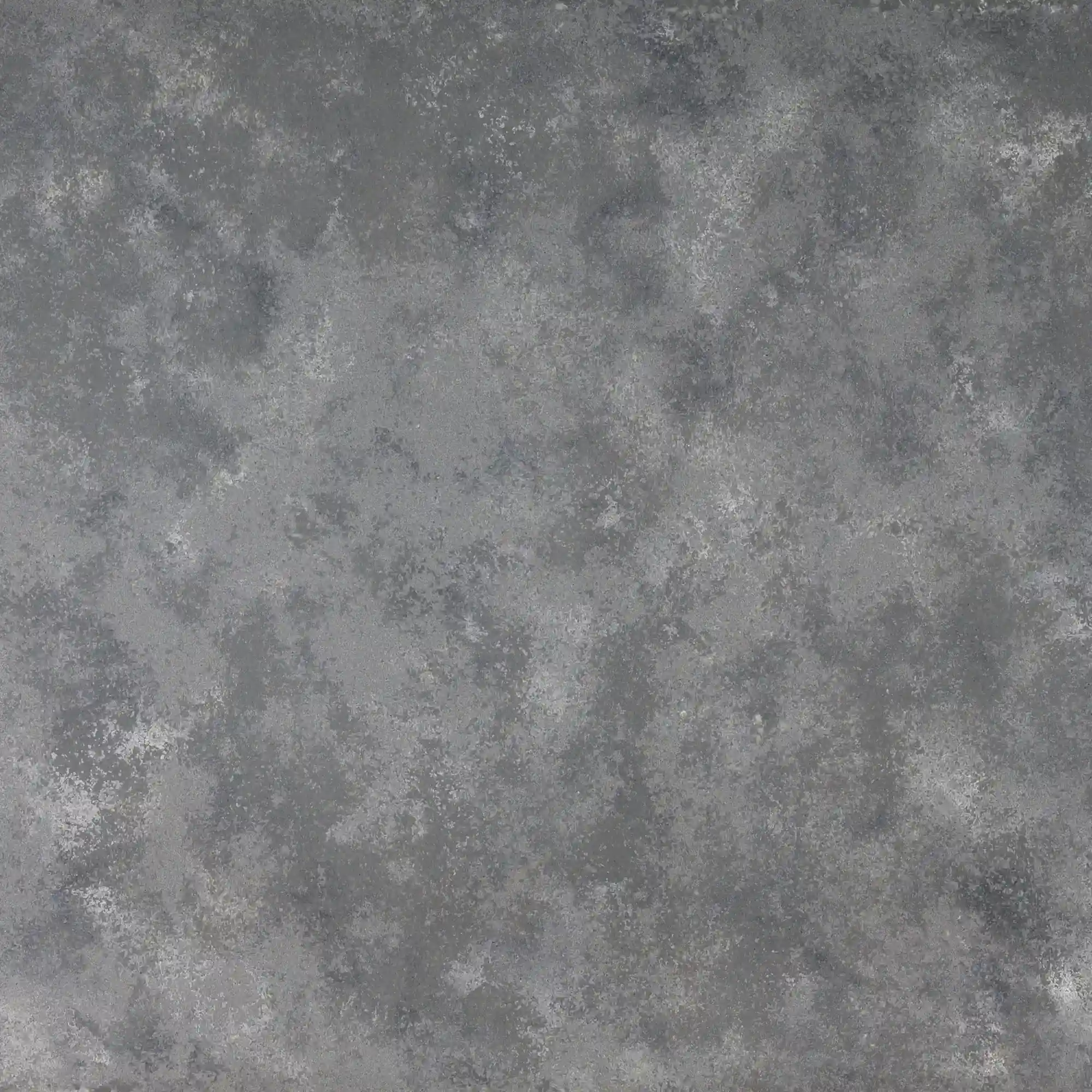
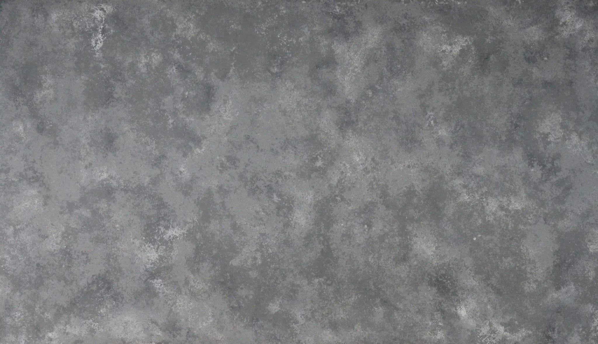
| Primärfarb(en) | Medium Grey |
| Akzentfarbe(n) | Light Grey Mottled Cloud Texture + Darker Grey Patch |
| Handwerk | Regelmäßig |
| Fertigstellungen | Poliert / Geschliffen / Wildleder / Leder |
| Maßgeschneiderte Größe | 138″ × 79″ / 126″ × 63″ / Anpassbar |
| Dicke | 20mm/30mm/Customizable |
| Randstil | Abgeschrägte polierte Kante/2+2cm lamellierte Kante/Gehrungskante |
| Land | Thailand |
| Full Body Quartz | Ja |
| Buchungsübereinstimmung verfügbar | Ja |
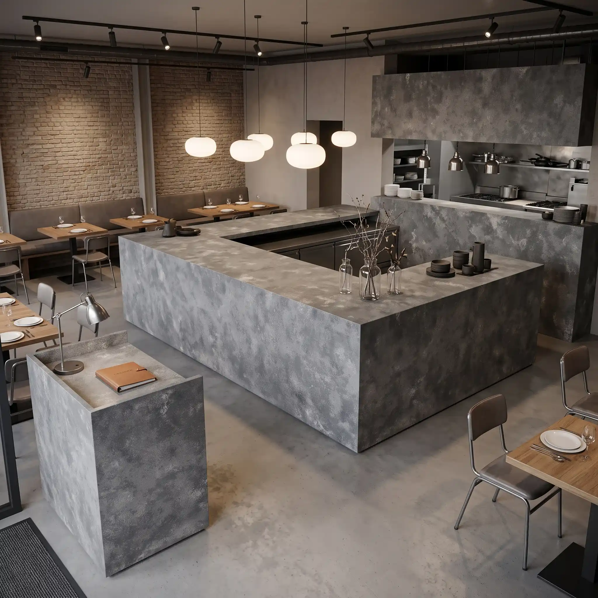
| Arbeitsplatten Wohngebiet: Ja Gewerblich: Ja |
| Mauer Wohngebiet: Ja Gewerblich: Ja |
| Bodenbelag Wohngebiet: Ja Gewerblich: Ja |
Beschreibung:
Häufig gestellte Fragen
What is more expensive, travertine or travertine look quartz?
There isn’t a fixed answer—pricing depends heavily on grade, finish, origin, and project requirements.
In general, natural travertine is often more affordable at entry level because it is a quarried material. However, its cost can rise significantly depending on selection quality, block consistency, thickness, surface treatment (honed, filled, brushed), and quarry source. High-grade, clean, or more uniform travertine can quickly move into premium pricing.
Engineered quartz, on the other hand, has a more structured cost base. It includes raw materials like quartz aggregates, resins, pigments, and controlled industrial production. Advanced designs—such as full-body printed quartz or travertine-look quartz—add additional manufacturing complexity, which can place these products at a higher price point than basic natural stone.
For example, travertine-look quartz developed by factories like Grand Quartz Tech is designed to replicate layered stone textures with high consistency across slabs. This level of pattern control and batch uniformity is especially valuable in large commercial projects, where visual continuity matters more than natural variation.
In real-world projects, you’ll see overlap: some commercial-grade travertine can be cost-competitive with engineered quartz, while premium quartz products with advanced printing technology can exceed the price of standard natural stone.
Beyond material cost, factors like freight, lead time, installation efficiency, and long-term maintenance often influence the final decision. In many commercial and hospitality applications, quartz is ultimately preferred because it offers higher consistency, lower maintenance, and better durability—even if the upfront cost is higher.
How to Check Quartz Countertop Quality Like a Pro | Expert ?
Installers usually recommend checking for seam visibility first — if the pattern repeats cleanly across joints, it’s likely full-body printed, which means better consistency.
Look closely at the edge of the slab; if you see a resin-rich layer or a thin white line, it’s probably surface-printed, which can show seams more easily.
A quality quartz slab should feel dense and uniform — tap it lightly; a hollow sound might mean poor compaction.
Check for color variation across the slab; if one end is darker or has a different texture, it could be due to uneven mixing during production.
Also, examine the backside: a consistent color throughout means full-body printing, which prevents veining from fading at edges or under thin cuts.
For finish, a polished surface should be smooth without scratches or swirls.
Honed or matte finishes can hide imperfections but may show fingerprints more.
At Grand Quartz Tech, we use 3I tech and full-body printing to ensure the slab looks the same from edge to edge — important for waterfall edges or custom shapes.
Always request a sample before bulk ordering, especially for large commercial projects where consistency matters.
And never skip dry-lay approval; even slight pattern shifts can ruin the look in a long run.
What are the three levels of quartz?
In the stone industry, quartz is often loosely grouped into three practical levels—A, B, and sometimes C—based on quality, design complexity, and application rather than a strict global standard.
Level A (Premium / High-end quartz)
This is the top tier. It includes slabs with strong design control, high color consistency, and advanced surface technology such as full-body printing or deep vein structures. Patterns are usually more natural-looking and carefully engineered for large commercial or luxury residential projects where visual continuity is critical.
Level B (Standard commercial quartz)
This is the most commonly used category. It offers stable quality and consistent colors, but the design is simpler compared to Level A. You’ll typically see solid colors, light marble looks, or basic veining patterns. It is widely used in residential kitchens, rental projects, and mid-range commercial applications.
Level C (Entry-level / economy quartz)
This level focuses on cost efficiency. Patterns are usually simpler, with less visual depth and lower design refinement. Performance can still meet basic countertop requirements, but it’s generally used for budget-sensitive projects where appearance and advanced detailing are not the main priority.
In practice, the distinction between A, B, and C quartz is not just about durability—it’s more about design complexity, visual realism, and project positioning.
What is the prettiest quartz?
Homeowners often report after a year or two that the ‘prettiest’ quartz isn’t always the one with the most sparkle or the darkest veins — it’s the one that fits the space and lighting.
A polished black quartz with high contrast can look under LED lights, but it shows fingerprints and smudges like crazy.
Crystalline gray or onyx-look quartz with soft veining tends to age better in kitchens because it hides daily wear.
In high-traffic commercial spaces, people gravitate toward neutral tones — warm whites, soft grays, or light browns — because they’re less likely to show stains or water marks.
That said, some designers love bold patterns, like deep charcoal with gold flecks or full-body printed marble veining.
The prettiest quartz is subjective, but the best-performing ones are usually those with full-body printing and consistent tone.
At Grand Quartz Tech, we’ve found that our Crystalline Gray Onyx Quartz (GQ-T120) gets strong feedback for its balance of depth and subtlety — it doesn’t overwhelm the room but still adds texture.
It’s also durable and handles UV exposure well, which matters if you’re near windows or in southern climates.
Ultimately, beauty is in the details: how the pattern aligns, how the edge reflects light, and whether it complements the cabinets and backsplash.
-1000x1000.webp)