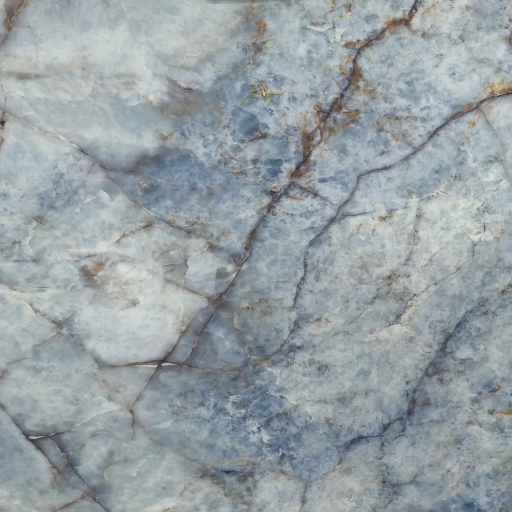
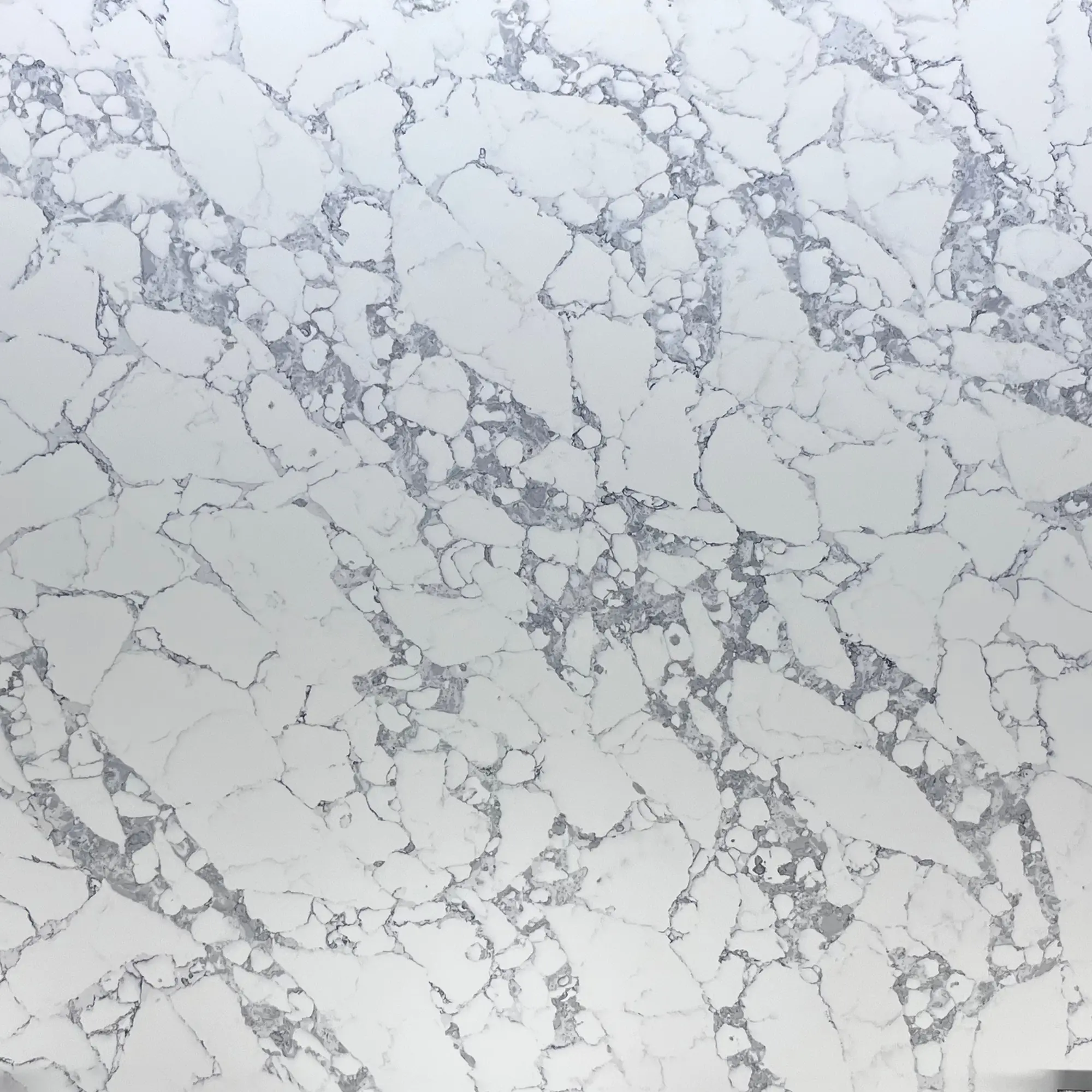
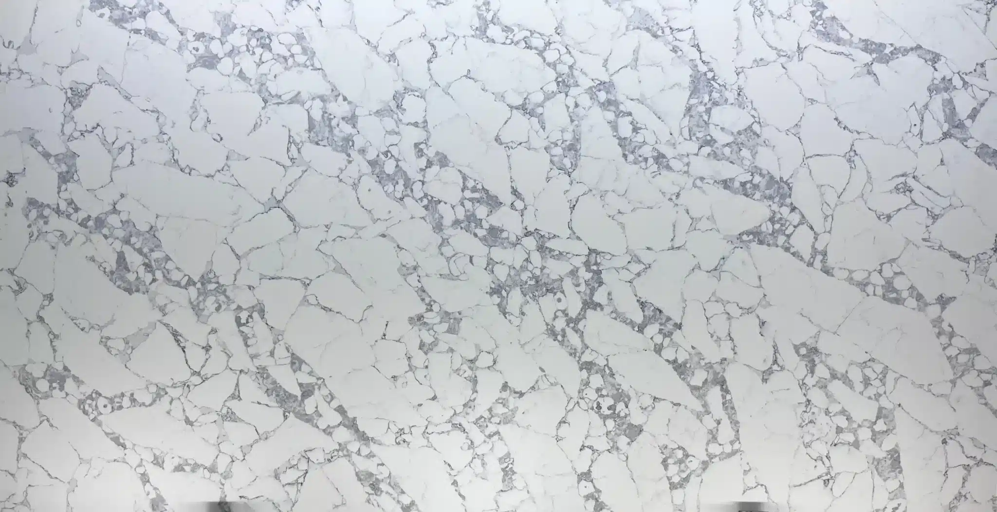
| Primärfarb(en) | Bright Cool White |
| Akzentfarbe(n) | Medium Silver Grey Mosaic Cloud |
| Handwerk | Regelmäßig |
| Fertigstellungen | Poliert / Geschliffen / Wildleder / Leder |
| Maßgeschneiderte Größe | 138″ × 79″ / 126″ × 63″ / Anpassbar |
| Dicke | 20mm/30mm/Customizable |
| Randstil | Abgeschrägte polierte Kante/2+2cm lamellierte Kante/Gehrungskante |
| Land | Thailand |
| Full Body Quartz | Ja |
| Buchungsübereinstimmung verfügbar | Ja |
| Arbeitsplatten Wohngebiet: Ja Gewerblich: Ja |
| Mauer Wohngebiet: Ja Gewerblich: Ja |
| Bodenbelag Wohngebiet: Ja Gewerblich: Ja |
Gray countertops are still relevant, but the trend has shifted. A few years ago, charcoal and dark gray quartz was everywhere, but now it’s more about balance and warmth. Today, light to medium gray tones—especially those with subtle veining or warm undertones—are back in favor because they pair well with white, wood, or warm white cabinets. Dark gray can still work, but it’s more niche and often reserved for modern or industrial kitchens. The key is avoiding a cold, sterile look—add warmth with wooden elements, brass fixtures, or a warm backsplash. Also, gray isn’t going away completely, but it’s no longer the dominant choice like it was. If you’re choosing gray, lean toward ones with gold, beige, or soft white flecks to keep it feeling current. Bottom line: gray is still in style, but not as a one-size-fits-all solution. It’s about picking the right shade and balancing it with other materials.
There’s no single ‘prettiest’ gray—it depends on your kitchen’s overall palette. But if we’re talking about the most versatile and visually pleasing, it’s a warm medium gray with subtle undertones of beige, taupe, or soft gold. Think of shades like ‘Warm Gray’ or ‘Stone Gray’ in quartz—these have enough depth to feel grounded but not so dark they make the space feel cold. They work beautifully with white or light wood cabinets, and they don’t clash with brass or matte black fixtures. Avoid cool grays with blue or green undertones unless you’re going for a Scandinavian or industrial vibe—they can make a room feel chilly or institutional. The best gray countertops have slight variation—like veining or speckling—that adds texture and interest without being overwhelming. If you’re unsure, go for a sample and test it under your kitchen lighting. The right gray should feel balanced, not dominant.
Ihr vertrauenswürdiger Quarz
Manufaktur seit 1989.
Unser Team ist rund um die Uhr verfügbar.





-1000x1000.webp)