- Home
- Quartz
- Quartz Slabs
- White Macaubas Quartz Countertops GQ-T462
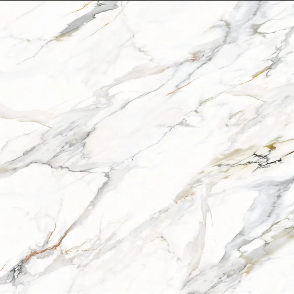
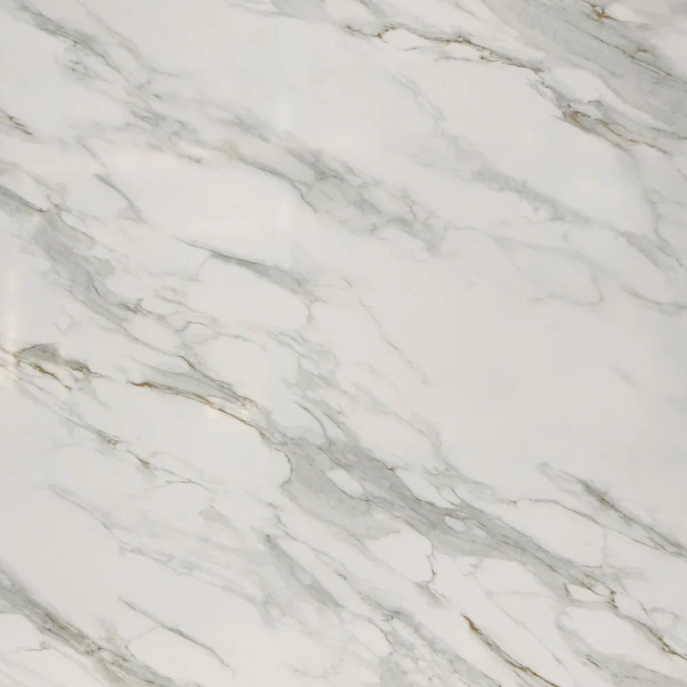
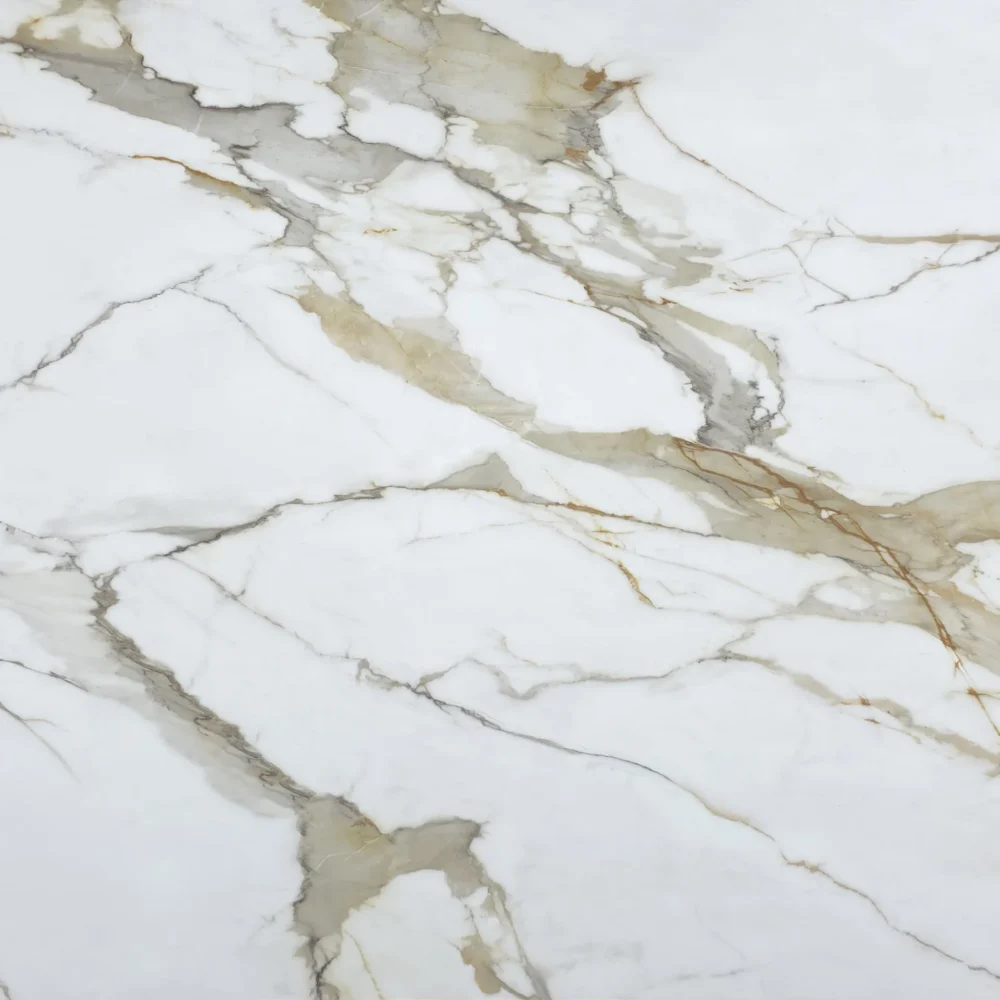
White Macaubas Quartz Countertops GQ-T462


| Primary Color (s) | Pale Off-White |
| ACCENT COLOR (S) | Soft Taupe Beige + Subtle White Streak |
| Craft | Regular |
| Finishes | Polished / Honed / Suede / Leathered |
| Customized Size | 138″× 79″ / 126″× 63″ / Customizable |
| Thickness | 30mm/Customizable |
| Edge Style | Eased polished edge/2+2cm laminated edge/Mitred edge |
| Country | Thailand |
| Variations | Medium |
| Full Body Printed Quartz | Yes |
| Bookmatch Available | Yes |
| Countertops Residential: Yes Commercial: Yes |
| Wall Residential: Yes Commercial: Yes |
| Flooring Residential: Yes Commercial: Yes |
Description:
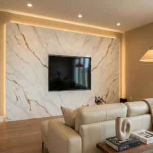
From surface detail to room mood: GQ-T462 begins with a softened off-white field that leans gently into light warm gray, carrying pale beige and greige undertones beneath the surface. The base has a quiet clouded depth rather than a flat painted-white appearance, like thin mineral layers seen through a soft morning haze. Across this calm ground, gray, taupe, and muted beige veins move mainly in long horizontal runs, with slight diagonal shifts that keep the pattern natural. Some lines are fine and lightly broken; others gain charcoal-gray edges or small warm brown notes, adding definition without creating harsh contrast. The overall reading is smooth, sedimentary, and quietly refined—more quartzite-inspired layering than dramatic marble veining.
Where it fits in American design: This slab is especially useful when a project needs a light countertop that feels warm, organized, and easy to coordinate. In a transitional American kitchen, GQ-T462 works well with white oak cabinetry, brushed nickel hardware, pale wood flooring, and a simple warm-white backsplash; the linear taupe-gray movement visually stretches the island while keeping the palette relaxed. For a modern farmhouse kitchen, it can be paired with warm white shaker cabinets, a muted gray island, nickel or black fixtures, apron-front sinks, and woven stools, giving the room a natural stone rhythm without making the countertop too busy. In a coastal classic master bathroom, the same surface suits double vanities, tub surrounds, shower ledges, and low backsplashes beside soft taupe cabinetry, a freestanding tub, linen textures, and polished or brushed nickel fittings, creating a bright but restful spa atmosphere.
Case-inspired framing: Imagine a 675-square-foot boutique residential flooring and window-shade consultation studio with a front welcome counter, one sample-review table, a compact refreshment area, and a client powder room. The designer specifies GQ-T462 for the transaction counter, the coffee ledge, and the vanity top to keep the small showroom visually connected from entry to restroom. During layout planning, the fabricator runs the longer horizontal veining across the face of the main counter so the surface reads like a quiet visual guide toward the material display wall. More open off-white areas are reserved for the working zones where tablets, finish boards, shade books, and quote folders need a clean background. Under warm-neutral 3500K lighting, the slab gives a soft reflected brightness instead of a sharp glare, while white oak drawers, warm white wall panels, brushed nickel pulls, muted gray display frames, taupe upholstery, and cream paint all connect back to its balanced undertones. The completed space feels calm, professional, and residentially familiar—an easy reference for distributors, builders, and designers specifying subtle light quartz for kitchens, vanities, islands, laundry counters, boutique reception desks, and small hospitality interiors.
Frequently asked questions
Should I choose the white quartz countertop or the one with texture?
If you cook a lot or hate seeing every crumb, textured pattern is usually the more forgiving choice. Plain white and soft marble-look quartz can look clean in a showroom, but homeowners often report after a year or two that coffee rings, hard water haze, metal pan marks, and tiny chips at the sink are easier to notice. Textured designs hide daily wear better, especially in rentals, busy family kitchens, and islands where overhead lighting hits at a low angle.
The tradeoff lies in overall style. Some heavily textured styles give off a more basic kitchen vibe, while veined white quartz delivers a softer, more natural aesthetic when installed properly. Most fabricators suggest viewing full slabs or large samples instead of small cut pieces to see the actual visual effect clearly.
It is also necessary to confirm the position of splicing joints in advance. For marble-style and flowing vein patterns, improper joint positions will be very obvious if perfect vein matching and color matching cannot be achieved. Choose textured quartz if you prefer easier daily maintenance; pick pure white styles if you pursue a neat and bright look, while accepting that it is more prone to showing slight traces of use.
How to clean white quartz countertops - what are the best and safest methods? Contradictory answers online?
The safest routine is boring, and that’s why the internet makes it confusing. In real-world kitchens, white quartz usually needs warm water, a small amount of dish soap, and a clean microfiber cloth more than it needs specialty sprays.
The trick is rinsing and drying; a frequent complaint we hear is “my quartz looks cloudy,” and it’s often soap film or hard water residue, not damage. For greasy areas, 70% isopropyl alcohol works well if you wipe it off and don’t let it pool around seams. For dried food, soften it first, then use a plastic scraper. Avoid abrasive pads, powdered cleansers, harsh degreasers, oven cleaner, paint stripper, and repeated vinegar cleaning. Vinegar may not ruin a slab instantly, but installers usually recommend keeping acids off the surface because resins and some finishes can dull unevenly.
Honed and matte finishes show fingerprints and wipe marks more than polished quartz, so they may need more buffing with a dry microfiber.
Always check the actual brand care sheet, because warranties can be picky.