



- Start
- Quarz
- Quarzplatten
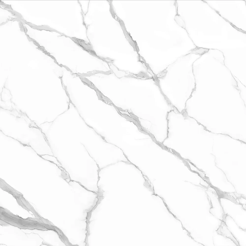
- Calacatta Laza Marble Look Quartz Slabs GQ-T283
Calacatta Laza Marble Look Quartz Slabs GQ-T283
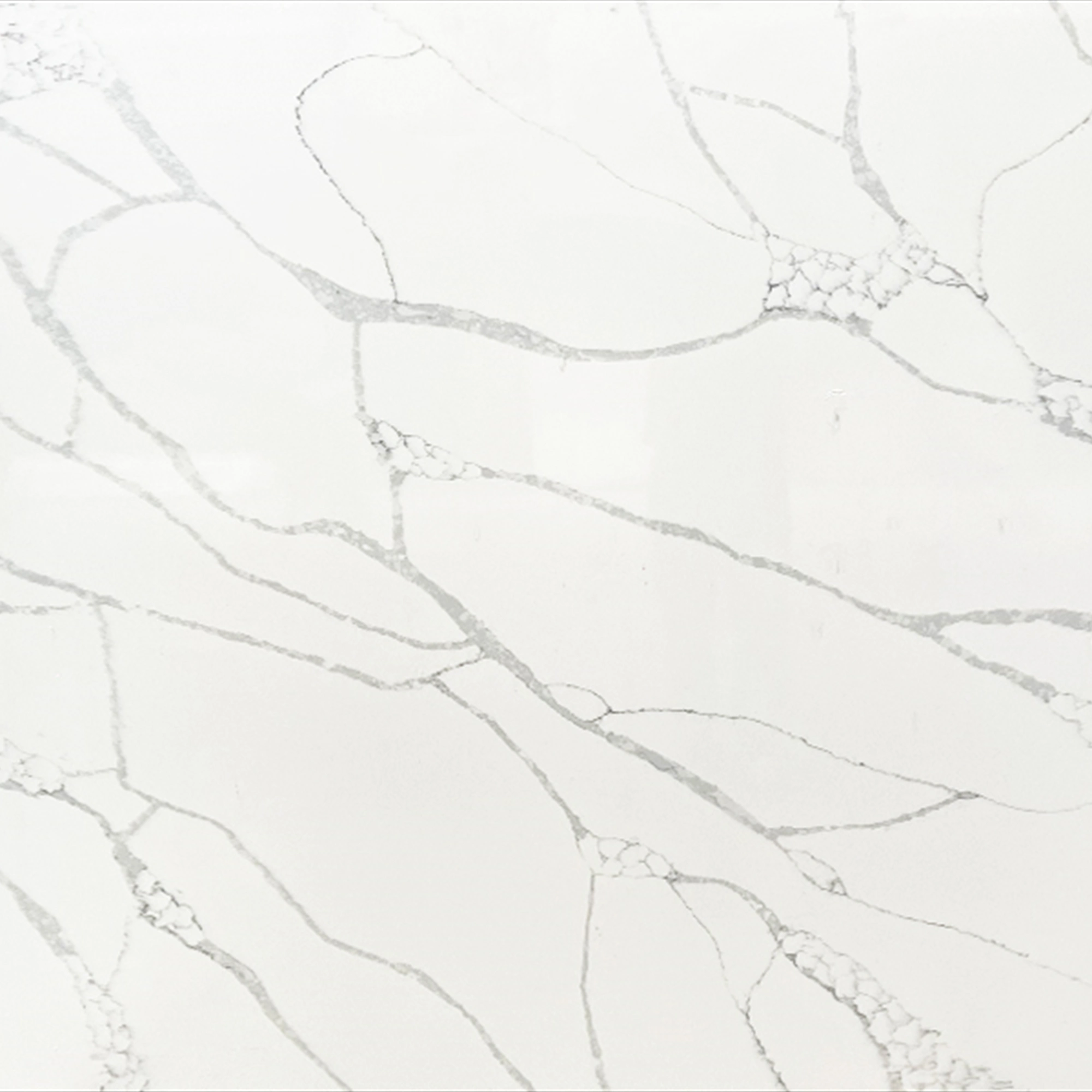
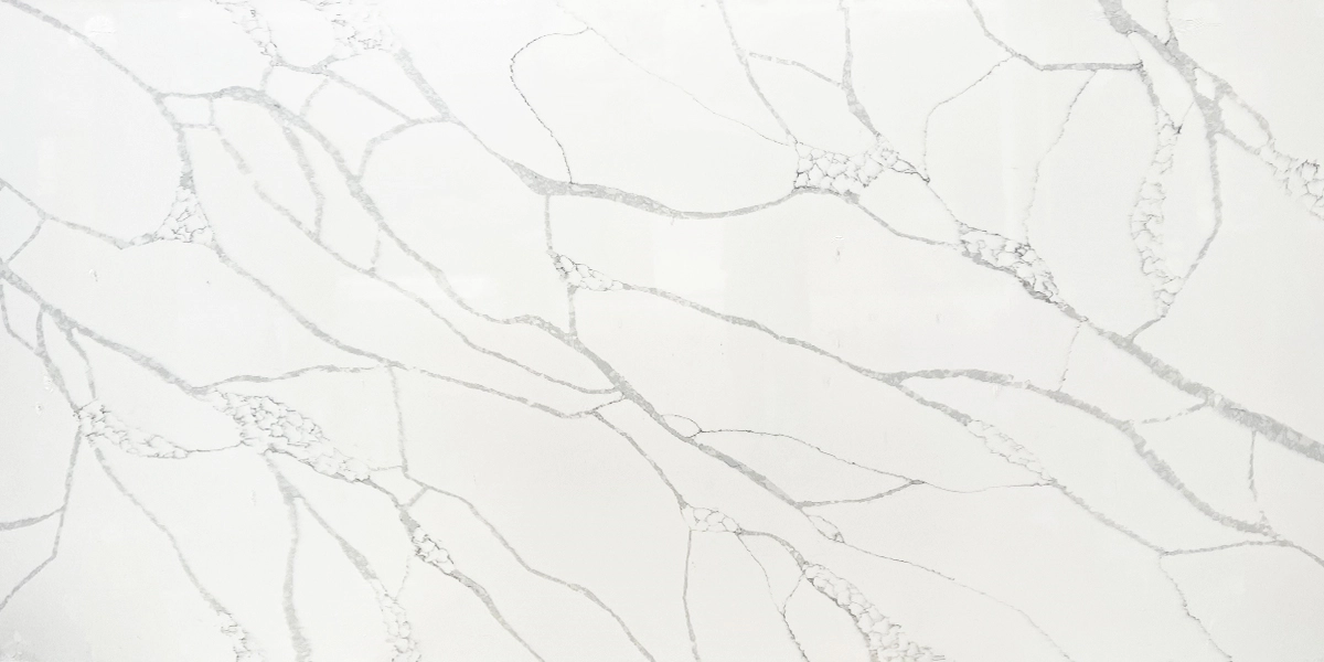
| Primärfarb(en) | Hellweiß |
| Akzentfarbe(n) | Light to Medium Grey Veins |
| Handwerk | Regelmäßig |
| Fertigstellungen | Poliert / Geschliffen / Wildleder / Leder |
| Maßgeschneiderte Größe | 138″ × 79″ / 126″ × 63″ / Anpassbar |
| Dicke | 20mm/30mm/Customizable |
| Randstil | Abgeschrägte polierte Kante/2+2cm lamellierte Kante/Gehrungskante |
| Land | Thailand |
| Full Body Quartz | Ja |
| Buchungsübereinstimmung verfügbar | Ja |
| Arbeitsplatten Wohngebiet: Ja Gewerblich: Ja |
| Mauer Wohngebiet: Ja Gewerblich: Ja |
| Bodenbelag Wohngebiet: Ja Gewerblich: Ja |
Beschreibung:
Häufig gestellte Fragen
How to Choose High-Performance Calacatta Quartz for ?
High-performance Calacatta quartz isn’t about the name—it’s about how it holds up under real jobsite conditions.
Most fabricators will tell you: consistency in density and thickness matters more than veining drama.
If you’re doing a commercial kitchen or a high-volume residential build, look for slabs with tight batch control—especially on thickness tolerance (±0.5mm is ideal) and resin distribution.
Polished finishes show smudges more on darker veins, so consider honed or lightly textured options if maintenance is a concern on-site.
Full-body printed quartz—like what Grand Quartz Tech runs on its dedicated lines—means the pattern goes all the way through, so cut edges and seams don’t ghost or mismatch.
Jumbo slabs (138″ x 79″) reduce seam count, but only if your shop has proper handling gear—thin or warped edges on oversized slabs can cause lippage.
Always dry-lay full slabs before cutting; veining alignment shifts between batches, and lighting in a warehouse doesn’t match your job site.
Skip surface-printed slabs—they chip at edges, fade under UV, and telegraph seams badly.
Which countertop is better, calacatta ultra quartz or ?
‘Better’ depends on your fabrication workflow and client expectations—not marketing names.
Calacatta Ultra–style quartz tends to have higher contrast veining, which looks dramatic in large, well-lit spaces but can feel overwhelming in smaller kitchens or under recessed LED lighting.
Installers usually recommend it for open-concept layouts where the pattern reads from a distance.
But in practice, that contrast makes seam alignment harder—especially on bookmatched islands—and veining repetition shows faster in long runs.
Some batches run slightly softer in resin content, so edge polishing takes longer and chips easier during CNC routing.
If your shop does a lot of waterfall edges or curved details, a lower-contrast Calacatta—like one with softer gray-gold veining—gives more layout flexibility and hides minor fabrication inconsistencies.
Grand Quartz Tech’s printed quartz lines let you adjust veining intensity per project, so you’re not locked into one ‘Ultra’ profile.
Bottom line: choose based on how it cuts, polishes, and lays—not how it looks in a showroom photo.
What are the pros and cons of calacatta laza quartz?
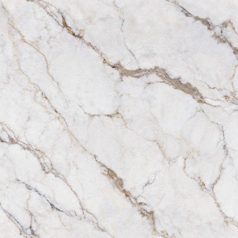
Calacatta Laza–style quartz delivers warm, creamy tones with fine gold-gray veining—great for traditional or transitional kitchens where you want marble character without the upkeep.
Pros: it’s forgiving on seam placement because the veining is subtle and evenly distributed, and it books well across large surfaces.
Fabricators report fewer edge chipping issues during CNC profiling compared to high-contrast variants.
Cons: the gold undertones shift under cool white LEDs or north-facing light—some slabs read beige, others yellowish.
Batch-to-batch variation happens, especially if production lines aren’t tightly controlled; that’s why dry-lay approval is non-negotiable.
Calacatta laza quartz backsplash options?
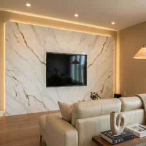
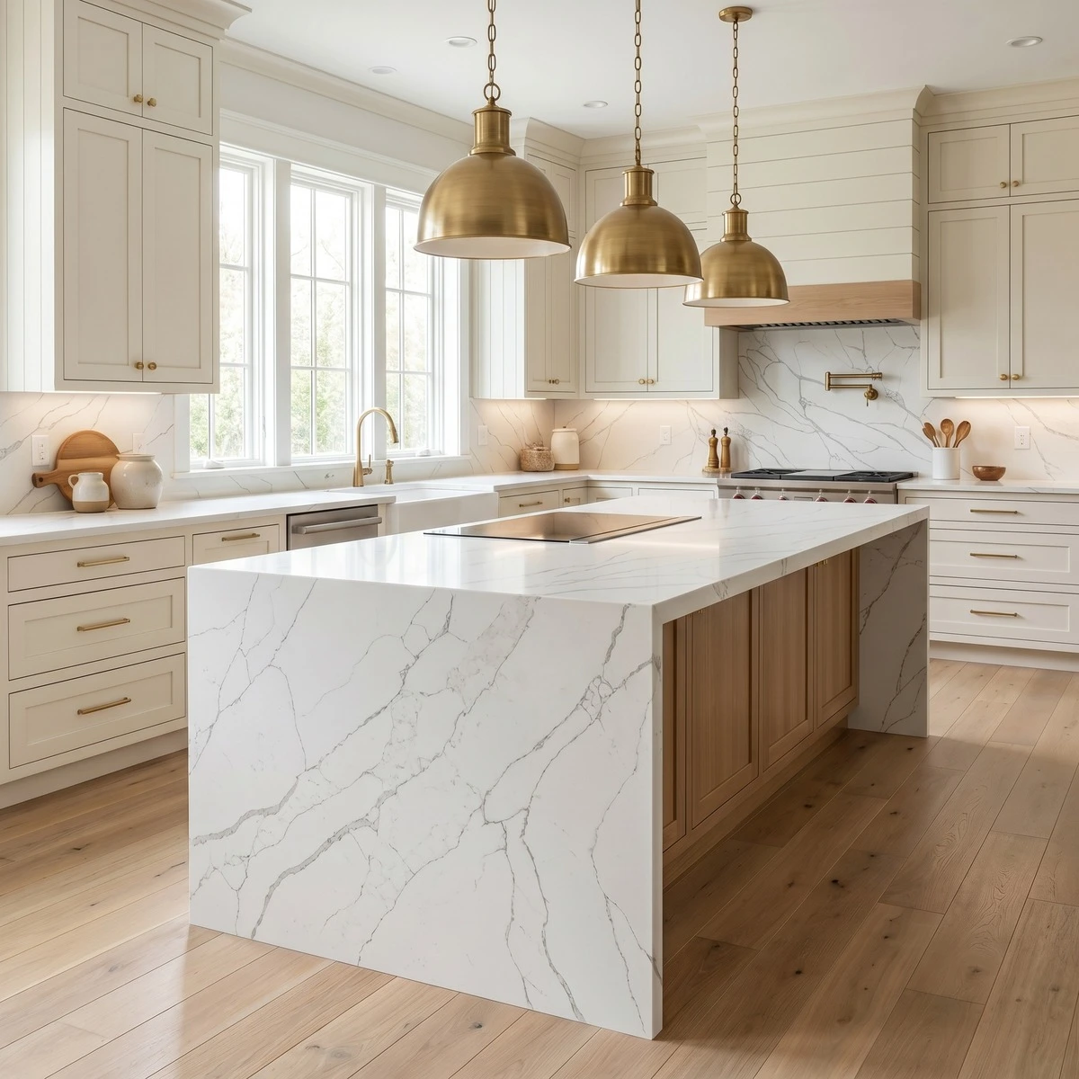
For Calacatta Laza–style quartz backsplashes, full-slab vertical panels are the cleanest option—no grout lines, no pattern breaks—but they demand precise wall prep and strong adhesive coverage.
Avoid matte or leathered textures unless the client specifically wants that tactile contrast—those finishes mute the gold tones and make cleaning harder behind sinks.
Bookmatching works best behind the range or cooktop, but only if you’ve dry-laid the full slab first—vein flow changes between batches, and mismatched joints look worse on vertical surfaces than countertops.
Use warm gray or off-white grout; black or charcoal grout fights the gold undertones and creates visual noise.
Under-cabinet LED strips help, but avoid placing them too close to the slab—heat buildup over time can affect resin stability.
And remember: quartz expands/contracts differently than tile backer board, so leave proper expansion gaps at corners and transitions.
-1000x1000.webp)