- Home
- Quartz
- Quartz Slabs
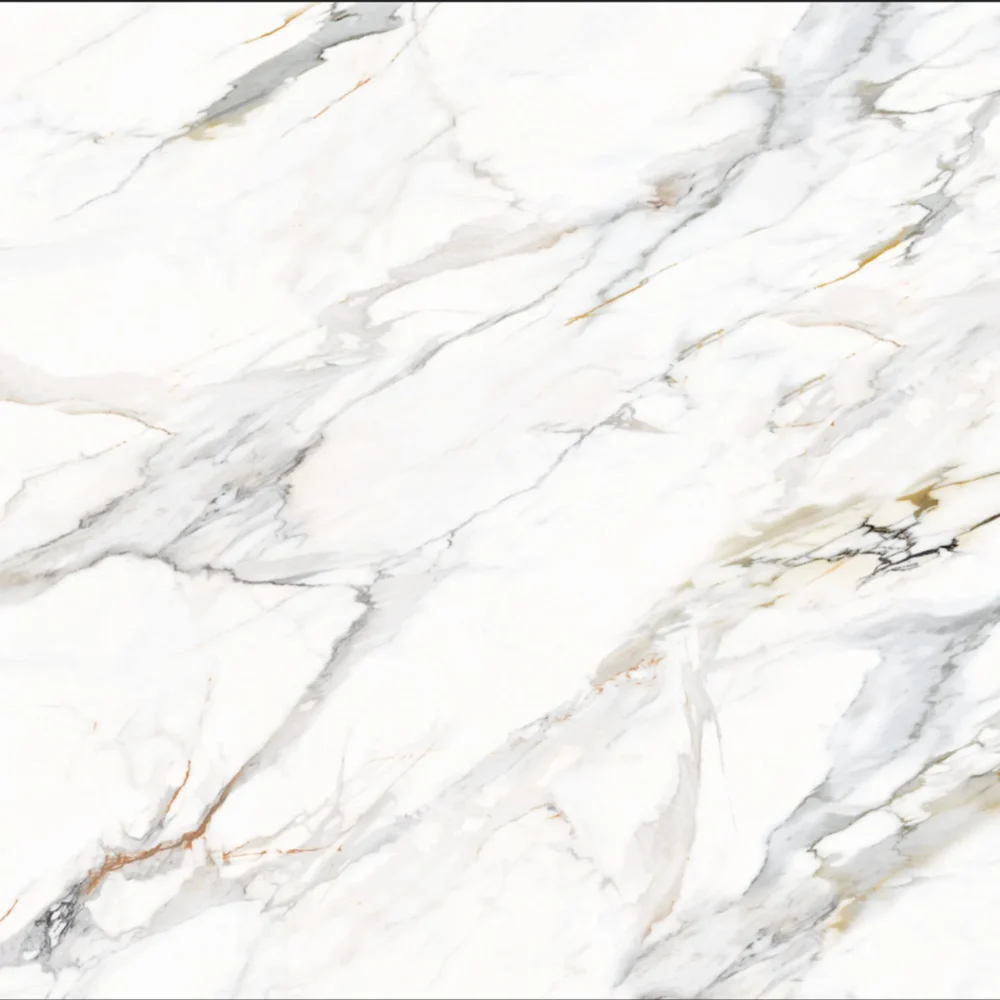
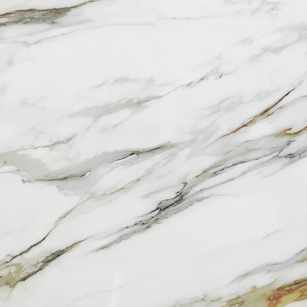
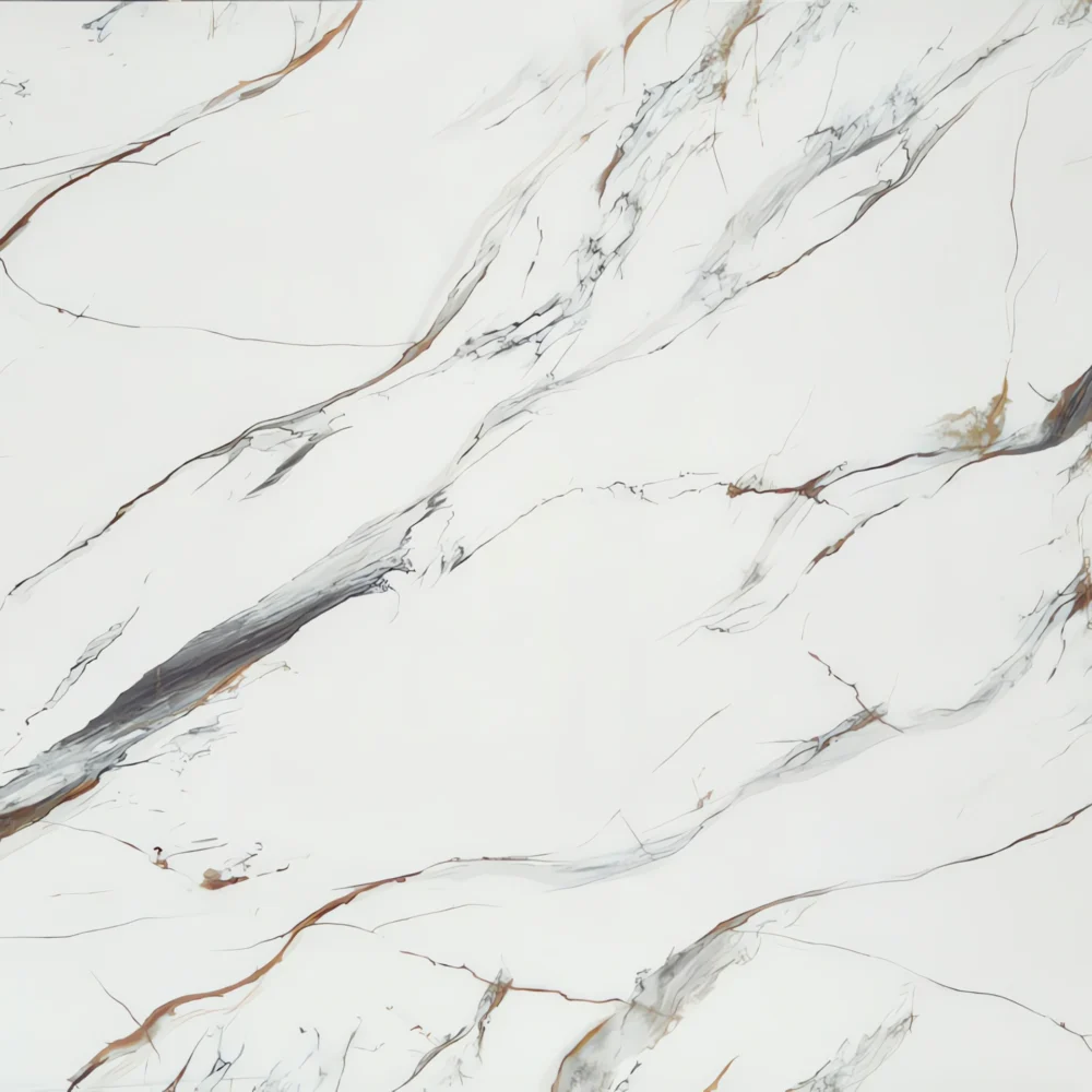
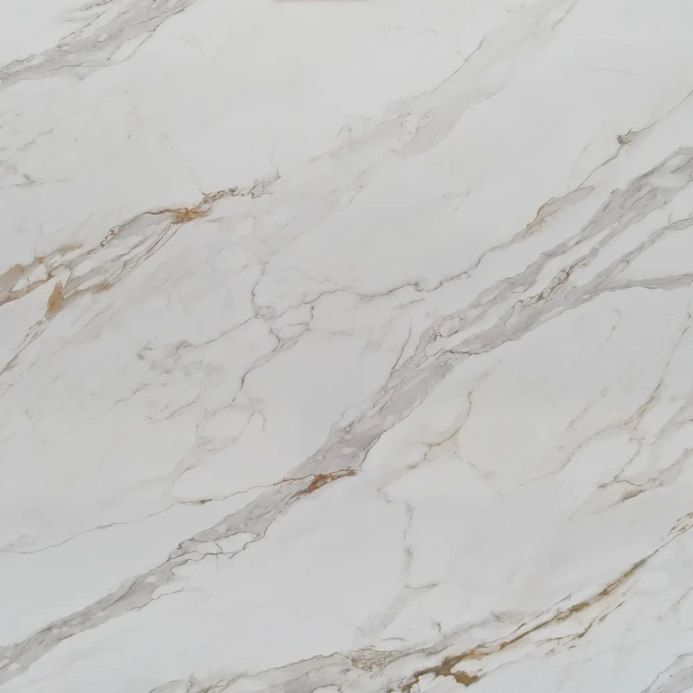
- Calacatta Oro White with Gold Veins GQ-R0252
Calacatta Oro White with Gold Veins GQ-R0252


| Primary Color (s) | Bright Calacatta White |
| ACCENT COLOR (S) | Soft Ash Gray + Warm Honey Gold |
| Craft | Printed |
| Finishes | Polished / Honed / Suede / Leathered |
| Customized Size | 138″× 79″ / 126″× 63″ / Customizable |
| Thickness | 20mm/30mm/Customizable |
| Edge Style | Eased polished edge/2+2cm laminated edge/Mitred edge |
| Country | Thailand |
| Full Body Printed Quartz | Yes |
| Bookmatch Available | Yes |
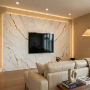
| Countertops Residential: Yes Commercial: Yes |
| Wall Residential: Yes Commercial: Yes |
| Flooring Residential: Yes Commercial: Yes |
Description:
GQ-R0252 opens with a bright white to soft ivory field, then gains depth through pale gray clouding, beige undertones, and warm translucent-looking shadows. Across this clean base, gray veins travel in a confident diagonal direction, while gold, caramel, and rust-brown accents appear like oxidized mineral seams caught inside polished marble. The movement is not flat or repetitive: some lines are fine and sharp, others widen into irregular warm bands with feathered edges, creating the sense of a sunlit fracture running through a calm white stone face. From a distance, the slab reads bright and elegant; up close, the smoky gray patches and warm brown-gold details give it a more natural, layered character.
For American residential design, this surface works especially well when a project needs a white countertop with warmth and visible direction. In a transitional kitchen, GQ-R0252 can be used for perimeter tops, a statement island, or a waterfall end beside white shaker cabinets, warm brass pulls, soft oak flooring, and a simple ivory backsplash. In a modern farmhouse kitchen, it pairs naturally with natural oak accents, matte black faucets, woven counter stools, and a full-height quartz backsplash, allowing the gold-brown movement to connect the wood and metal finishes. In a classic primary bathroom, the same slab brings a polished marble atmosphere to double vanities, tub surrounds, shower ledges, and vanity splashes, especially with soft ivory cabinetry, warm gold fixtures, a freestanding tub, and gentle wall lighting.
Case-inspired framing: imagine a 790-square-foot boutique home fragrance and candle studio with a front checkout counter, a small scent-blending bar, two consultation tables, and one customer restroom. The designer specifies GQ-R0252 for the 9-foot sales counter, the blending counter, and the restroom vanity so the compact retail space feels bright, refined, and consistent. During slab planning, the fabricator angles the main gold-caramel vein across the checkout face, making it visible from the entrance, while calmer white and ivory sections are kept on the work zones where sample jars, trays, tablets, and packaging need a clean visual background. Under 3000K to 3500K lighting, the polished surface reflects a soft glow rather than a harsh shine. White shaker-style millwork, brushed brass shelving, natural oak display blocks, matte black signage, cream plaster walls, and linen seating all pick up the slab’s warm-cool balance. The finished environment feels premium but approachable—an aesthetic that distributors, builders, and designers can translate into kitchens, bathrooms, boutique counters, model-home islands, and hospitality vanities.
Frequently asked questions
What backsplash would go well with this Calacatta quartz countertop?
The safest backsplash s usually the one that doesn’t fight the veining. Designers and installers usually recommend pulling one quiet color from the slab – soft white, warm white, pale taupe, or a muted greige – instead of adding another busy stone pattern.
With Calacatta -style quartz that has gold or warm gray veins, glossy white subway tile can work, but it may look too cold if the countertop back ground is creamy. Handmade- look zellige can be nice, though the uneven surface catches shadows and grout lines become part of the design. Large-fomat porcelain panels give a cleaner look, but layout and outlet cuts need a good installer.
A frequent complaint we hear is that the sample locked fine in the showroom, then looked yellow, pink, or gray tones. Tape backsplash samples vertically against the wall and check them morning, night, and under your actual under your actual under -cabinet lights. Also test grout color – bright white grout can make a warm quartz suddenly look dingy.
What types of cabinets work best with Calacatta Gold quartz with beige/gold veining?
Calacatta Gold quartz with beige or gold veining works best with cabinets that have warm or balanced undertones. The warm veining adds softness and depth, so it pairs especially well with cabinetry that feels natural, layered, and not overly cold.
Some of the most popular combinations include:
- warm white cabinets,
- greige cabinets,
- natural oak,
- walnut wood tones,
- taupe finishes,
- champagne-colored cabinetry,
- and matte beige or sand-tone cabinets.
Warm white cabinets are one of the safest and most timeless choices. They keep the space bright while allowing the gold veining to feel intentional instead of yellow.
Natural wood cabinets, especially oak and walnut, are another excellent match. The warm veining helps connect the countertop with the wood grain, creating a softer and more upscale look. This combination is very popular in modern luxury kitchens, hotels, and commercial hospitality spaces.
Greige and taupe cabinets also work extremely well because they sit between gray and beige. They balance the warmth of the quartz without making the room feel too creamy or too cool.
Dark cabinets can create strong contrast if you want a more dramatic look. Deep walnut, espresso, charcoal brown, or bronze-toned cabinets can make Calacatta Gold quartz stand out beautifully on large islands or waterfall edges.
The combinations that usually create problems are cool-toned grays with blue or green undertones. Under bright white LED lighting, those cooler cabinet colors can make the warm gold veining look disconnected or slightly muddy.
In real projects, the final result depends on the entire material palette, including:
- cabinet undertones,
- wall color,
- backsplash,
- flooring,
- hardware finish,
- and lighting temperature.
That is why professional designers usually review all samples together under the actual project lighting instead of matching the countertop to the cabinet color alone.
In most cases, Calacatta Gold quartz is more flexible than people expect. The warm veining actually helps tie different materials together and makes the space feel more natural and inviting.