



- Home
- Quartz
- Quartz Slabs
- Classic Calacatta Quartz Slabs GQ-T265 for Wholesale
Classic Calacatta Quartz Slabs GQ-T265 for Wholesale
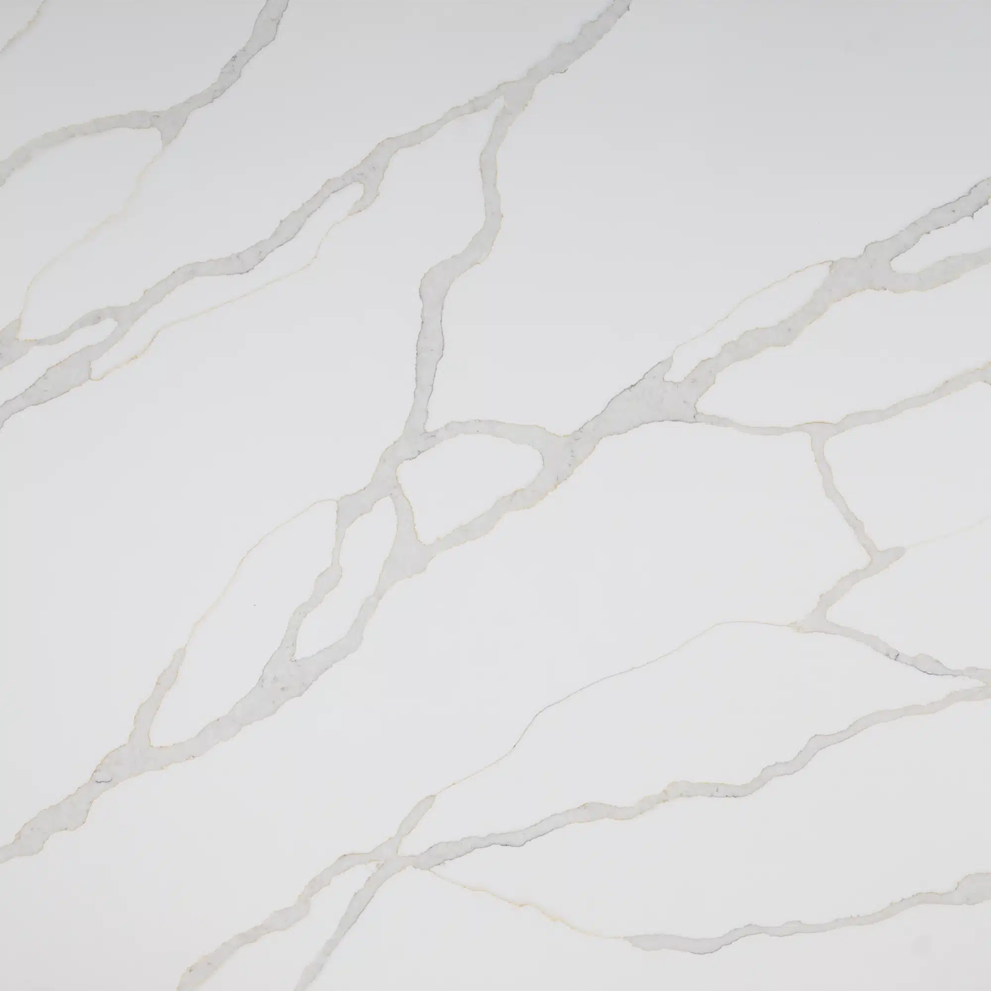

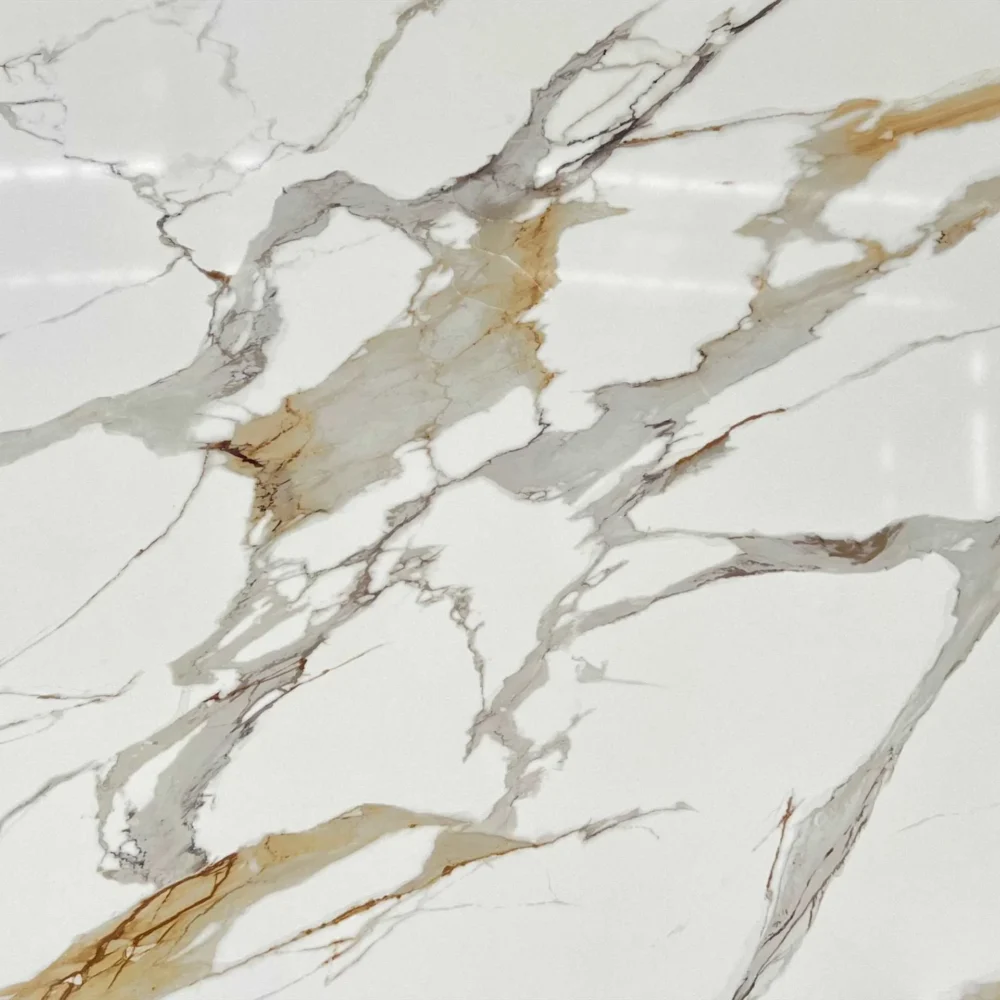
| Primary Color(s) | Bright White |
| Accent Color(s) | Light Grey Veins with Faint Golden-Beige Outlines |
| Craft | Regular |
| Finishes | Polished / Honed / Suede / Leathered |
| Customized Size | 138″ × 79″ / 126″ × 63″ / Customizable |
| Thickness | 20mm/30mm/Customizable |
| Edge Style | Eased polished edge/2+2cm laminated edge/Mitred edge |
| Full Body Quartz | Yes |
| Bookmatch Available | Yes |
| Place of Origin | Thailand |
| Port of Transportation | Thailand |
| Packaging | Foam or carton inside + strong wooden crates with reinforced straps outside and fumigation |
| Delivery time | 15-20 days / Express service is negotiable. |
| MOQ | 10 ㎡ |
| Payment terms | 30%T/T after confirm the order and the 70% T/T by copy of B/L |
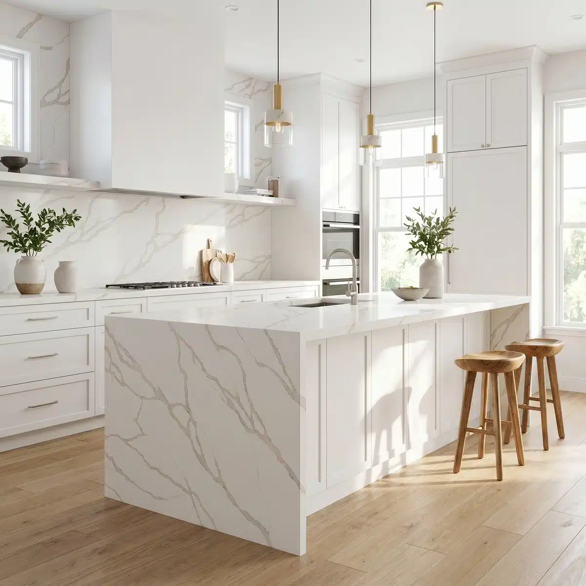
| Countertops Residential: Yes Commercial: Yes |
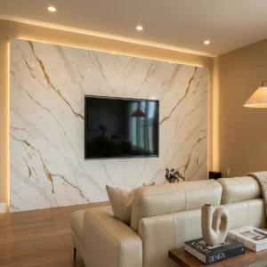
| Wall Residential: Yes Commercial: Yes |
| Flooring Residential: Yes Commercial: Yes |
Description:
Frequently asked questions
Stunning Kitchen Stones: What Is Calacatta Laza Quartz?
Calacatta Laza is a printed quartz design meant to echo the bold, organic veining of natural Calacatta marble—especially the Laza variant known for high-contrast gray-to-charcoal movement on a bright white field.
It’s not marble, and it’s not a solid-color quartz.
It’s a full-body printed slab, meaning the pattern runs through the entire thickness—not just surface-deep.
That matters when you’re edge profiling or doing mitered corners: no ghosting, no mismatched veins at the cut edge.
Most fabricators will tell you this pattern holds up well on large islands and bookmatched backsplashes—but seam visibility depends heavily on installer skill and lighting angle.
Polished finish shows fingerprints more than honed, especially on darker veins.
In real-world kitchens, we’ve seen UV exposure over time subtly shift warm undertones in some batches, so east- or south-facing installations need consideration.
Grand Quartz Tech produces this in Thailand using low-silica lines, and their jumbo slabs (up to 138" x 79") help reduce seams on wide spans.
It’s durable, but like all quartz, thermal shock from direct cooktop contact or hot pans can cause microfractures near edges.
What color cabinets go with calacatta laza quartz?
It depends on what part of the slab you’re anchoring to—the base white or the vein tone.
White cabinets keep it crisp and open, but they’ll highlight any subtle yellow or gray cast in the stone under certain lights.
Dark cabinets—charcoal, matte black, deep navy—work best when the veining is heavy and defined; they push the drama without competing.
If the slab has warm undertones (and not all do), walnut or espresso-stained wood can bridge that warmth—but avoid red-toned woods; they fight with the gray veins.
Gray-washed oak or greige cabinets are safer for transitional spaces, especially if your lighting leans cool.
Installers usually recommend dry-laying full-size samples next to cabinet doors under your actual kitchen lighting—not showroom LEDs.
One thing most buyers overlook: cabinet sheen level.
High-gloss cabinets bounce light into the quartz veins and exaggerate contrast; satin or matte finishes soften it.
And if you’re using GQ-T265, check the batch number—vein density varies across production runs, and that changes how much contrast your cabinets need to hold balance.
Is calacatta laza quartz expensive?
It’s priced above standard quartz, but not because of raw material cost—it’s about pattern complexity, print fidelity, and yield loss during fabrication.
Busy veining means more slab waste when templating around flaws or matching veins across seams.
That drives up effective cost per usable square foot.
Freight and duties also weigh heavier on jumbo slabs, which many buyers choose for this style to minimize seams.
Project volume matters: Grand Quartz Tech offers tighter lead times and CAD support for commercial orders, which offsets some of the in institutional builds.
But for a single-family home?
You’ll pay more for consistency—no quarry variation, no resin pooling, no hidden fissures—but you trade off some of the ‘alive’ character of natural stone.
It’s not inherently more expensive than other printed quartz lines; it’s priced relative to how much vein alignment and slab size you demand.
Thermal stability and NSF certification add value in food-service or healthcare jobs, but won’t matter in a master bath.
So yes—it’s a step up—but whether it’s ‘expensive’ depends on your tolerance for seam count, timeline pressure, and how hard you’re pushing the design.
What color is Calacatta Laza quartz?
Think bright white base—not sterile, not creamy—with veins ranging from medium gray to near-black, sometimes with faint golden or taupe inflections where the print layer interacts with the quartz matrix.
But here’s what samples won’t tell you: the ‘white’ shifts under different light.
Under 3000K warm LED, it reads softer; under 5000K daylight, the gray veins pop sharper and the base can look cooler, almost bluish.
Some batches run warmer, some cooler—Grand Quartz Tech controls this with pigment calibration, but it’s still batch-dependent.
The veins aren’t uniform—they thicken, branch, fade—so two slabs side-by-side may look like siblings, not twins.
That’s intentional: too much repetition kills the marble illusion.
Fabricators know this means bookmatching takes extra time and slab selection.
Also, polished finish amplifies depth in the veins; honed flattens them slightly and reduces glare—but both show smudges differently.
Always test a 12" x 12" sample mounted on your actual wall color, lit by your planned fixtures, before signing off.
Digital renders lie.
Light lies.
Only physical samples under job-site conditions don’t.