



- Home
- Quartz
- Quartz Slabs
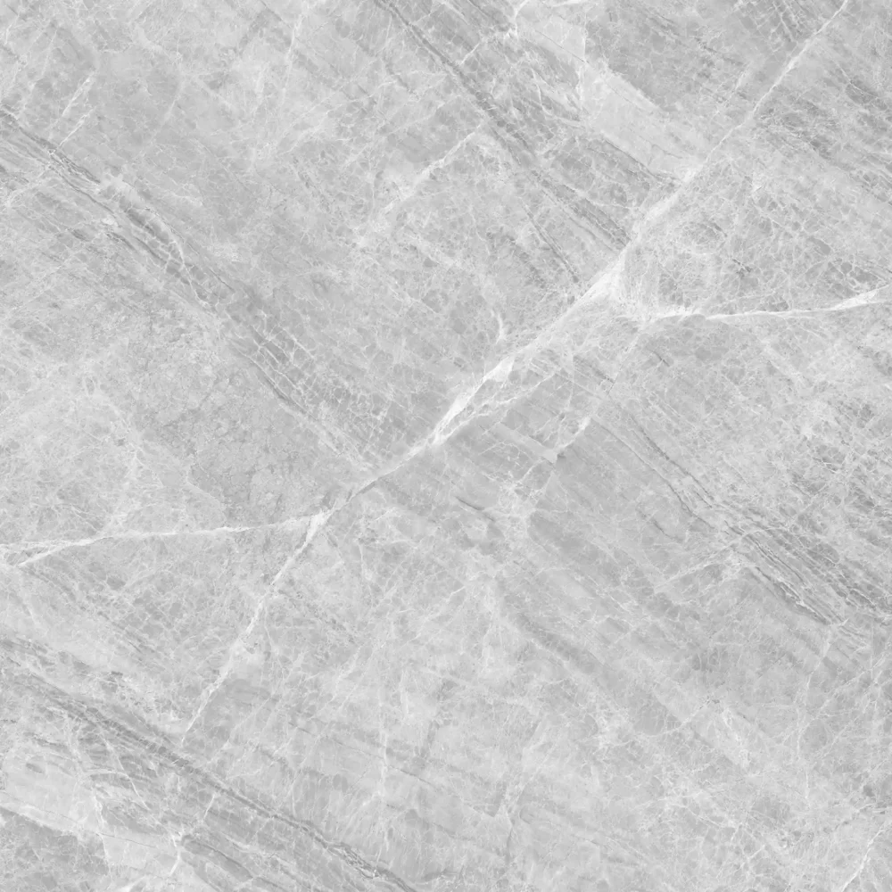
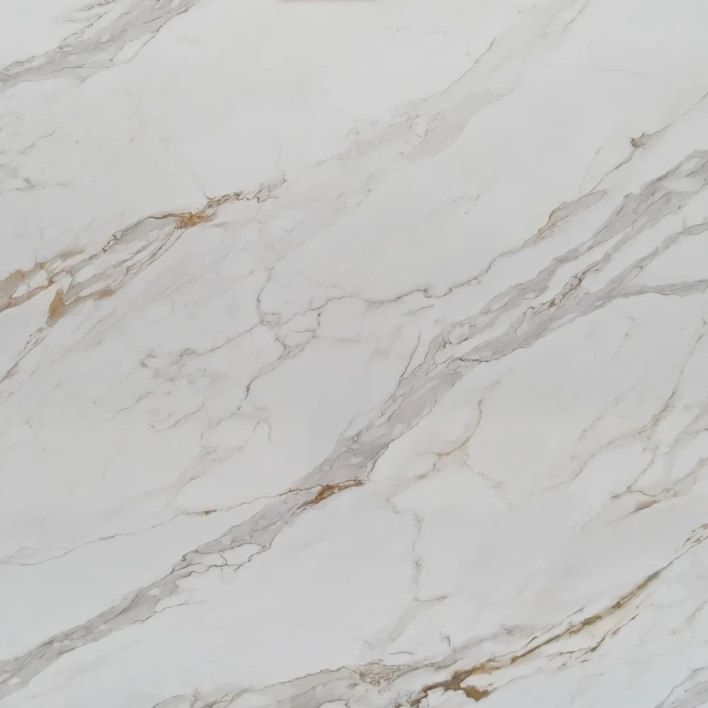
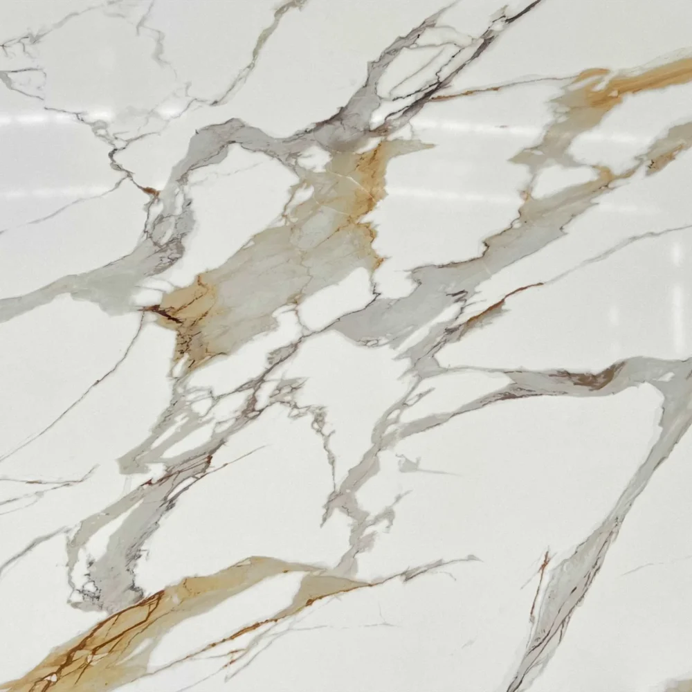
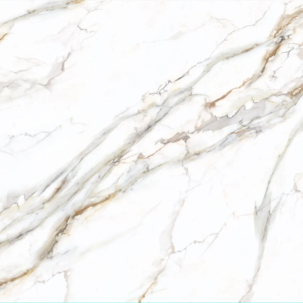
- Engineered Persian White Quartz Slabs for Island Countertops GQ-T268
Engineered Persian White Quartz Slabs for Island Countertops GQ-T268
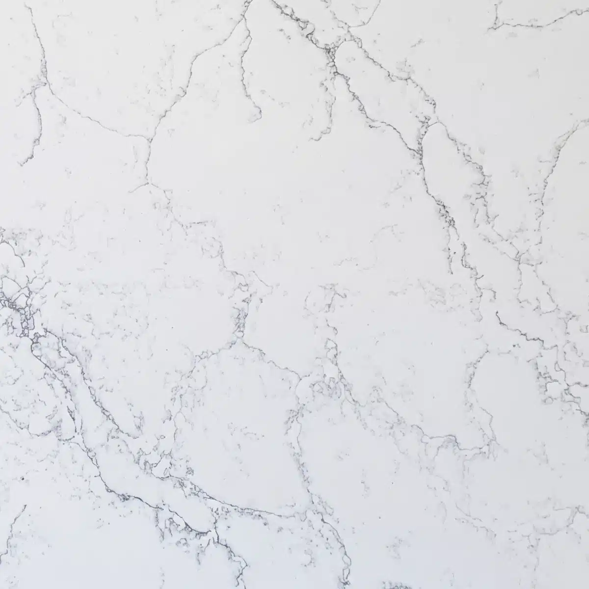
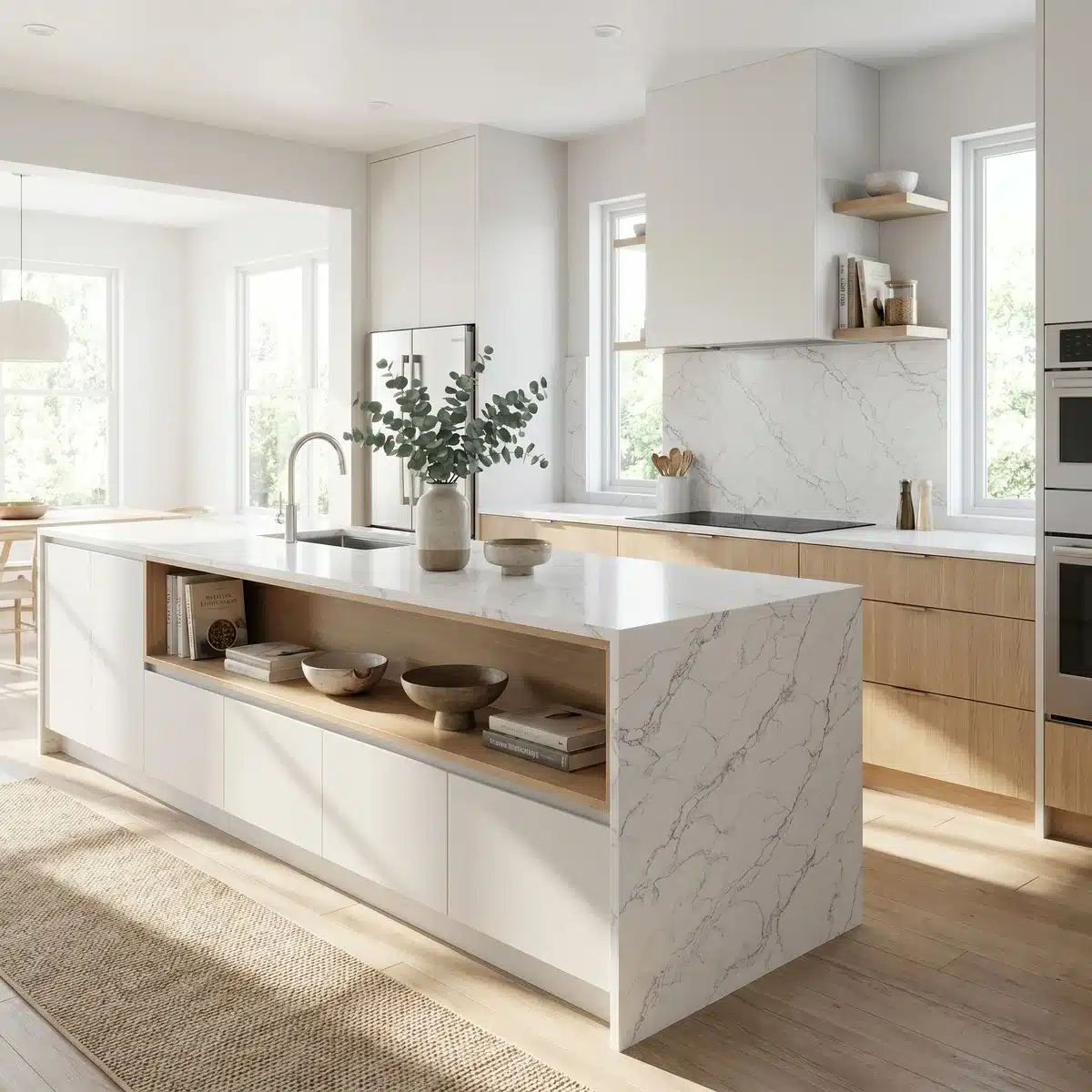
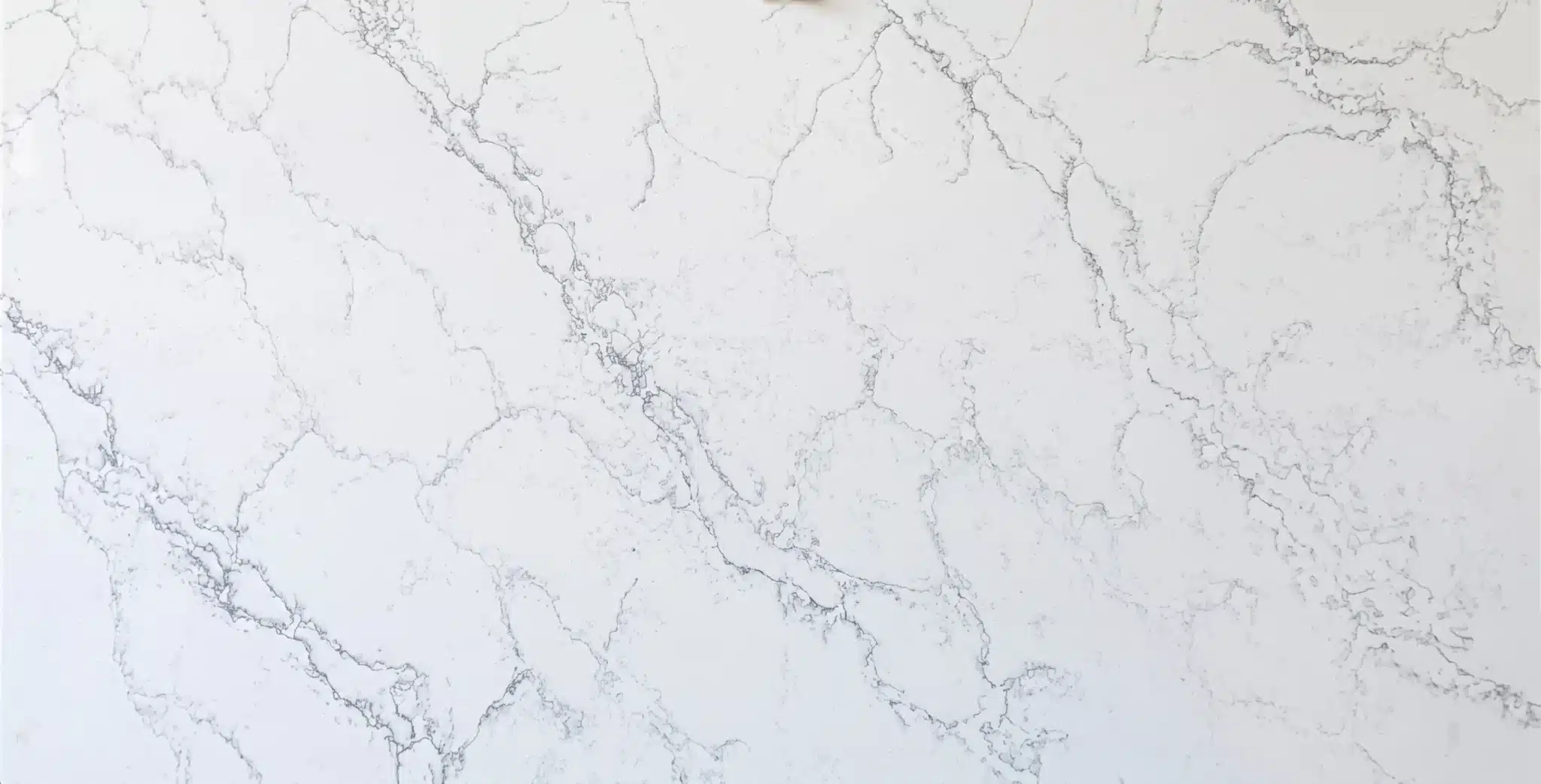
| Primary Color(s) | Bright White |
| Accent Color(s) | Medium to Dark Grey Veins |
| Craft | Regular |
| Finishes | Polished / Honed / Suede / Leathered |
| Customized Size | 138″ × 79″ / 126″ × 63″ / Customizable |
| Thickness | 20mm/30mm/Customizable |
| Edge Style | Eased polished edge/2+2cm laminated edge/Mitred edge |
| Full Body Quartz | Yes |
| Bookmatch Available | Yes |
| Place of Origin | Thailand |
| Port of Transportation | Thailand |
| Packaging | Foam or carton inside + strong wooden crates with reinforced straps outside and fumigation |
| Delivery time | 15-20 days / Express service is negotiable. |
| MOQ | 10 ㎡ |
| Payment terms | 30%T/T after confirm the order and the 70% T/T by copy of B/L |
| Countertops Residential: Yes Commercial: Yes |
| Wall Residential: Yes Commercial: Yes |
| Flooring Residential: Yes Commercial: Yes |
Description:
Frequently asked questions
How to Pair White Quartz Countertops with Oak Cabinets?
Oak cabinets bring warmth and grain—white quartz needs to play off that, not fight it.
Most fabricators I've worked with for 20 years avoid stark, cool-toned whites with heavy veining next to oak; they make the wood look tired or muddy.
Instead, go for a white quartz with soft beige or warm gray undertones—something that reads neutral in natural light but doesn’t clash with oak’s amber or honey tones.
Polished finishes work fine, but honed or lightly textured surfaces hide smudges better in real-world kitchens where coffee mugs and cutting boards get set down daily.
Bookmatching matters less here than consistency across slabs—oak grain varies, so you want quartz that holds its tone across multiple pieces.
Dry-lay both materials together under your kitchen lighting before finalizing.
If you're using whitewashed or medium-toned oak, steer clear of quartz with yellowish undertones—they’ll shift under morning sun or LED fixtures.
Grand Quartz Tech’s marble-look line includes several whites with subtle, linear veining that bridge the gap without competing.
And remember: backsplash tile, hardware finish, and wall color all affect how the pairing lands—don’t isolate the countertop decision.
What do we wish everyone knew about white quartz countertops?
White quartz isn’t one thing—it’s a family of slabs with wildly different behavior.
Undertones change everything: a blue-gray vein reads cold next to warm oak, while gold-tinged veining can clash with cool-toned cabinets. 'Low variation' means consistent patterning across slabs—not uniform color.
You’ll still see tonal shifts between batches, especially under north-facing light or recessed LEDs.
And 'white' doesn’t mean 'hides wear.' Polished whites show fingerprints, water spots, and light scratches faster than textured or veined options.
Acidic spills like vinegar or citrus juice won’t etch quartz like marble, but they can dull the resin over time if left sitting—especially on high-gloss finishes.
Most installers I know recommend pH-neutral cleaners and avoiding abrasive pads, even on matte finishes.
Also, thermal shock is real: setting a hot pan directly on white quartz can cause micro-fractures near seams or cutouts.
Grand Quartz Tech runs low-silica production lines, which helps with fabrication dust control—but that doesn’t change how the slab reacts to heat or impact.
Always dry-lay full slabs, not just samples.
What looks clean on a tablet often reads flat or washed-out in person.
What White Quartz Countertops Have No Veins?
True vein-free white quartz doesn’t exist—engineered quartz always has some pigment dispersion, even in 'solid color' slabs.
What you’ll find are low-variation options with faint, almost imperceptible streaks or tonal shifts—like Bright White or Arctic White equivalents.
These rely on tight pigment control and full-body printing tech to minimize visual noise.
But even those can telegraph slight inconsistencies under direct sunlight or angled lighting, especially on large islands.
Fabricators usually warn clients that 'vein-free' slabs show every scratch, scuff, and cleaning streak more than patterned ones.
Matte or leathered finishes help, but they don’t eliminate visibility—just soften it.
If you’re after minimalism, prioritize consistency over absolute uniformity: match slab batches tightly, avoid mixing production runs, and confirm seam placement with your CAD drawing before cutting.
Grand Quartz Tech’s printed quartz lines deliver tighter batch-to-batch control than older casting methods, but no manufacturer guarantees zero variation.
And keep in mind: solid whites require more frequent wiping in high-use zones—kitchens with kids or commercial breakfast bars tend to lean toward softly veined options for practicality, not just looks.
Does white quartz look good with white cabinets?
Yes—but only when there’s enough contrast to avoid visual fatigue.
Pure-white cabinets + pure-white quartz = flat, monotonous space unless you introduce texture, depth, or warmth elsewhere.
Installers usually recommend choosing a white quartz with subtle veining—gray, beige, or warm gold—to break up the expanse without overwhelming.
Polished finishes bounce light and open up small kitchens, but they also highlight every fingerprint and water mark.
Honed or satin finishes add tactility and reduce glare, which helps in rooms with lots of natural light.
Lighting is critical: cool-white LEDs can make both cabinet paint and quartz look bluish, while warm LEDs may exaggerate yellow undertones in either material.
Always test full-size samples in the actual room at different times of day.
Edge profiles matter too—a 1/4" eased edge feels lighter than a bullnose on white-on-white.
Hardware is your secret weapon: matte black, brushed brass, or oil-rubbed bronze adds necessary contrast.
Grand Quartz Tech’s stone look line offers several whites with fine, linear veining that read as 'textured neutral' rather than 'patterned'—ideal for this pairing when you need cohesion without sameness.