- Home
- Quartz
- Quartz Slabs
- Calacatta Bianco Lasa Quartz GQ-T461
Calacatta Bianco Lasa Quartz GQ-T461


| Primary Color (s) | Pale Ice White |
| ACCENT COLOR (S) | Warm Honey Gold |
| Craft | Regular |
| Finishes | Polished / Honed / Suede / Leathered |
| Customized Size | 138″× 79″ / 126″× 63″ / Customizable |
| Thickness | 20mm/30mm/Customizable |
| Edge Style | Eased polished edge/2+2cm laminated edge/Mitred edge |
| Country | Thailand |
| Full Body Quartz | Yes |
| Bookmatch Available | Yes |
| Countertops Residential: Yes Commercial: Yes |
| Wall Residential: Yes Commercial: Yes |
| Flooring Residential: Yes Commercial: Yes |
Description:
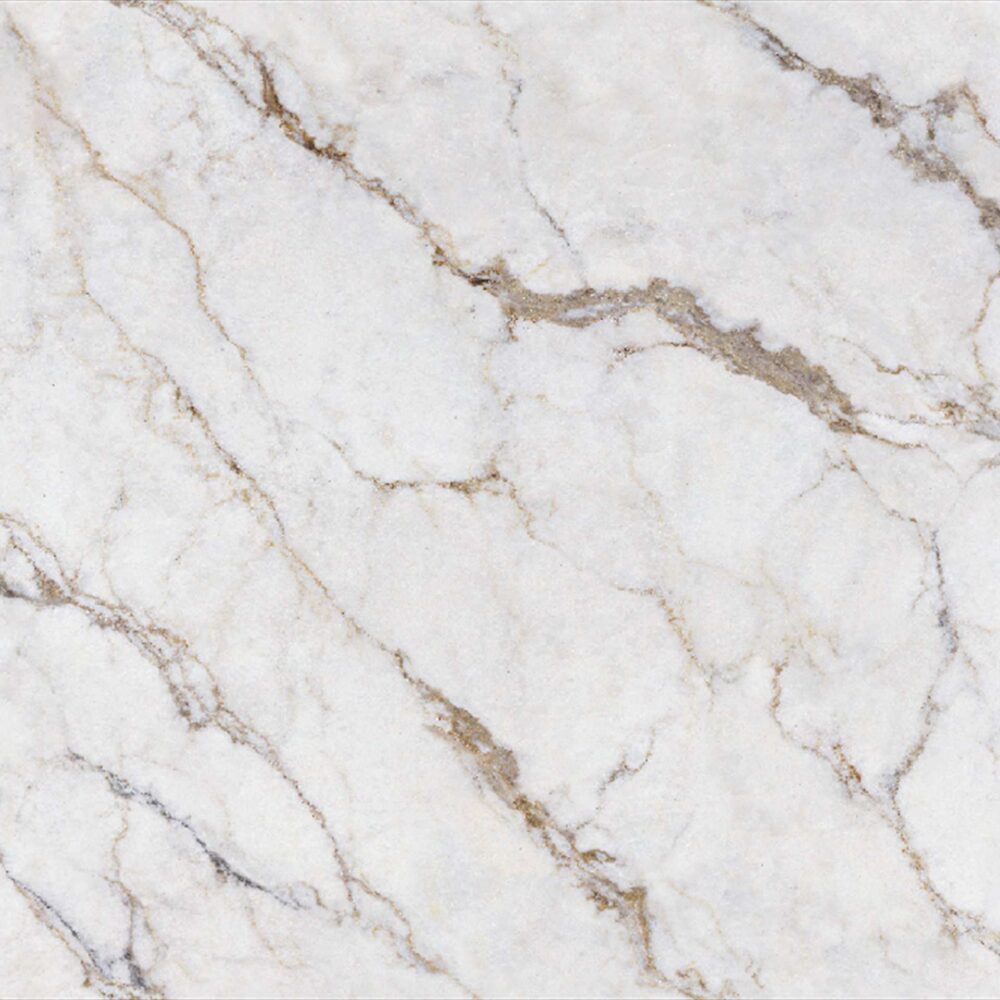
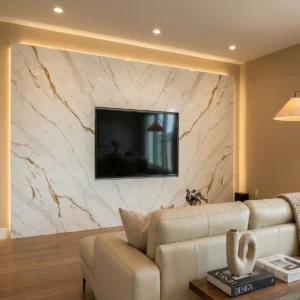
Color and vein story: GQ-T461 is a polished quartz countertop surface with a softened marble character, built on a light gray to warm off-white background. The base is not flat white; it carries cloudy tonal variation, pale misty areas, and fine white crackle-like details that give the slab quiet depth. Warm beige, taupe, and muted greige veins move diagonally through the surface in long, relaxed strokes. Rather than appearing sharply cut, the lines open and fade like warm pencil marks pulled through morning fog, with some clustered passages adding a natural stone rhythm. The result is elegant and approachable: bright enough for clean American interiors, but warmer and more layered than a cool white marble look.
Application direction: This design is especially strong for projects where the countertop needs to feel refined without becoming the loudest finish in the room. In a transitional kitchen, GQ-T461 pairs naturally with warm white shaker cabinets, brushed brass knobs, soft oak flooring, and a creamy handmade tile backsplash; the taupe-beige movement connects the cabinetry, hardware, and floor into one calm palette. For a modern farmhouse kitchen island, it works beautifully with light oak base cabinets, matte black faucets, black-framed pendants, and woven counter stools, giving the island a natural focal point while keeping the space relaxed. In a classic American master bathroom, it can be used for double vanities, tub decks, shower ledges, and low backsplashes beside taupe walls, a freestanding white tub, polished nickel fixtures, and linen-textured window treatments, creating a warm spa-like brightness with subtle marble movement.
Case-inspired framing: Imagine a 690-square-foot boutique home textile and window-treatment studio with a front sales counter, a fabric-swatch review table, a compact coffee niche, and one client restroom. The designer selects GQ-T461 for the 8-foot transaction counter, beverage surface, and vanity top so the small showroom feels consistent, soft, and residentially familiar. During slab layout, the fabricator lets the diagonal taupe veining travel from the visitor side toward the sample wall, giving the counter a gentle sense of direction without making the work surface busy. The calmer off-white zones are placed where quote folders, tablets, hardware rings, and fabric books need a clear background. Under warm-neutral 3500K lighting, the polished finish reflects a clean glow, while warm white millwork, light oak drawers, brushed brass display rods, matte black shelf brackets, taupe upholstery, and cream wall paint echo the slab’s balanced warm-gray undertone. The finished space feels orderly, welcoming, and commercially practical—an easy reference for distributors, builders, and designers specifying light quartz countertops for kitchens, vanities, islands, laundry rooms, boutique counters, and small hospitality interiors.
Frequently asked questions
Will white quartz make my honey oak cabinets look more orange?
Yes, it can — but it depends heavily on the undertone of the slab and the light in the room. Most kitchen designers will tell you honey oak already has a strong yellow-orange cast, so a cold blue-white quartz can make the cabinets look even warmer by contrast. A softer white with cream, taupe, beige-gray, or muted drift-like movement usually plays nicer than a bright arctic white.
In real-world kitchens, the biggest mistakes happen when people pick from a tiny showroom chip under LED lighting. Take a full-size sample home, stand it vertically against the cabinets, and look at it morning, afternoon, and under your actual island pendants.
Also check it next to flooring and backsplash tile, because those can push the whole palette warmer or cooler.
If the cabinets are staying, avoid quartz with icy gray veining unless you want a sharper contrast. If you’re painting later, you have more room to go cooler.