



- Home
- Quartz
- Quartz Slabs
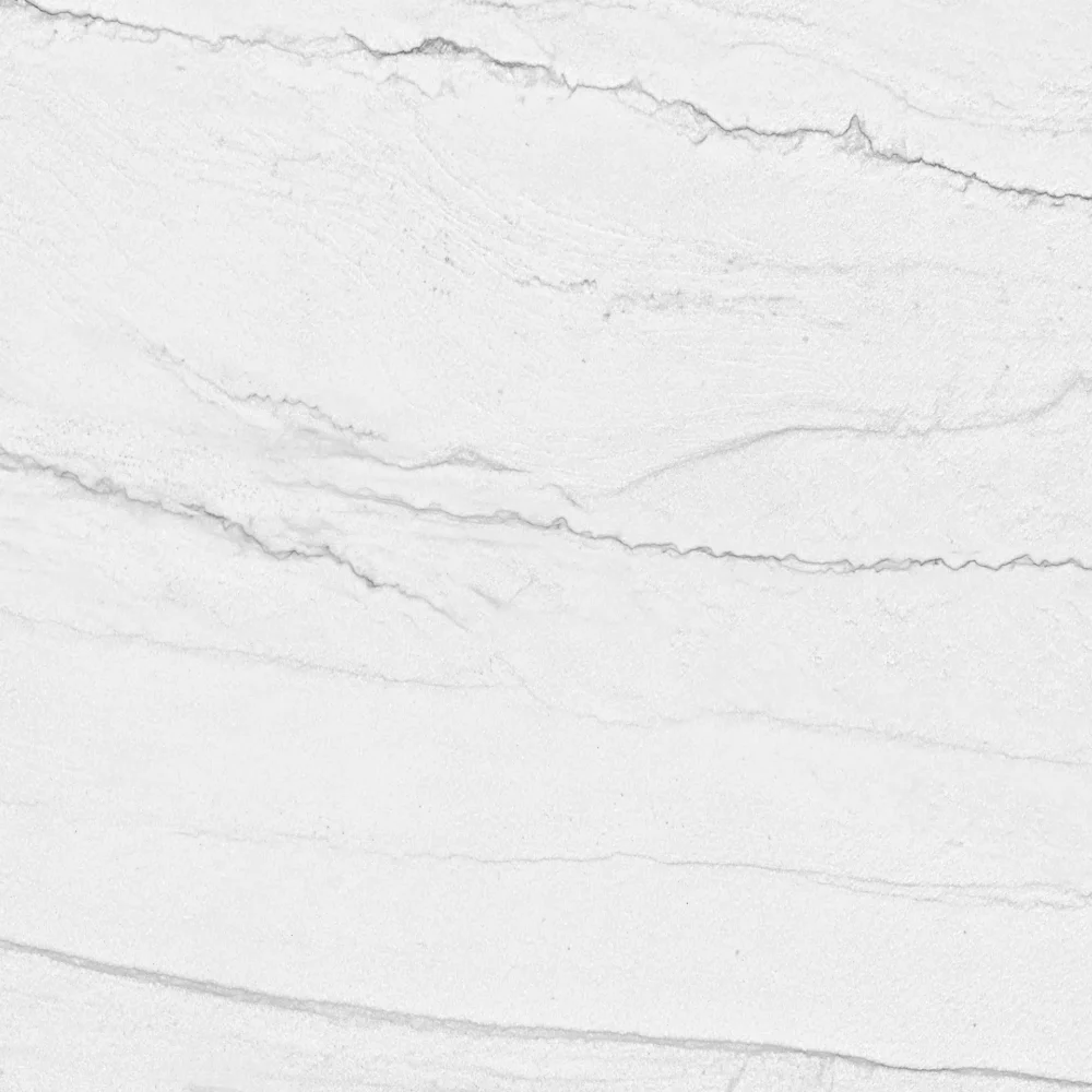
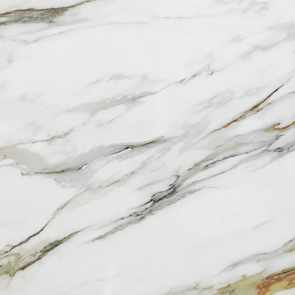
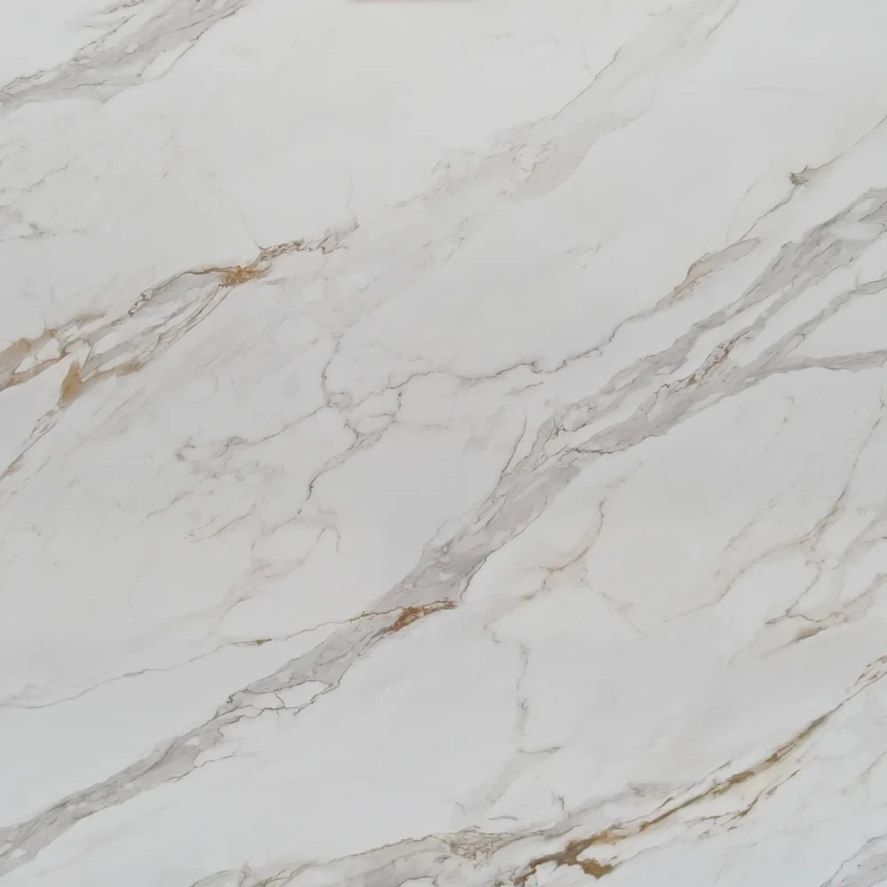
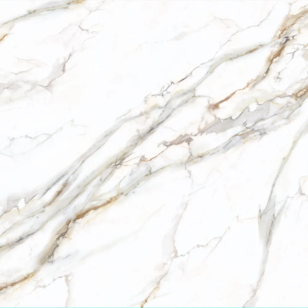
- Grey Sparkling Quartz Slabs GQ-FG334 for Wholesale
Grey Sparkling Quartz Slabs GQ-FG334 for Wholesale
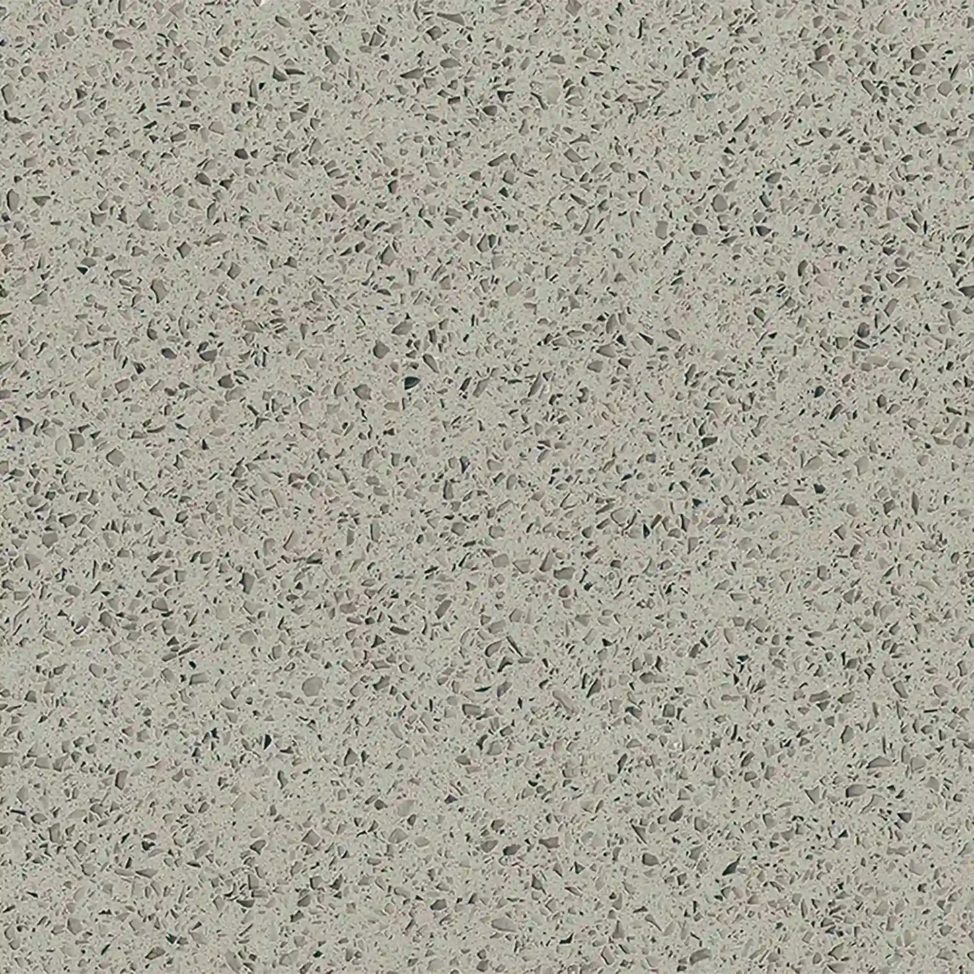
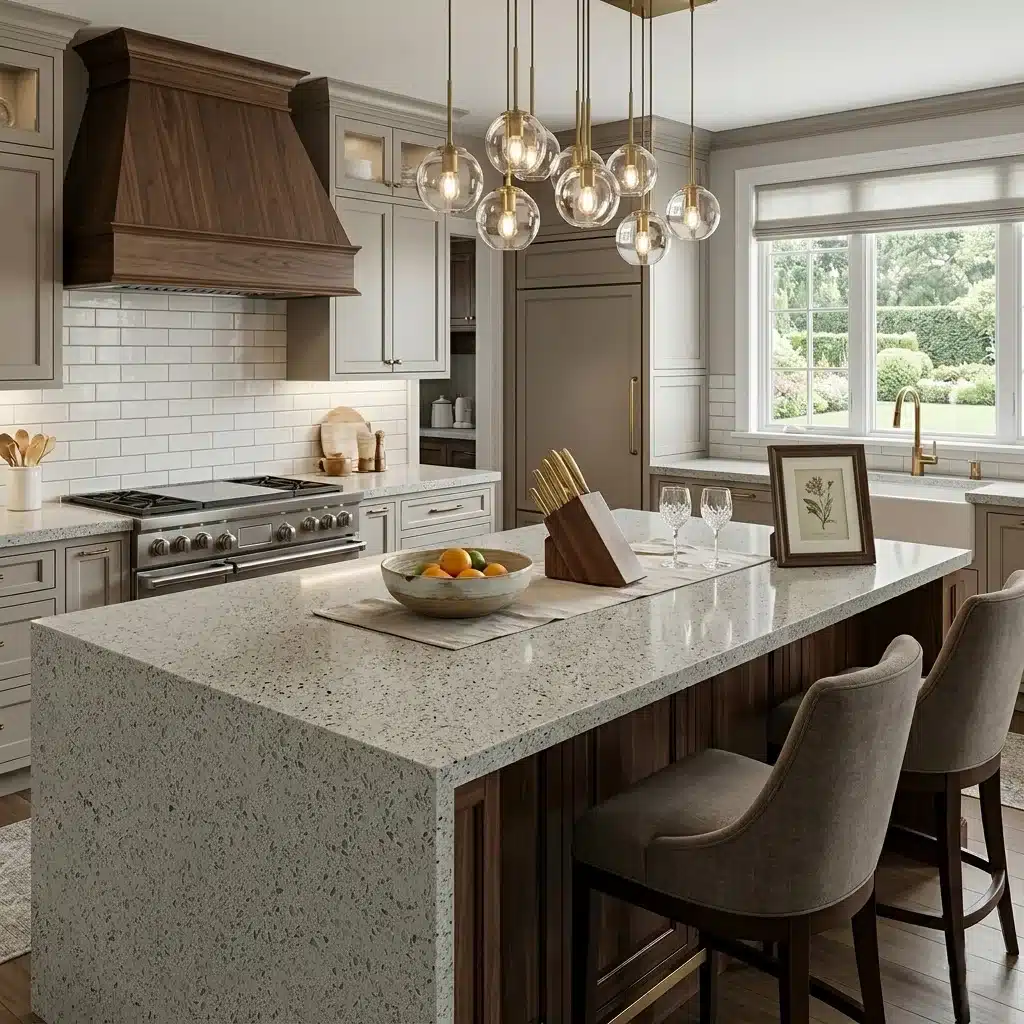
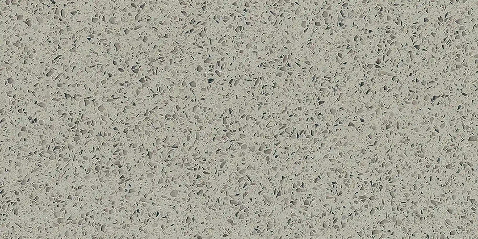
| Primary Color(s) | Light Gray |
| Accent Color(s) | Ash Gray + Ash Charcoal |
| Craft | Regular |
| Finishes | Polished / Honed / Suede / Leathered |
| Customized Size | 138″ × 79″ / 126″ × 63″ / Customizable |
| Thickness | 20mm/30mm/Customizable |
| Edge Style | Eased polished edge/2+2cm laminated edge/Mitred edge |
| Full Body Quartz | Yes |
| Bookmatch Available | Yes |
| Place of Origin | Thailand |
| Port of Transportation | Thailand |
| Packaging | Foam or carton inside + strong wooden crates with reinforced straps outside and fumigation |
| Delivery time | 15-20 days / Express service is negotiable. |
| MOQ | 10 ㎡ |
| Payment terms | 30%T/T after confirm the order and the 70% T/T by copy of B/L |
| Countertops Residential: Yes Commercial: Yes |
| Wall Residential: Yes Commercial: Yes |
| Flooring Residential: Yes Commercial: Yes |
Description:
Frequently asked questions
What color cabinets go with grey quartz countertops?
Grey quartz countertops work with almost any cabinet color—but the real question is *how* they work together.
Most fabricators will tell you: white cabinets give clean contrast, especially with light-to-mid grey quartz that has fine silver or charcoal veining.
Dark cabinets—charcoal, deep navy, or espresso—anchor lighter greys and add visual weight in larger kitchens.
Warm-toned greys or taupe cabinets soften cooler quartz slabs, but only if undertones align: blue-based greys clash with brown-dominant cabinetry, and vice versa.
In real-world kitchens, I’ve seen too many dry-lays fail because someone assumed 'grey' meant neutral—then the slab’s cool undertone made the warm cabinets look muddy under recessed LED lighting.
Always test full-size samples side-by-side, not just swatches.
And don’t forget the hardware and backsplash—they’re part of the equation.
GQ-FG334, for example, reads cooler in north-facing light but warms up near halogen pendants.
That kind of shift matters more than the name on the sample tag.
What color is quartz gray?
There’s no single 'quartz gray'—it’s a spectrum shaped by pigment, resin, and printing tech.
Some slabs run cool: smoky, bluish greys with tight silver veining; others lean warm: soft greys with beige or taupe undertones, sometimes even faint rust flecks.
GQ-FG334 sits mid-spectrum—light base, fine charcoal veining, minimal warmth—but its appearance shifts depending on lighting and adjacent materials.
In high-traffic commercial spaces, I’ve watched the same slab read as 'stormy' under fluorescent lights and 'airy' under warm LEDs.
Undertones aren’t theoretical—they affect how flooring, tile, and appliances interact with the surface.
A slab labeled 'light grey' can telegraph blue next to stainless steel or green beside certain wall paint.
Physical samples matter because printed quartz—especially Full Body Printed Quartz like GQ’s—can have subtle tonal gradients across the slab.
Don’t rely on monitor colors or small chips.
If you’re ordering multiple slabs for a large project, ask for batch-matched photos.
Misjudging this leads to visible tonal jumps at seams.
How to Choose the Right Quartz Countertop for Grey ?
Start with the room’s function and lighting—not the catalog photo.
For residential kitchens with natural light, a light-to-mid grey quartz like GQ-FG334 gives flexibility without sacrificing depth.
In hospitality lobbies or office breakrooms, darker greys with bolder veining hold up better against wear and cleaning cycles—but only if the finish is honed or lightly textured; polished dark greys show smudges and water spots fast.
Consider fabrication limits: busy patterns or high-contrast veining make seam alignment harder, especially on islands or waterfall edges.
Bookmatching?
Possible with jumbo slabs (up to 138" x 79" from Grand Quartz Tech), but requires precise templating.
Also, check resin behavior—some greys yellow slightly under UV exposure over time, especially near south-facing windows.
If your project includes NSF-certified food prep zones, confirm the slab’s certification applies to the specific finish and thickness you’re using.
Most contractors overlook that until the inspector shows up.
And always dry-lay full slabs—not just corners—before cutting.
What looks balanced on paper often feels flat or disjointed in 3D space.
Quartz countertop for light grey cabinets?
Light grey cabinets need a countertop that adds dimension—not duplication.
A mid-grey quartz with controlled veining, like GQ-FG334, gives enough contrast to avoid visual flattening while keeping the space open.
Pure white quartz can work, but only if it has grey or silver movement; solid whites often look clinical next to light greys unless the backsplash or flooring introduces warmth.
Avoid matching cabinet and countertop tones exactly—fabricators usually recommend at least 20% luminance difference to prevent a washed-out effect.
In real-world installs, I’ve seen light grey cabinets paired with cool-toned quartz look sterile under overhead LEDs, but warm up nicely with brass hardware and wood accents.
If your cabinets lean warm (beige-grey), skip slabs with blue undertones—even if the name says 'neutral'.
Also, consider edge profiles: a 1/4" eased edge on a light grey cabinet keeps things crisp; a bullnose or ogee softens contrast.
And don’t forget the sink cutout—darker quartz hides scratches around faucet bases better than light slabs.
Test everything under your actual kitchen lighting before finalizing.