



- Home
- Quartz
- Quartz Slabs
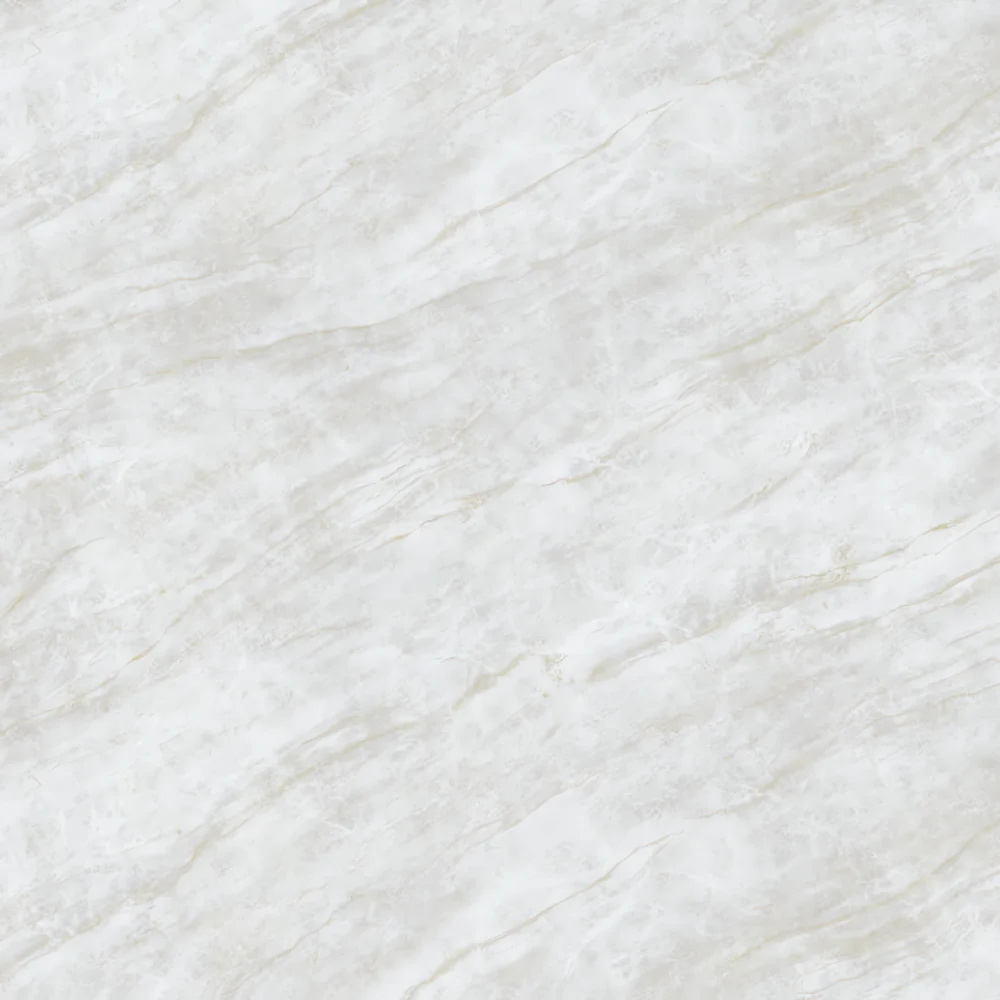
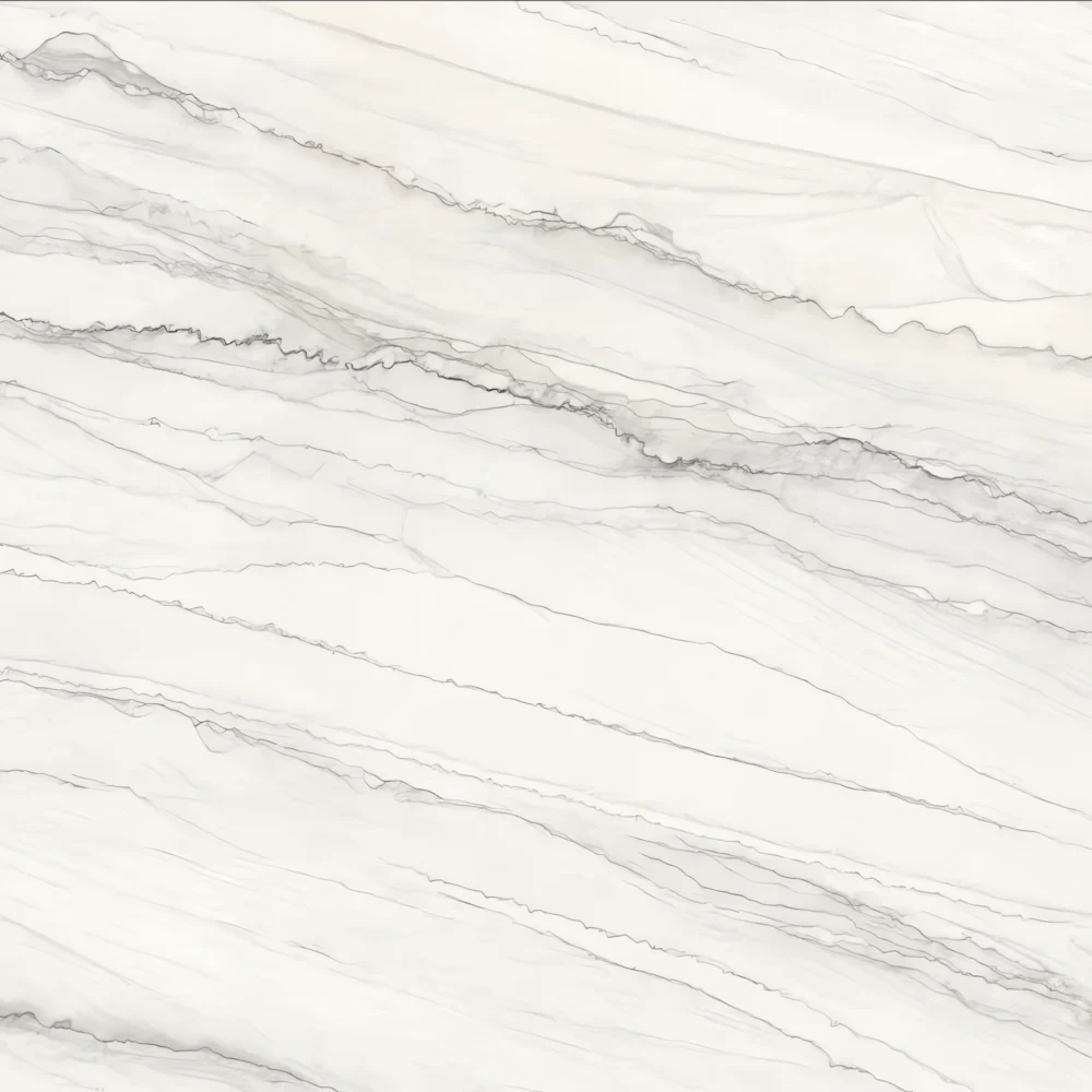
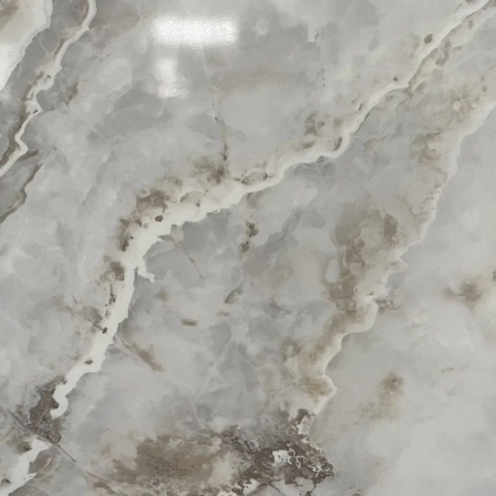
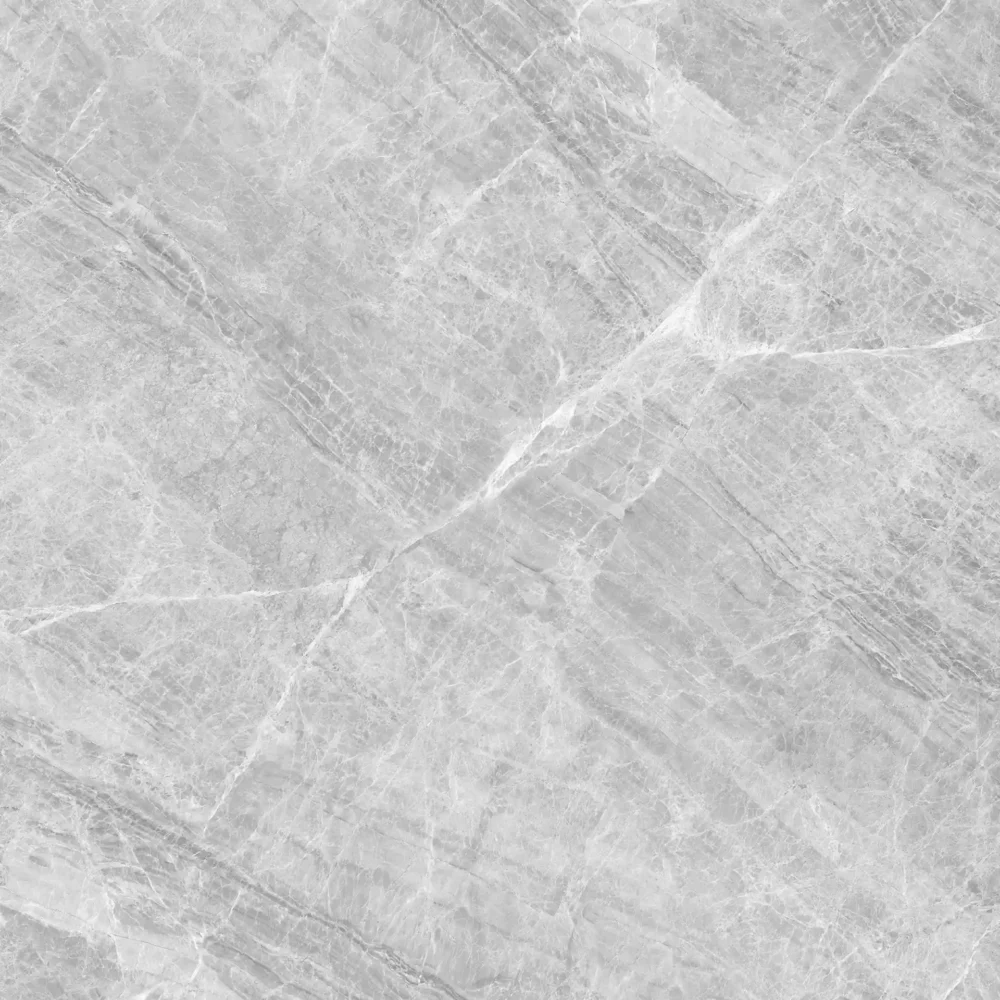
- Light Gray With Charcoal Fleck Quartz GQ-4004 for wholesale
Light Gray With Charcoal Fleck Quartz GQ-4004 for wholesale
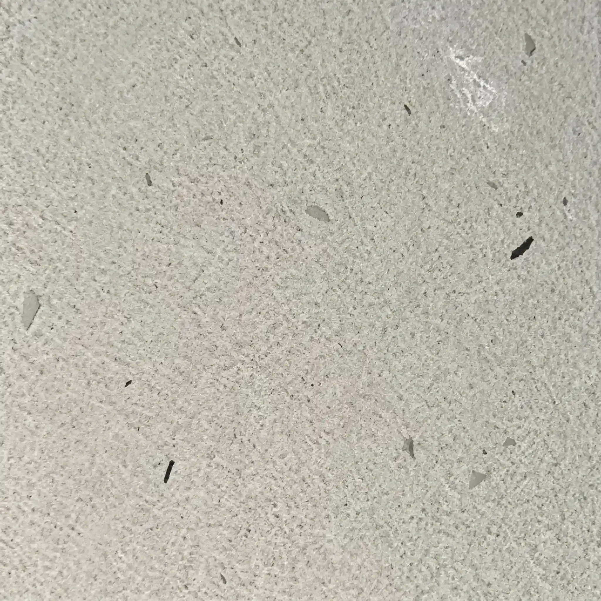
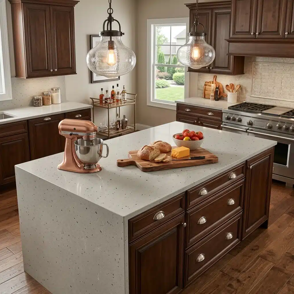
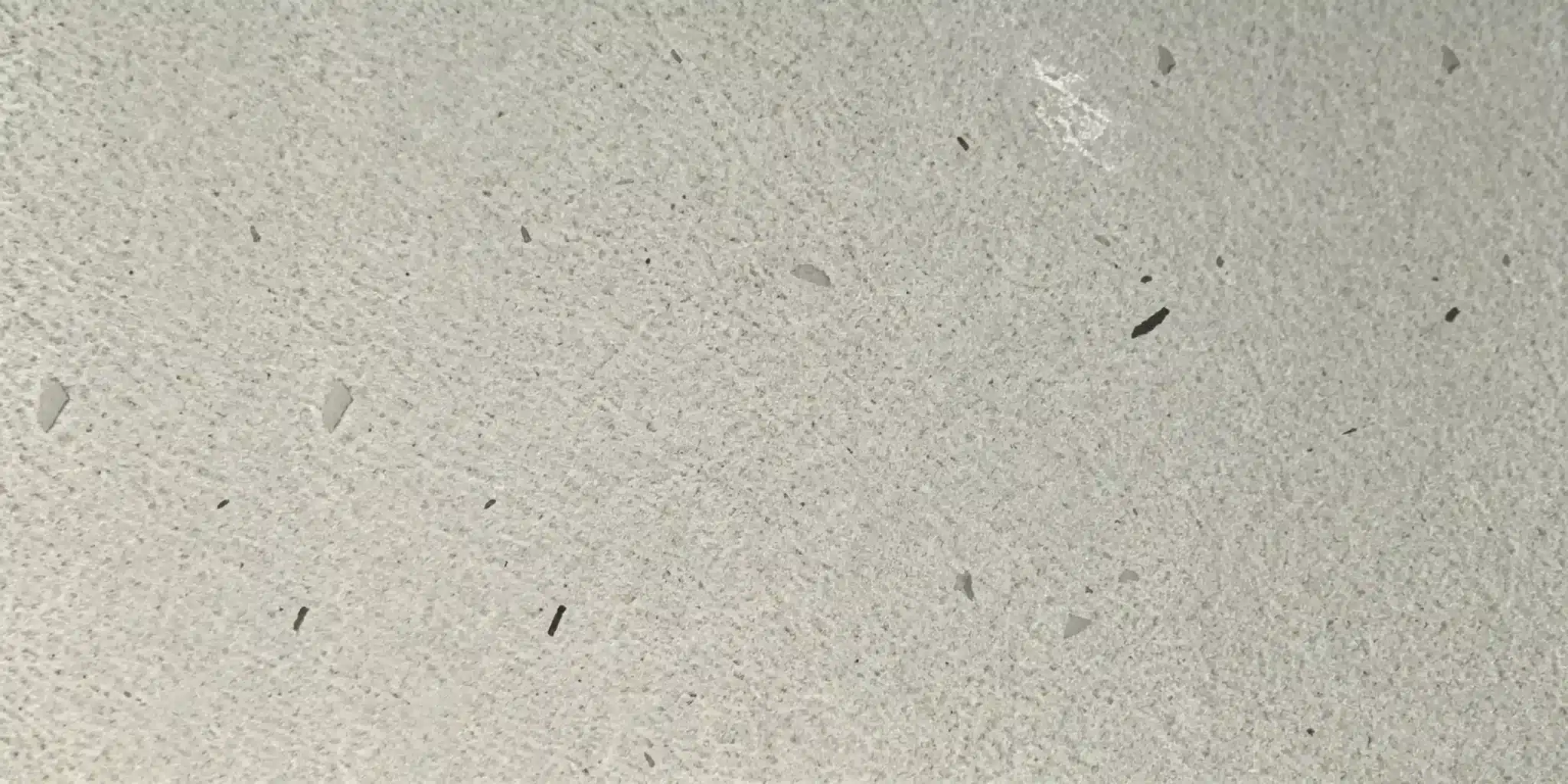
| Primary Color(s) | Pale Ash Gray |
| Accent Color(s) | Charcoal Fleck Black |
| Craft | Regular |
| Finishes | Polished / Honed / Suede / Leathered |
| Customized Size | 138″ × 79″ / 126″ × 63″ / Customizable |
| Thickness | 20mm/30mm/Customizable |
| Edge Style | Eased polished edge/2+2cm laminated edge/Mitred edge |
| Full Body Quartz | Yes |
| Bookmatch Available | Yes |
| Place of Origin | Thailand |
| Port of Transportation | Thailand |
| Packaging | Foam or carton inside + strong wooden crates with reinforced straps outside and fumigation |
| Delivery time | 15-20 days / Express service is negotiable. |
| MOQ | 10 ㎡ |
| Payment terms | 30%T/T after confirm the order and the 70% T/T by copy of B/L |
| Countertops Residential: Yes Commercial: Yes |
| Wall Residential: Yes Commercial: Yes |
| Flooring Residential: Yes Commercial: Yes |
Description:
Frequently asked questions
What are dark gray quartz countertops with light veins like?
Dark gray quartz with light veins—charcoal base with silver, cream, or soft gray streaks—reads bold but not aggressive.
It’s got more dimension than solid black, and less visual fatigue than pure charcoal in large kitchen runs.
In real-world kitchens, it holds up well under ambient or layered lighting, especially when paired with warm-toned cabinetry or brass fixtures.
But vein consistency varies slab to slab—no two slabs match exactly, even within the same batch.
Dry-lay is non-negotiable, especially for islands or open-concept spaces where pattern flow matters.
Seam alignment gets tricky: light veins on a dark field telegraph mismatches faster than on mid-tone backgrounds.
Most fabricators tell you to avoid tight seam joints on busy patterns like this—opt for wider, cleaner seams with consistent veining direction.
Also, polished dark grays show fine scratches and water etching more than matte or honed finishes, so they’re better suited for homes with routine maintenance or commercial spaces where cleaning protocols are locked in.
GQ-4004 uses Full Body Printed Quartz tech, so the vein runs through the slab—not just surface-deep—which helps with edge treatments and repair tolerance.
Light quartz countertops for kitchen?
Light quartz—ivory, warm white, or soft beige—opens up small kitchens and plays nice with almost any cabinet tone.
It’s a go-to for builders and designers who need flexibility across projects.
But here’s what installers don’t always warn clients about: light quartz shows dust, lint, water spots, and fingerprints *immediately*, especially with a polished finish.
A satin or honed finish cuts down on that glare and hides micro-scratches better over time.
From a fabrication standpoint, light quartz slabs often have subtle variation—some with faint gold flecks, others with cool gray undertones or soft clouding.
That’s not a defect—it’s part of the printed quartz character—but it means dry-laying full slabs before cutting is essential, particularly for waterfall islands or long continuous runs.
You’ll want to check veining continuity across joints and ensure no abrupt tonal shifts between slabs.
Also, avoid pairing very light quartz with high-gloss cabinets unless you’re ready for constant wiping.
GQ’s light quartz lines are made on low-silica production lines, which helps reduce dust exposure during cutting—but doesn’t change the fact that lighter colors demand more frequent surface attention post-install.
Which Colors of Quartz Countertops Matches with Gray ?
Gray cabinets aren’t one-size-fits-all—they range from cool blue-based grays to warm taupe-leaning ones—and quartz needs to follow that lead.
Cool grays pair cleanly with white quartz that has silver, graphite, or pale blue veining; warm grays need beige, tan, or gold-tinged quartz to avoid clashing.
Solid light gray quartz works as a neutral bridge, but only if its undertone matches the cabinet—some ‘light gray’ slabs lean brown, and that fights with cool-toned cabinets under LED lighting.
Always test physical samples next to your cabinet doors in the actual space, at different times of day.
For contractors: avoid relying on digital renderings alone.
Vein density and scale matter too—a tight, linear vein reads differently than a broad, organic one.
If you're specifying GQ-4004 or similar marble-look quartz, confirm whether the gray veins are mineral-based or UV-printed, since UV can fade slightly over years of direct sun exposure near windows.
And remember: quartz and cabinets shouldn’t match exactly.
You want contrast—just not conflict.
Bookmatching or directional veining helps tie the look together, especially in open-plan layouts.
What about white quartz countertops with gray and gold veins? It's a compelling mixture that gives richness and elegance to any environment?
White quartz with gray and gold veins delivers strong visual hierarchy—gray anchors it, gold warms it up—but it’s not universally flattering.
In practice, it shines in spaces with controlled lighting: gold veins pop under warm LEDs or incandescent bulbs but flatten out under cool fluorescents.
That means sample testing in your actual lighting setup is critical.
Fabricators report the biggest headache isn’t color—it’s seam matching.
Gold veins, especially when printed, can shift slightly in hue or thickness between slabs, making joint alignment visible if not handled carefully.
Full-body printed quartz (like GQ’s Stone Look line) handles this better than surface-only prints because the vein repeats consistently through the slab thickness—helpful for mitered edges and edge profiles.
Still, avoid placing gold-heavy sections near high-wear zones like sink perimeters unless you’re okay with more frequent cleaning.
And be realistic: this combo shows smudges and dried soap residue faster than solid whites.
It’s elegant, yes—but elegance here comes with upkeep tradeoffs.
Best used where design intent outweighs daily practicality, like formal kitchens or boutique hospitality projects.