



- Home
- Quartz
- Quartz Slabs
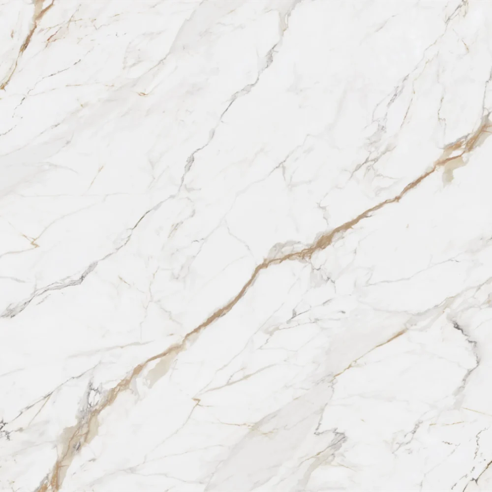
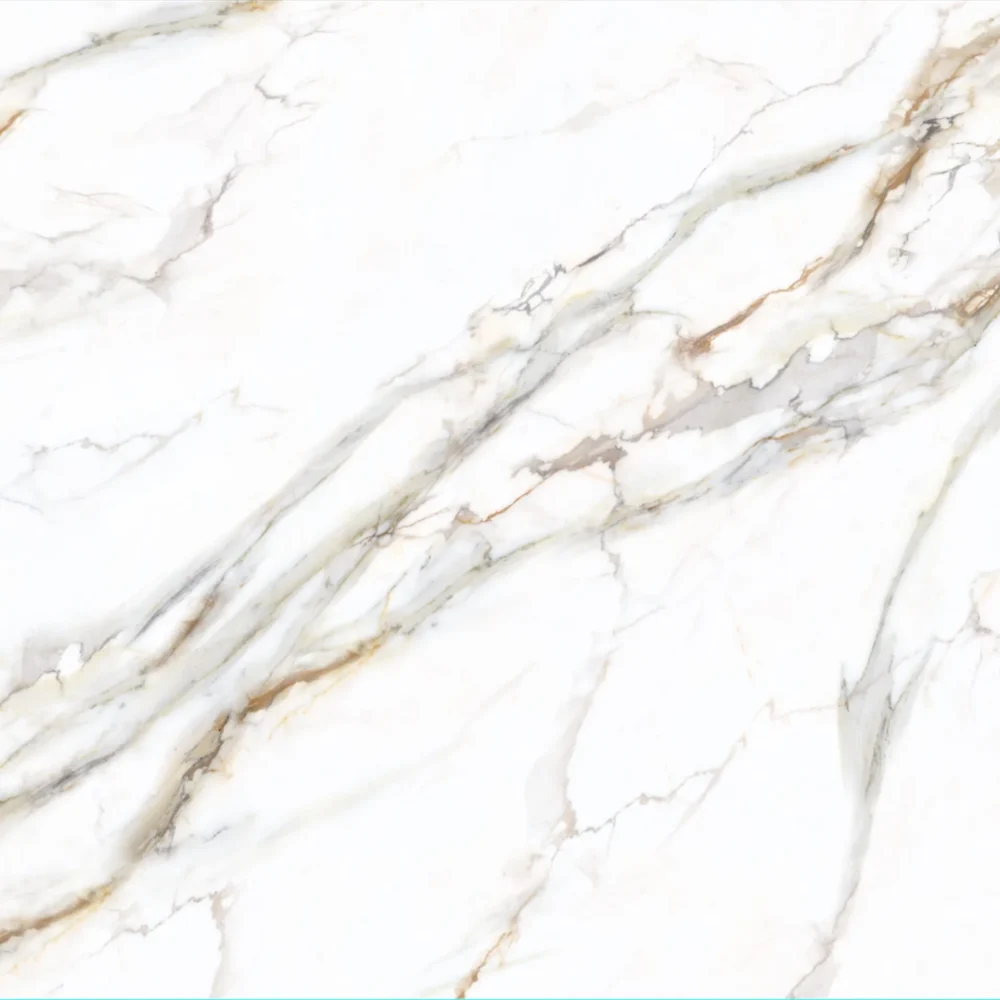
- Neutral Calacatta Cream Quartz Slabs GQ-T301 for wholesale
Neutral Calacatta Cream Quartz Slabs GQ-T301 for wholesale
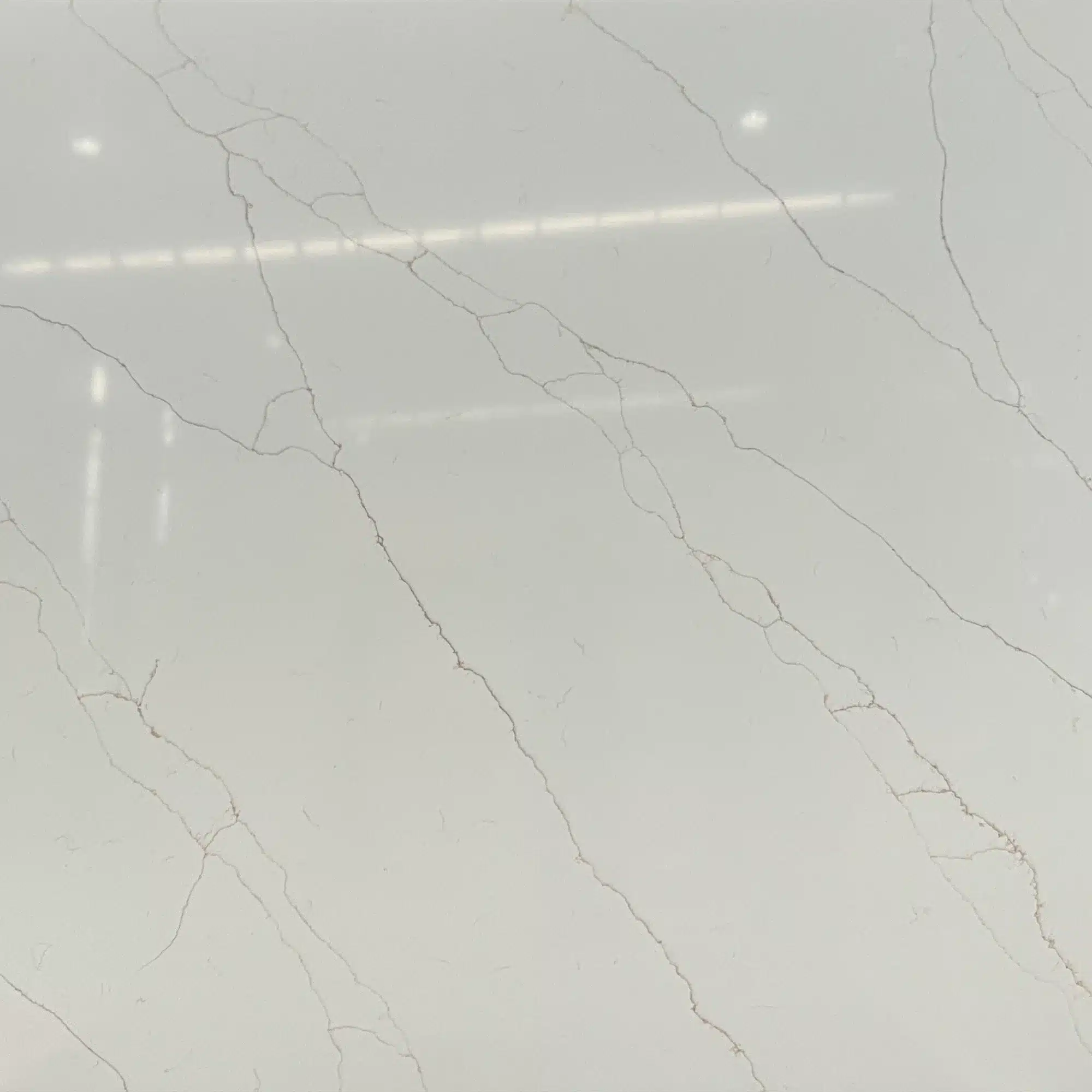
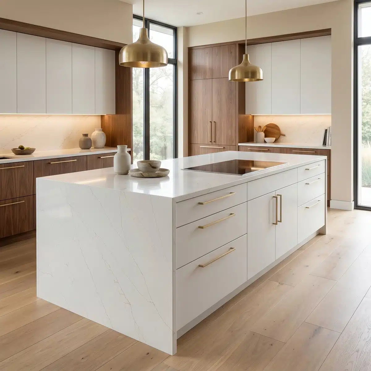
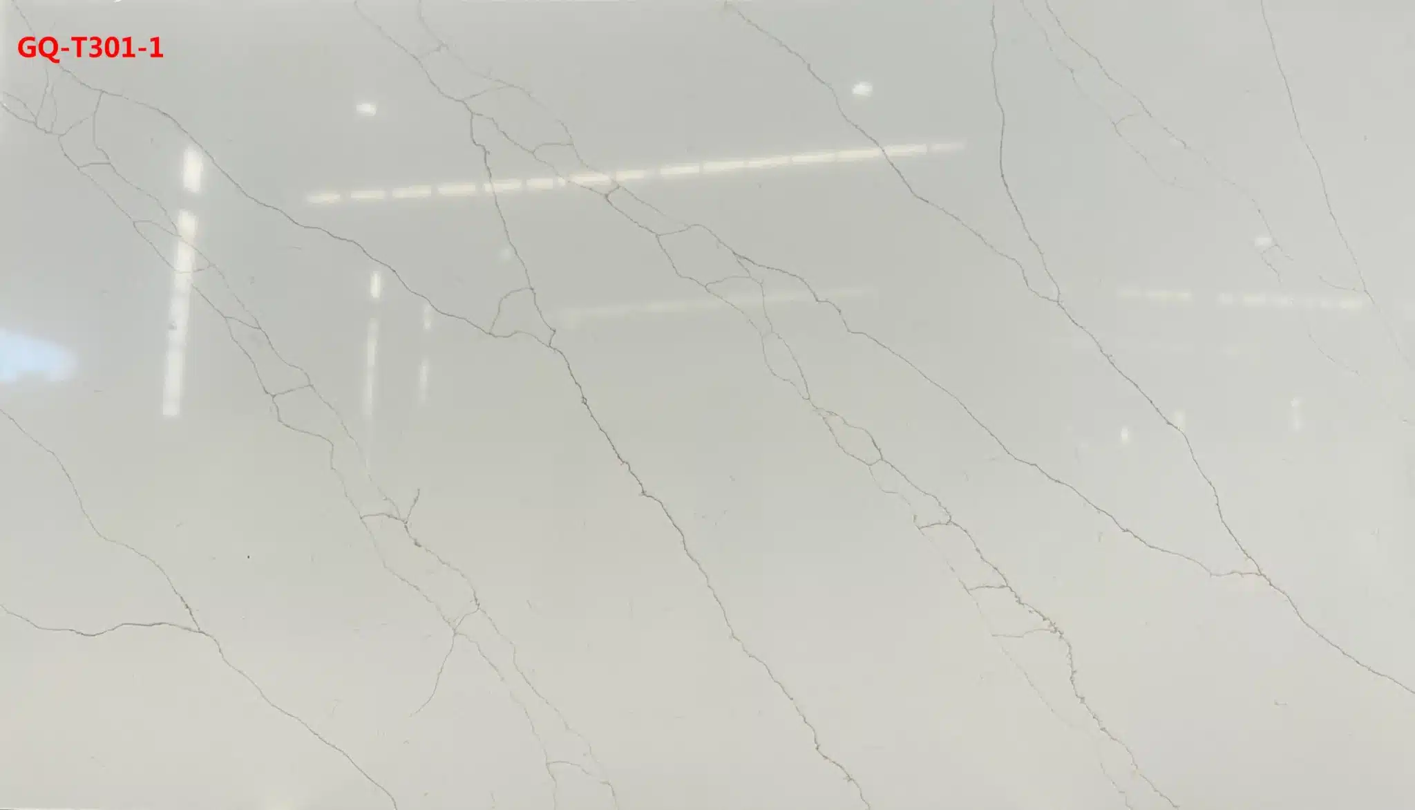
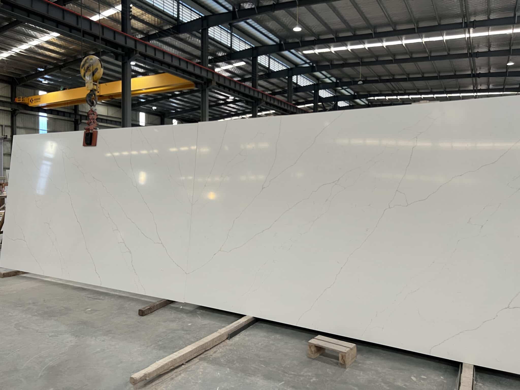
| Primary Color(s) | Creamy White |
| Accent Color(s) | Light Golden-Tan Veins |
| Craft | Regular |
| Finishes | Polished / Honed / Suede / Leathered |
| Customized Size | 138″ × 79″ / 126″ × 63″ / Customizable |
| Thickness | 20mm/30mm/Customizable |
| Edge Style | Eased polished edge/2+2cm laminated edge/Mitred edge |
| Full Body Quartz | Yes |
| Bookmatch Available | Yes |
| Place of Origin | Thailand |
| Port of Transportation | Thailand |
| Packaging | Foam or carton inside + strong wooden crates with reinforced straps outside and fumigation |
| Delivery time | 15-20 days / Express service is negotiable. |
| MOQ | 10 ㎡ |
| Payment terms | 30%T/T after confirm the order and the 70% T/T by copy of B/L |
| Countertops Residential: Yes Commercial: Yes |
| Wall Residential: Yes Commercial: Yes |
| Flooring Residential: Yes Commercial: Yes |
Description:
Frequently asked questions
Is Dawn dish soap safe for quartz?
Yes, Dawn dish soap is safe for quartz — but only if used correctly.
Most fabricators I’ve worked with for 20+ years use it on job sites for quick grease removal, especially around cooktops and sinks.
The catch?
Always dilute it — one capful per quart of warm water — and wipe it off within 30 seconds.
Letting it sit, especially on polished dark slabs, can leave a hazy film that’s tough to buff out.
Never pair it with steel wool or abrasive pads; those scratch the resin matrix and expose filler particles.
And avoid it entirely near seams — Dawn’s surfactants can break down silicone over time if left un-rinsed.
For daily cleaning, warm water and a microfiber cloth are enough.
If you need more cleaning power, stick to pH-neutral cleaners rated for engineered quartz — not just ‘stone-safe’ ones, which often contain citric acid or vinegar.
Dawn works in a pinch, but it’s not a maintenance solution.
Think of it like using WD-40 on a hinge: functional, but not meant for long-term use.
What is the trend in quartz countertops in 2026?
In 2026, the real shift isn’t just about color — it’s about how quartz behaves in space.
We’re seeing strong demand for high-contrast veining in deep charcoals and true whites, but what’s driving specs now is texture consistency across large surfaces.
Honed and leathered finishes are gaining traction because they hide seam telegraphing better than polished — critical for 138-inch jumbo slabs used in open-concept kitchens.
Bookmatched Calacatta-style patterns are common, but clients now expect tight alignment *and* consistent veining direction across islands and backsplashes — something only full-body printed quartz delivers reliably.
On the commercial side, hospitality projects are specifying matte-finish quartz with NSF certification for food prep zones, while multifamily builders are choosing low-variation slabs for faster layout and less waste.
Warm-toned veining (think taupe or soft gold) is replacing stark gray, and edge profiles are getting bolder — ogee, waterfall, and double-bevel — but only when slab thickness supports it.
What hasn’t changed: installers still prefer 3cm for durability on overhangs, and fabricators will tell you that consistent slab calibration matters more than the pattern itself.
Why is quartz in decline?
Quartz isn’t declining — demand is steady, especially in commercial and mid-market residential builds.
What’s shifting is buyer sophistication.
Five years ago, people picked quartz for stain resistance and low upkeep.
Today, they’re asking about UV stability on sun-drenched balconies, thermal shock from hot pots on honed finishes, and whether seams will telegraph under LED lighting.
Some early quartz lines yellowed or dulled after UV exposure — that’s why newer factories, like Grand Quartz Tech in Thailand, now use UV-stable resins and low-silica production lines certified by SGS and NSF.
The ‘decline’ myth comes from oversaturated markets where generic white quartz flooded big-box channels, leading to price erosion and perception fatigue.
But contractors I talk to say full-body printed quartz — especially marble-look and quartzite-look slabs — is winning bids because it solves real problems: no quarry variation, no sealing, and tighter tolerances for CNC fabrication.
If anything, quartz is maturing — not fading.
It’s just demanding better material science and smarter specification.
What is the rarest color of quartz?
There’s no universally rare color — rarity depends on production volume, slab size, and finish consistency.
In practice, the hardest-to-source options are full-body printed slabs with tight veining control in ultra-dark or ultra-light palettes — like true black with fine, crisp white veining, or pure white with subtle blue-gray movement.
These require precise pigment dispersion and multiple print passes, so yield drops.
Fabricators report longer lead times on those, especially when ordering super jumbo sizes (138" x 79") for bookmatched walls.
What’s truly scarce isn’t the color itself, but matching slabs — same batch, same veining rhythm, same caliper — for large-scale projects.
That’s why some wholesalers limit certain SKUs to project-only orders.
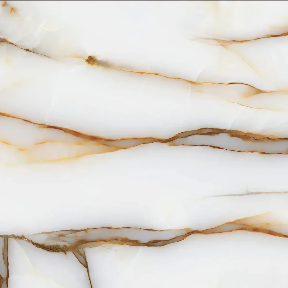
Gold-flecked or iridescent finishes exist, but they’re niche and often limited to specific production runs.
For most jobs, availability hinges less on hue and more on factory capacity and shipping logistics — especially since Grand Quartz Tech ships from Thailand, and air freight constraints can delay exotic batches.
Bottom line: don’t chase ‘rare’ — chase consistency, certification, and slab-size flexibility.
-1000x1000.webp)