- Home
- Quartz
- Quartz Slabs
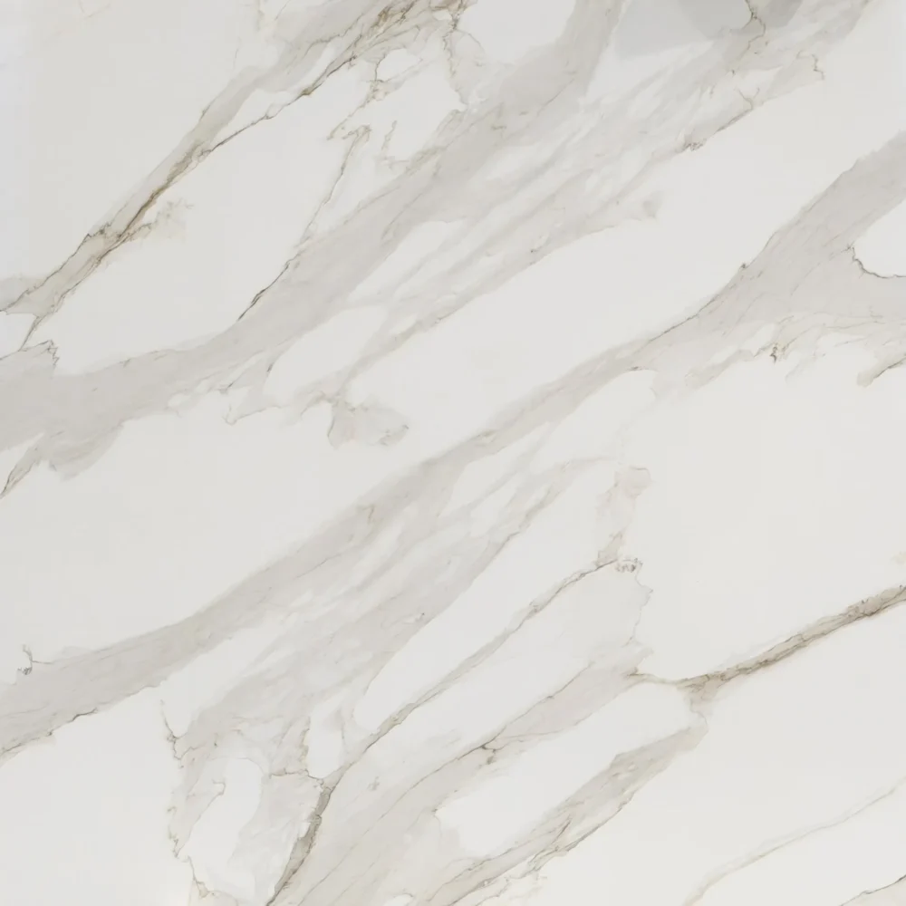
- Quartzite Look Quartz for Kitchen Island Countertops GQ-R0250
Quartzite Look Quartz for Kitchen Island Countertops GQ-R0250


| Primary Color (s) | Light Dove Gray |
| ACCENT COLOR (S) | Warm Mauve Brown |
| Craft | Printed |
| Finishes | Polished / Honed / Suede / Leathered |
| Customized Size | 138″× 79″ / 126″× 63″ / Customizable |
| Thickness | 20mm/30mm/Customizable |
| Edge Style | Eased polished edge/2+2cm laminated edge/Mitred edge |
| Country | Thailand |
| Full Body Printed Quartz | Yes |
| Bookmatch Available | Yes |
| Countertops Residential: Yes Commercial: Yes |
| Wall Residential: Yes Commercial: Yes |
| Flooring Residential: Yes Commercial: Yes |
Description:
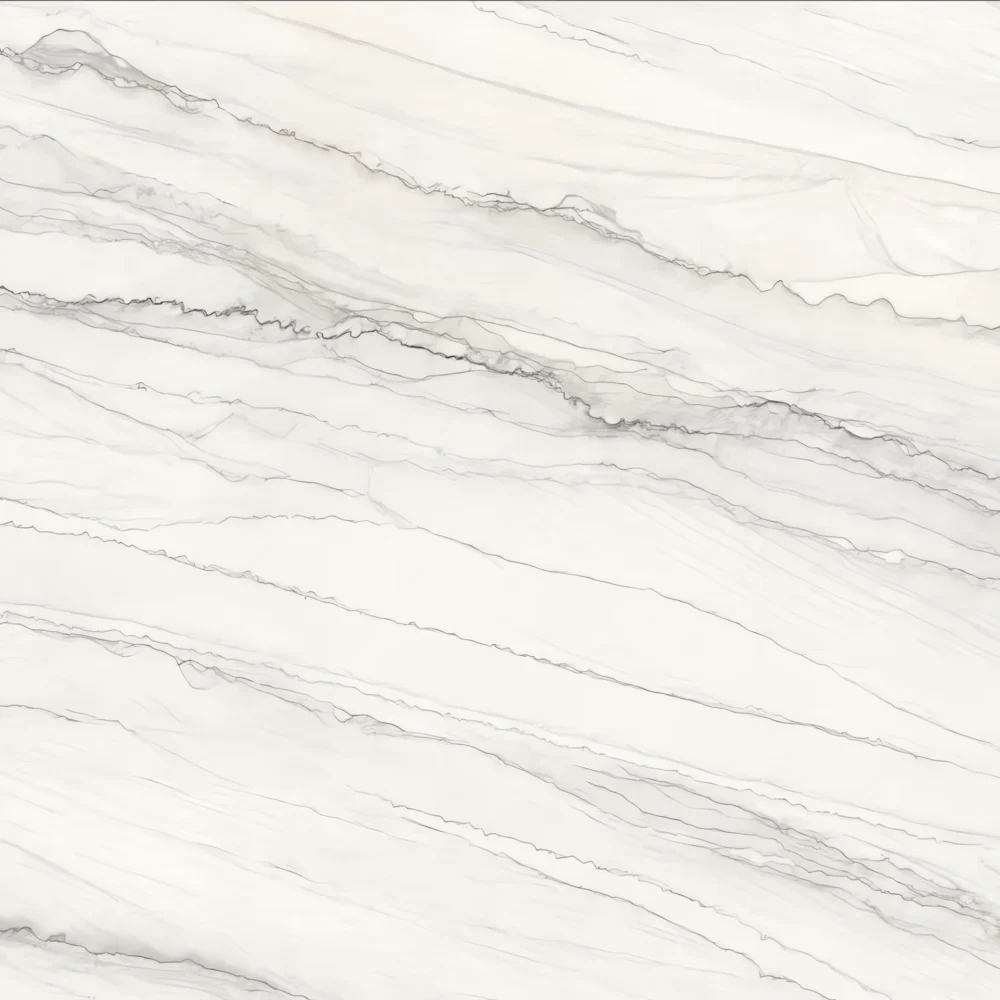
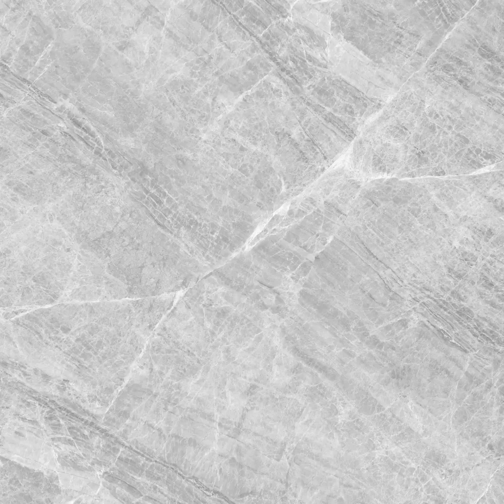
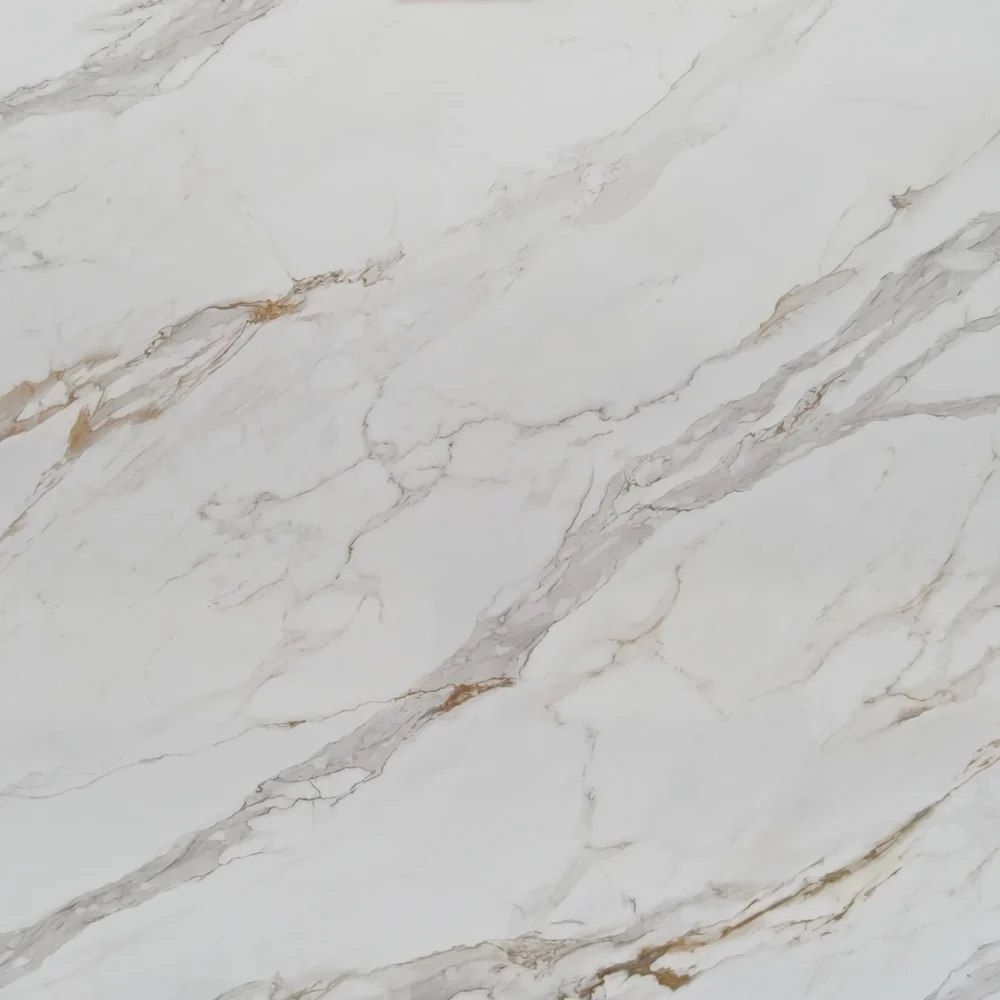
Material impression: GQ-R0250 begins with a cool medium-gray body rather than a white marble field. Silver-gray misting, charcoal shadow areas, and fine granular mineral texture give the slab a compact, stone-cut appearance, as if layers of gray rock have been lightly weathered and then polished smooth. The veining is restrained but directional: slim dark-gray, taupe-brown, and occasional reddish-brown lines move mainly across the slab in horizontal bands, with small branching traces and softened edges. The effect is closer to quiet gray quartzite or sedimentary marble than a dramatic Calacatta pattern—subtle, layered, and practical for interiors that need movement without visual noise.
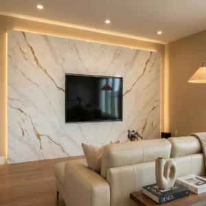
Design placement: In an American transitional kitchen, GQ-R0250 works especially well as perimeter countertops beside white shaker cabinets, brushed nickel pulls, pale gray tile, and warm wood flooring; the gray base keeps the room tailored, while the brown-taupe threads prevent the palette from feeling cold. For a modern farmhouse kitchen, it can be used on a large island with navy or charcoal cabinetry, oak shelves, black iron pendants, and woven stools, creating a soft natural-stone focal point instead of a high-contrast centerpiece. In a classic master bathroom, the same slab suits vanity tops, shower wall panels, tub ledges, and full-height backsplash areas, pairing cleanly with light gray vanities, chrome or nickel fixtures, white walls, and a freestanding tub for a calm, spa-like atmosphere.
Case-inspired framing: Picture a 680-square-foot boutique residential mortgage office with a front greeting counter, two small consultation desks, a coffee alcove, and one client restroom. The designer selects GQ-R0250 for the reception counter, the beverage ledge, and the restroom vanity to create a steady, professional material language throughout the compact space. During layout planning, the fabricator runs the longer gray-brown bands lengthwise across the counter face, so the surface reads as a quiet horizontal horizon from the entry. The more even gray zones are kept on the writing areas where tablets, loan folders, pens, and sample documents need a clean background. Under 3500K neutral lighting, the slab feels composed rather than dark; white shaker-style millwork, brushed nickel hardware, charcoal accent chairs, pale oak flooring, and soft linen wallcovering pick up its balanced cool-gray and earthy undertones. The finished space feels trustworthy, durable, and easy to maintain—an aesthetic that can be translated just as naturally into kitchens, bathroom vanities, backsplash panels, reception desks, and model-home upgrade packages.
Frequently asked questions
Has anyone used calacatta quartz with brown cabinets and regretted the undertone?
Yes, people regret it when the white, Vein color, and cabinet stain weren’t checked together in the actual roon. In real-world kitchens, brown cabinets can look great with a Calacatta-style slab if the veining has some warn taupe, broin, or soft beige in it. The problen is when the s1ab reads cool gray -blue and the cabinets are orange oak, red cherry, or very yellow maple – then the wtole kitchen can feel slightly “off.’
Most fabricators and designer’s ill tell you to bring a cabinet door, floring sample, backsp lash sample, and look at the quartz under your onnlighting. A slab that looks creany under 300eK warn LEDs may look stark under daylieht or 40eK island pendants. Large white surfaces also reflect wall color and window light, so the sample can shift once installed.If you’re pairing with walnut, espresso, rift oak, or medium broin shaker cabinets, browin Veining usually helps tie things together. Just don’tchoose from a phone photo or a tiny showroom chip.
What’s the largest usable width you can really get out of a quartz slab?
Don’t assume the entire advertised slab size is fully usable. The actual working area is usually smaller.
Most standard quartz slabs are about 126″ × 63″. Jumbo slabs are often around 138″ × 79″. But the exact size varies by brand, color, and production batch.
In real fabrication, the fabricator usually needs to:
trim the factory edges,
square the slab,
remove chipped or damaged areas,
and leave room for edge finishing.
Because of this, the usable width is often a few inches less than the listed slab size.
For example, a jumbo slab may provide around 60″ of finished depth for a large island if the layout works perfectly. But that should never be treated as guaranteed.
Calacatta-style quartz with directional veining can make the situation even more complicated. In many projects, the fabricator will prioritize vein flow and visual balance instead of simply maximizing every inch of material. The slab may need to be rotated or repositioned so the veining looks natural across the island, waterfall panels, or seams.
Even if the slab is technically large enough, other jobsite conditions can still affect the final design. Stairways, elevators, transportation limits, cabinet support, overhang requirements, and seam placement can all force design adjustments or additional seams.
The safest approach is to have the fabricator confirm the exact slab dimensions and provide a full layout drawing before finalizing cabinets, waterfall panels, or oversized islands.