



- Home
- Quartz
- Quartz Slabs
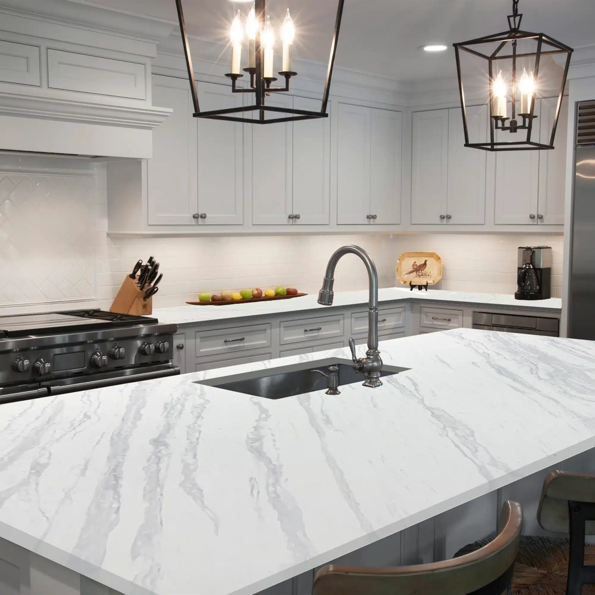
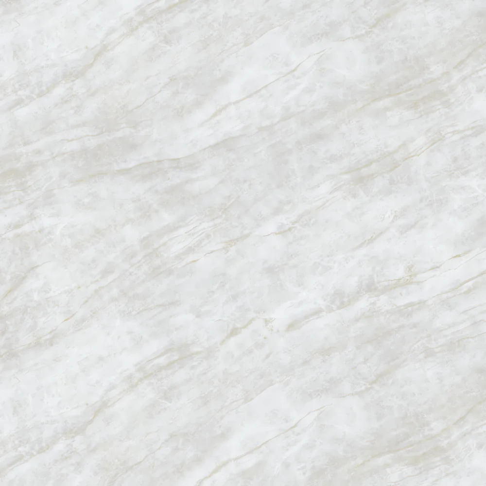
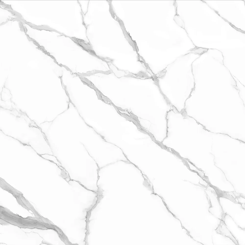
- Volakas Stream Quartz GQ-T366 | White with Soft Gray Diagonal Veining
Volakas Stream Quartz GQ-T366 | White with Soft Gray Diagonal Veining
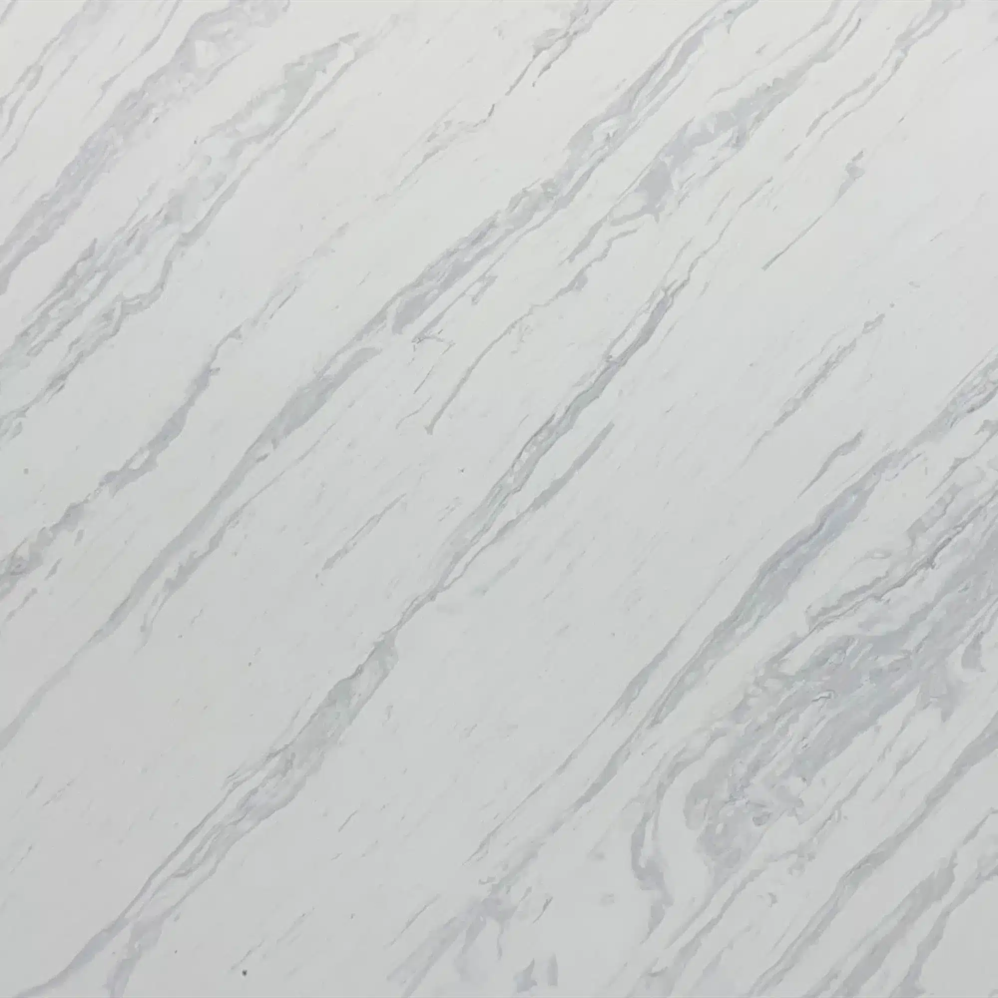
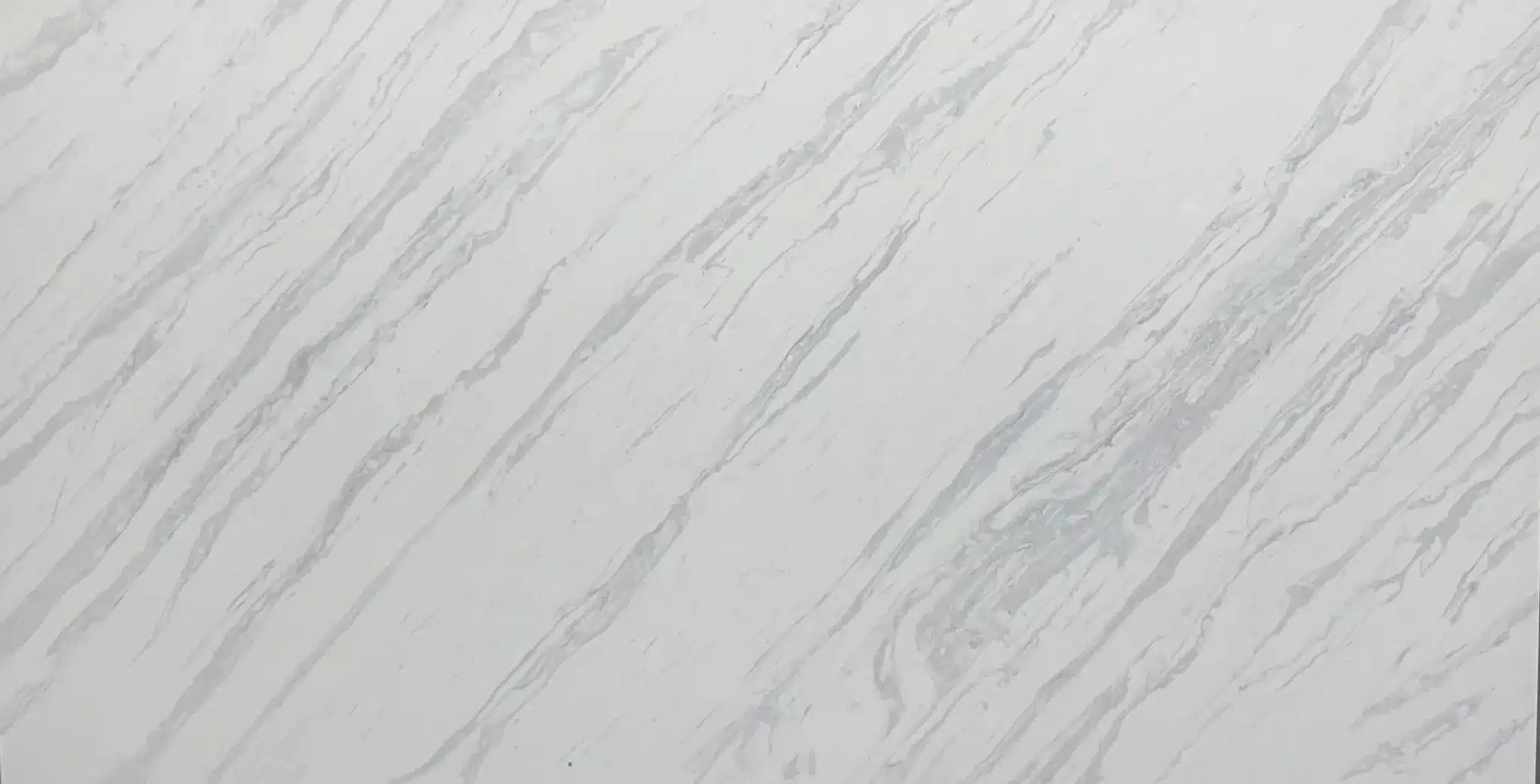
| Primary Color(s) | White |
| Accent Color(s) | Light to Medium Grey Veining |
| Craft | Regular |
| Finishes | Polished / Honed / Suede / Leathered |
| Customized Size | 138″ × 79″ / 126″ × 63″ / Customizable |
| Thickness | 20mm/30mm/Customizable |
| Edge Style | Eased polished edge/2+2cm laminated edge/Mitred edge |
| Variations | Medium |
| Full Body Quartz | Yes |
| Bookmatch Available | Yes |
| Place of Origin | Thailand |
| Port of Transportation | Thailand |
| Packaging | Foam or carton inside + strong wooden crates with reinforced straps outside and fumigation |
| Delivery time | 15-20 days / Express service is negotiable. |
| MOQ | 10 ㎡ |
| Payment terms | 30%T/T after confirm the order and the 70% T/T by copy of B/L |
| Countertops Residential: Yes Commercial: Yes |
| Wall Residential: Yes Commercial: Yes |
| Flooring Residential: Yes Commercial: Yes |
Description:
Frequently asked questions
What are the best colors for quartz countertops?
There’s no universal 'best' color—what works depends on your lighting, cabinetry, and how much visual weight you want the countertop to carry.
In real-world kitchens, light grays with soft movement—like GQ-T366—hold up well over time because they balance contrast without shouting.
Polished versions show fingerprints more on darker tones; honed finishes mute that but need consistent cleaning to avoid buildup in texture.
Most fabricators will tell you: busy veining hides scratches better than solid colors, but it also telegraphs seam lines more.
If you’re bookmatching or doing waterfall islands, full-body printed quartz (like Grand Quartz Tech’s technology) keeps edges consistent—no surprise white cores when mitered.
Warm whites with beige undertones tend to age better in sunlit rooms than cool whites, which can yellow slightly under UV exposure over years.
Always test physical samples—not digital swatches—under your actual morning, noon, and evening light.
And remember: backsplash tile, flooring, and wall paint all shift how a quartz color reads.
What looks neutral in a showroom may read warm or cold in your space.
What is the most versatile color of quartz countertops?
Light gray quartz with minimal, soft veining—like GQ-T366—is what most contractors reach for when they need flexibility across cabinet styles, lighting conditions, and resale goals.
It reads neutral in both north- and south-facing rooms, doesn’t fight warm wood tones or cool grays, and stays grounded under LED, incandescent, or natural light.
Installers usually recommend it for multi-family projects or model homes where predictability matters.
But versatility has limits: in low-light kitchens, even light grays can look flat without contrast elsewhere—so pair with a textured backsplash or open shelving to add depth.
Also, honed finishes on these colors hide smudges better than polished, but require more frequent wiping to prevent residue buildup in the micro-texture.
Real-world caveat: if your floor is heavily patterned or your cabinets have strong grain, a 'versatile' quartz can get lost—sometimes a subtle tone-on-tone variation works better than true neutrality.
Grand Quartz Tech’s full-body printed slabs help here—edges stay visually aligned even after fabrication, so the color holds its intent through sinks, cooktop cutouts, and seams.
What is the lifespan of quartz countertops?
Quartz doesn’t wear out like laminate or chip like granite—it fails from misuse, not age.
In residential kitchens, I’ve seen GQ slabs installed in 2015 still looking factory-fresh, with only minor seam discoloration from improper silicone or UV exposure near windows.
Commercial spaces tell a different story: hotel breakfast bars show edge rounding after five years of constant tray traffic; café counters near dishwashers develop micro-scratches from stainless steel tools.
Thermal shock is real—placing a hot pan directly on quartz near a gas range can cause hairline cracks, especially on thinner 2cm slabs.
Fabricators often see damage from DIY cutting or using abrasive pads during cleaning—those leave permanent haze on polished finishes.
NSF-certified quartz like Grand Quartz Tech’s holds up better in food prep zones because the resin matrix resists bacterial infiltration, but that doesn’t make it indestructible.
The real lifespan limiter?
Design fatigue.
Clients replace countertops not because they’re failing, but because the veining pattern feels dated next to new tile or cabinet trends.
With proper trivet use, non-abrasive cleaners, and seam maintenance, expect 20+ years—but plan for how your space evolves, not just the slab’s durability.
What questions should I ask about our quartz countertops?
Start with slab logistics: 'What’s the exact size, thickness, and weight per slab?' Jumbo sizes like Grand Quartz Tech’s 138" x 79" slabs move differently on-site—your crane capacity and framing must match.
Ask for dry-lay photos *before* fabrication, especially for bookmatched runs—vein alignment shifts between slabs, and digital previews lie.
Clarify finish type: polished quartz reflects light but shows water spots; honed needs more frequent wiping to avoid film buildup in the texture.
Confirm whether it’s full-body printed—if you’re doing waterfall ends or exposed edges, surface-only printing leaves visible white cores.
Ask about seam strategy: 'How many seams will this layout need, and where will they fall?' A good fabricator maps them to avoid crossing high-traffic zones or sink cutouts.
Request batch consistency sheets—color shift between production runs happens, especially with complex veining.
And don’t skip the freight question: Thai-made slabs like GQ’s ship reliably, but lead times tighten during monsoon season or port congestion.
Last: get written confirmation on who handles seam repair if discoloration occurs within six months—material warranty rarely covers labor or reinstallation.
-1000x1000.webp)