- Home
- Quartz
- Quartz Slabs
- Warm Quartz Slabs GQ-T460 for Kitchen Islands and Backsplashes
Warm Quartz Slabs GQ-T460 for Kitchen Islands and Backsplashes


| Primary Color (s) | Light Cream |
| ACCENT COLOR (S) | Soft Beige |
| Craft | Regular |
| Finishes | Polished / Honed / Suede / Leathered |
| Customized Size | 138″× 79″ / 126″× 63″ / Customizable |
| Thickness | 20mm/30mm/Customizable |
| Edge Style | Eased polished edge/2+2cm laminated edge/Mitred edge |
| Country | Thailand |
| Full Body Quartz | Yes |
| Bookmatch Available | Yes |
| Countertops Residential: Yes Commercial: Yes |
| Wall Residential: Yes Commercial: Yes |
| Flooring Residential: Yes Commercial: Yes |
Description:
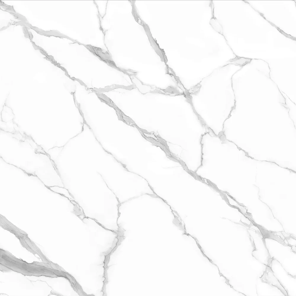
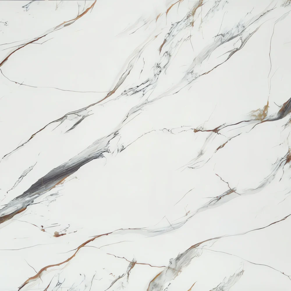
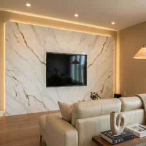
Color and vein character: GQ-T460 is a polished quartz surface designed for calm, light-filled interiors rather than strong marble drama. Its base moves between soft white and very pale warm gray, giving the slab a gentle brightness that avoids an icy or sterile impression. Fine gray veins appear as narrow, wavy, feathered lines—more like quiet rain trails on smooth limestone than heavy mineral fractures. On a waterfall face, the movement reads mostly vertical, while across the countertop plane it stretches lengthwise in a soft linear rhythm. The low-contrast pattern allows the surface to feel clean from a distance, yet close inspection reveals a refined stone-like texture with delicate directional detail.
Application direction: This design is especially useful for U.S. projects where the countertop needs to support cabinetry, wood tones, and fixtures without becoming visually loud. In a modern farmhouse kitchen, GQ-T460 works well with soft white shaker cabinets, warm oak shelves, apron-front sinks, and either brushed nickel or matte black hardware; the fine gray movement gives the island a natural surface language while keeping the room relaxed. For a transitional primary bathroom, it can be specified for double vanities, tub decks, low backsplashes, and shower ledges beside a freestanding tub, brushed nickel faucets, pale wall tile, and warm white paint. In a contemporary open-plan kitchen, the slab becomes especially elegant on a waterfall island with light wood flat-panel cabinetry, integrated appliances, slim pendant lighting, and a simple full-height backsplash, where the lengthwise veining helps elongate the space.
Case-inspired framing: Imagine a 730-square-foot boutique residential design consultation office with a front sample-review counter, a compact coffee station, one meeting table, and a client restroom. The designer selects GQ-T460 for the 8-foot counter, beverage ledge, and vanity top to create a consistent, quiet material story that does not compete with cabinet doors, tile boards, and flooring samples. During slab planning, the fabricator lets the fine linear veining run along the main counter length, while the waterfall end is positioned so the soft gray streaks fall downward in a natural vertical flow. The most open white-gray areas are kept on writing surfaces where laptops, finish schedules, color cards, and hardware trays need a clear background. Under warm-neutral 3500K lighting, the polished finish adds a clean reflection without glare, pairing neatly with white shaker display panels, pale oak drawers, brushed nickel pulls, linen chairs, and soft greige walls. The finished space feels orderly, bright, and commercially practical—an easy reference point for distributors, builders, and designers specifying subtle white quartz countertops for kitchens, vanities, islands, laundry rooms, and small client-facing interiors.