- Home
- Quartz
- Quartz Slabs
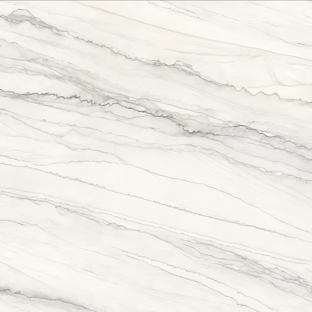
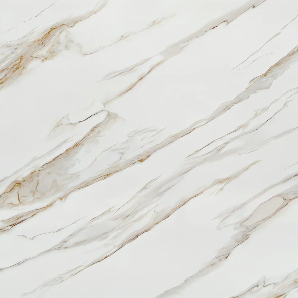
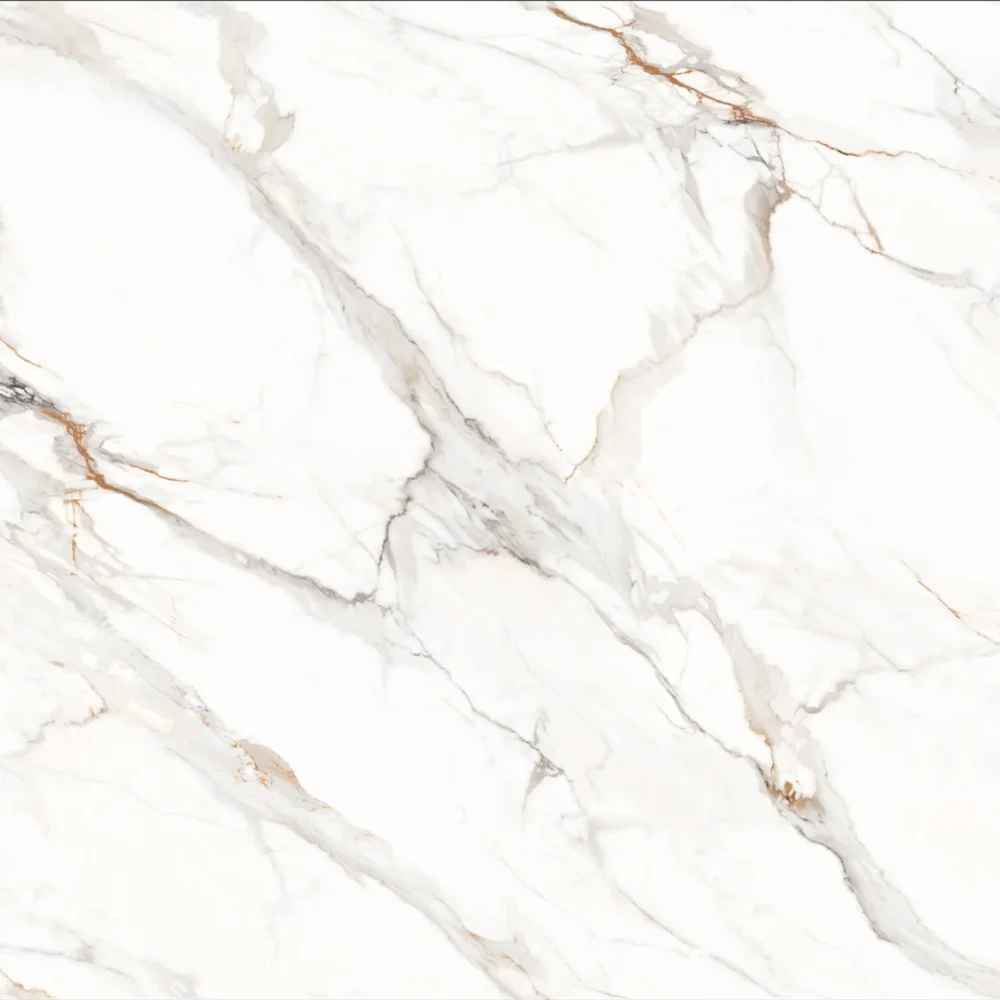
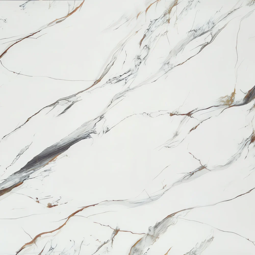
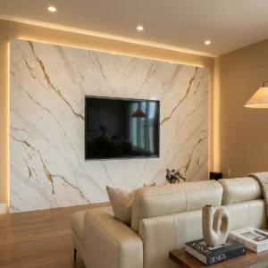
- Mountain Gold Vein Printed Quartz countertops GQ-R0240 for wholesale
Mountain Gold Vein Printed Quartz countertops GQ-R0240 for wholesale


| Primary Color(s) | Soft Ivory White |
| Accent Color(s) | Subtle Slate Grey + Faint Ash Grey Vein |
| Craft | Printed |
| Finishes | Polished / Honed / Suede / Leathered |
| Customized Size | 138″ × 79″ / 126″ × 63″ / Customizable |
| Thickness | 20mm/30mm/Customizable |
| Edge Style | Eased polished edge/2+2cm laminated edge/Mitred edge |
| Country | Thailand |
| Full Body Printed Quartz | Yes |
| Bookmatch Available | Yes |
| Countertops Residential: Yes Commercial: Yes |
| Wall Residential: Yes Commercial: Yes |
| Flooring Residential: Yes Commercial: Yes |
Description:
Frequently asked questions
I’m looking for a white quartz with subtle light gray veining. What are people using to achieve this look?
Honestly, most fabricators and homeowners go with engineered quartz that’s specifically formulated to mimic high-end natural stones like Taj Mahal quartzite. The key is finding a slab with low variation—consistent, soft gray veining over a bright white base. Popular options include 'Taj Mahal Quartz' or 'Statuario Ash Vein' patterns, which offer that subtle, elegant gray veining without overpowering the space. Some brands use full-body printing to replicate the natural look, especially in jumbo or super jumbo slabs, giving you longer runs with fewer seams. If you're going for a modern, clean kitchen or bathroom, these low-variation veined whites are huge right now. Just make sure the slab is from a reputable manufacturer—cheap versions can look plasticky or have inconsistent veining. Also, ask for a dry-lay approval if possible; you’ll see how the veining flows across multiple slabs before installation.
Do all quartz slabs look the same?
Not even close. That’s a common misconception. Quartz slabs vary wildly in color, veining, texture, and even material composition. You’ve got solid whites, bold blues, deep blacks, and everything in between. Then there’s the variation in veining—some slabs have minimal, subtle gray lines, others have dramatic, wide gold or blue veins. High-variation slabs can look almost like marble, while low-variation ones are more uniform, great for modern spaces. Even within the same color family, different brands or batches can look completely different. A 'pure white' from one manufacturer might have faint speckles, while another is dead white. And don’t forget finishes—polished, honed, leathered, or matte—all affect the final look. So no, not all quartz slabs look the same. It’s important to see actual samples or request high-res photos from the supplier before committing. Fabricators will tell you: always inspect the slab in person or via video call if possible.
How to Spot Low-Quality Quartz Slabs Before You Buy?
First, check the edges and backside. Low-quality slabs often have uneven thickness, chipped corners, or visible seams that aren’t properly bonded. Look for consistency in color and pattern—bad slabs will have blotchy areas or random dark spots that don’t match the design. If you’re buying a veined pattern, make sure the veins are smooth and continuous; jagged or pixelated lines suggest poor printing or low-grade resin. Also, inspect for surface defects: scratches, swirls, or a dull finish can be signs of poor manufacturing. Ask about the resin-to-quartz ratio—higher quartz content (90%+) means better durability. Low-grade slabs often use more resin, which can yellow over time. Finally, check the manufacturer’s reputation. Reputable brands like Cambria, Silestone, or MSI stand behind their products. If the price seems too good to be true, it probably is. Always request samples, and if possible, ask for a dry-lay preview. A good fabricator will spot issues before installation—don’t skip that step.
What materials achieve white quartz with light gray veining?
The main material is engineered quartz, specifically formulated to mimic high-end natural stones like Taj Mahal quartzite. These slabs are made from 90-95% ground quartz and 5-10% resin, with pigments and veining additives added during manufacturing. Full-body printing technology is now widely used to create realistic gray veining throughout the slab, not just on the surface. This ensures the pattern stays consistent even when cut or seamed. Brands like MSI, Cambria, and Cosentino offer white quartz with subtle gray veining under names like 'Taj Mahal Quartz,' 'Statuario White,' or 'Pure White with Gray Veins.' Some slabs use a combination of natural quartz particles and synthetic veining agents to achieve a more organic look. For a truly seamless effect, especially in large kitchens or islands, jumbo or super jumbo slabs are preferred—less seams, better continuity. The key is finding a slab with low variation and a consistent gray vein pattern that doesn’t look artificial or repetitive.