- Home
- Quartz
- Quartz Slabs
- Wholesale Taj Mahal Quartz for Minimalist Backlit Kitchen Islands GQ-R0226
Wholesale Taj Mahal Quartz for Minimalist Backlit Kitchen Islands GQ-R0226


| Primary Color (s) | Pale Onyx White |
| ACCENT COLOR (S) | Soft Champagne Vein |
| Craft | Printed |
| Finishes | Polished / Honed / Suede / Leathered |
| Customized Size | 138″× 79″ / 126″× 63″ / Customizable |
| Thickness | 20mm/30mm/Customizable |
| Edge Style | Eased polished edge/2+2cm laminated edge/Mitred edge |
| Country | Thailand |
| Full Body Printed Quartz | Yes |
| Bookmatch Available | Yes |
| Countertops Residential: Yes Commercial: Yes |
| Wall Residential: Yes Commercial: Yes |
| Flooring Residential: Yes Commercial: Yes |
Description:
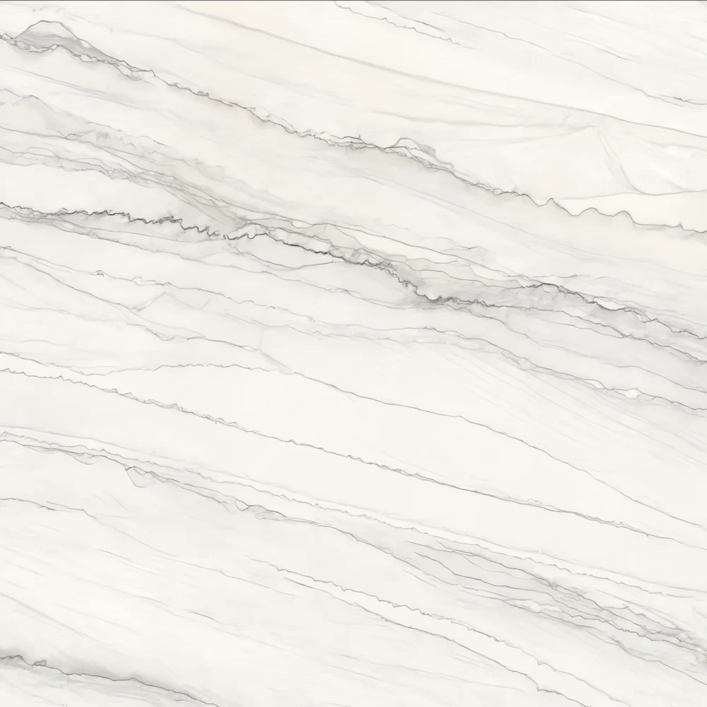
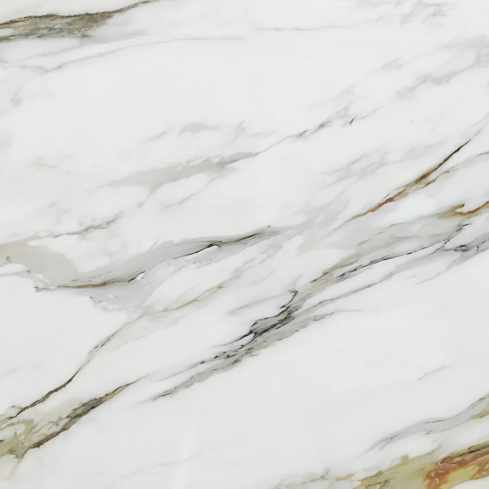
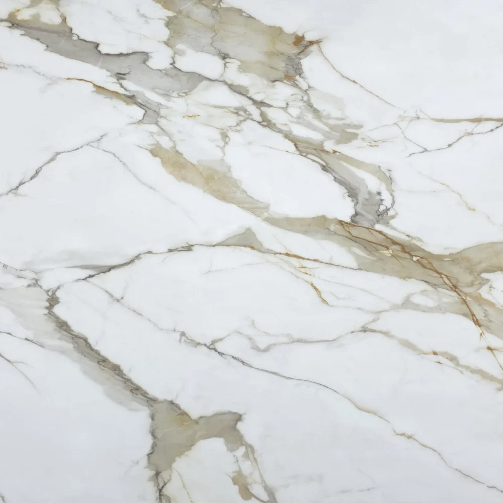
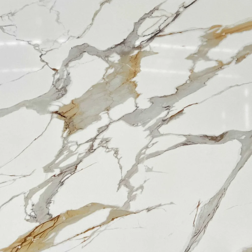
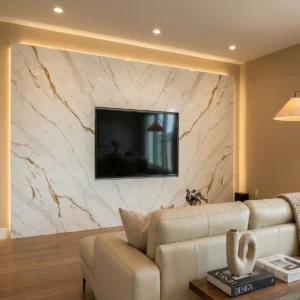
Color and movement: GQ-R0226 takes its strength from restraint. The surface sits in a soft off-white to warm ivory range, with creamy beige undertones that keep the slab welcoming rather than stark. Across this quiet base, fine taupe, light tan, and pale golden-beige veins travel diagonally in a loose, natural rhythm. The movement is similar to thin lines left by a breeze across wet sand: directional enough to give the countertop flow, but light enough to remain calm in a finished room. Faint cloudy layers in the background add depth, so the slab reads as a refined marble- or quartzite-inspired surface instead of a plain solid white top.
Design applications: This pattern is especially useful for projects where the countertop should brighten the space without becoming the loudest feature. In a transitional American kitchen, GQ-R0226 pairs beautifully with white shaker cabinets, brushed brass hardware, a soft white backsplash, and medium oak flooring; the warm ivory base supports the cabinetry while the beige-taupe veining connects naturally with brass and wood. On a modern farmhouse island, it works well with warm wood accents, matte black fixtures, woven stools, and simple pendant lighting, giving the island a soft natural focal point rather than a high-contrast marble statement. In a classic coastal primary bathroom, it can be specified for a double vanity, tub deck, shower ledges, or a low backsplash beside a freestanding tub and light oak vanity, creating a bright, relaxed atmosphere with gentle stone movement.
Case-inspired project concept: Imagine a 740-square-foot boutique kitchenware and cooking-class studio with a front checkout counter, a compact demo island, open shelving for ceramics, and one customer restroom. The designer selects GQ-R0226 for the 9-foot sales counter, the demo prep surface, and the restroom vanity to create one continuous light material language throughout the small space. During slab planning, the fabricator allows the delicate diagonal veins to run across the demo island from the instructor side toward the guest seating, giving the worktop a subtle sense of motion during classes. Softer ivory zones are reserved for the checkout area where packaging, recipe cards, and product samples need a clean visual field. Under warm-neutral 3500K lighting, the quartz reflects a gentle brightness without feeling glossy or cold. White shaker-style lower cabinets, natural oak shelves, brushed brass rails, matte black faucets, cream wall tile, and linen roman shades all pick up the slab’s quiet warm tones. The finished interior feels practical for daily retail traffic, comfortable for small events, and easy for homeowners, builders, and commercial buyers to translate into kitchens, bathrooms, hospitality counters, and model-home upgrade packages.
Frequently asked questions
Will I regret choosing a Calacatta-style quartz with white oak cabinets and champagne gold hardware?
You probably will not regret choosing Calacatta quartz if the slab matches your cabinet tone and lighting. However, this is also one of the easiest countertop materials to misjudge from a small sample.
Calacatta quartz comes in a very wide range of styles. Some slabs look warm and creamy, while others are bright blue-white or cool gray. Veining can also vary a lot. Some patterns are soft and natural-looking, while others use large dramatic veins that may feel too busy or artificial once installed across an entire kitchen.
When pairing Calacatta quartz with white oak cabinets and champagne gold hardware, undertones become extremely important. A quartz surface that is too cool or too gray can make white oak appear yellow or orange. It can also make warm gold hardware feel disconnected from the rest of the space.
That is why you should never choose from a small sample chip alone. Always ask to see the full slab, or at least a full jumbo sample. Large surfaces reveal details that small samples cannot show, including vein scale, background tone, and pattern repetition.
Seam planning matters as well. Ask your fabricator where the seams will be placed and how the veining will flow across them. Bold Calacatta patterns can make seams much more visible if the layout is not planned carefully.
From a practical standpoint, quartz is durable and easy to maintain, but it is not indestructible. Hot pans should still be placed on trivets. Harsh chemical cleaners should be avoided. Sharp outside corners and sink edges can also chip if they receive heavy impact.
In most cases, Calacatta quartz and white oak are a safe and timeless combination when the tones are balanced correctly. The problems usually come from four things: mismatched undertones, overly dramatic veining, poor seam placement, or unrealistic expectations about quartz performance.
Why is it so hard to find a warm white or beige quartz that works with dark wood cabinets?
It is difficult because many modern quartz colors are designed around bright white and cool gray trends, while dark wood cabinets naturally bring warmth and strong undertones into the space. The two do not always balance easily.
A lot of homeowners assume any “warm white” or “beige” quartz will work with dark wood cabinets, but the real issue is undertone compatibility. Some quartz surfaces lean creamy yellow, while others hide gray, green, or even pink undertones that only become obvious after installation.
Lighting makes this even more complicated. A slab that looks soft and warm in a showroom may suddenly appear cold, blue-gray, or overly yellow inside a real kitchen. Dark cabinetry also increases contrast, which makes quartz undertones stand out much more clearly.
Veining style is another challenge. Many popular quartz designs today use bold Calacatta-style patterns with bright white backgrounds and dramatic gray veins. Against walnut, espresso, cherry, or dark oak cabinets, these surfaces can sometimes feel too sharp or visually busy. At the same time, some beige quartz colors look flat or outdated if they lack depth and movement.
The real goal is balance. Dark wood cabinets already add visual weight to the room. If the quartz is too cool, the kitchen can feel disconnected. If it is too warm or muddy, the entire space may start to feel heavy or dated.
In most successful projects, the best choice is usually a balanced warm-neutral quartz rather than a strongly yellow or beige surface. Warm white backgrounds with soft taupe, greige, sand, or light brown veining often pair much better with dark wood because they soften the contrast while still keeping the space modern and timeless.
This is also why small samples can be misleading. A small chip cannot accurately show how the background tone, veining scale, or overall contrast will look across a full island or long countertop. Viewing the full slab under lighting similar to your actual kitchen is one of the safest ways to avoid regret.
In practice, the quartz colors that work best with dark wood cabinets are usually the ones that support the cabinetry instead of competing with it. The wood should remain the visual anchor, while the quartz helps create warmth, balance, and depth.
If you are still struggling to decide which quartz color fits your cabinet style and overall interior design, you can explore our inspiration galleries for real project references and trend directions:
You can also contact our professional team for free recommendations based on your cabinet color, lighting, and project style.