



- Home
- Quartz
- Quartz Slabs
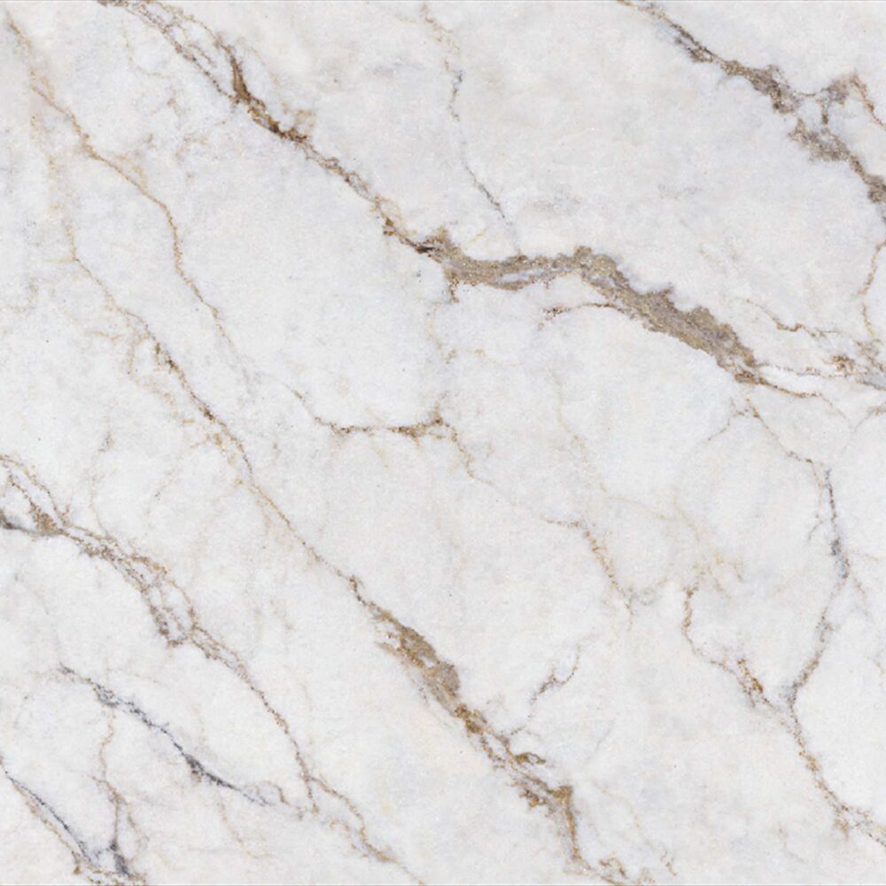
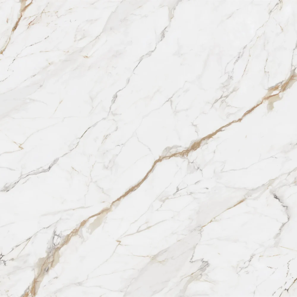
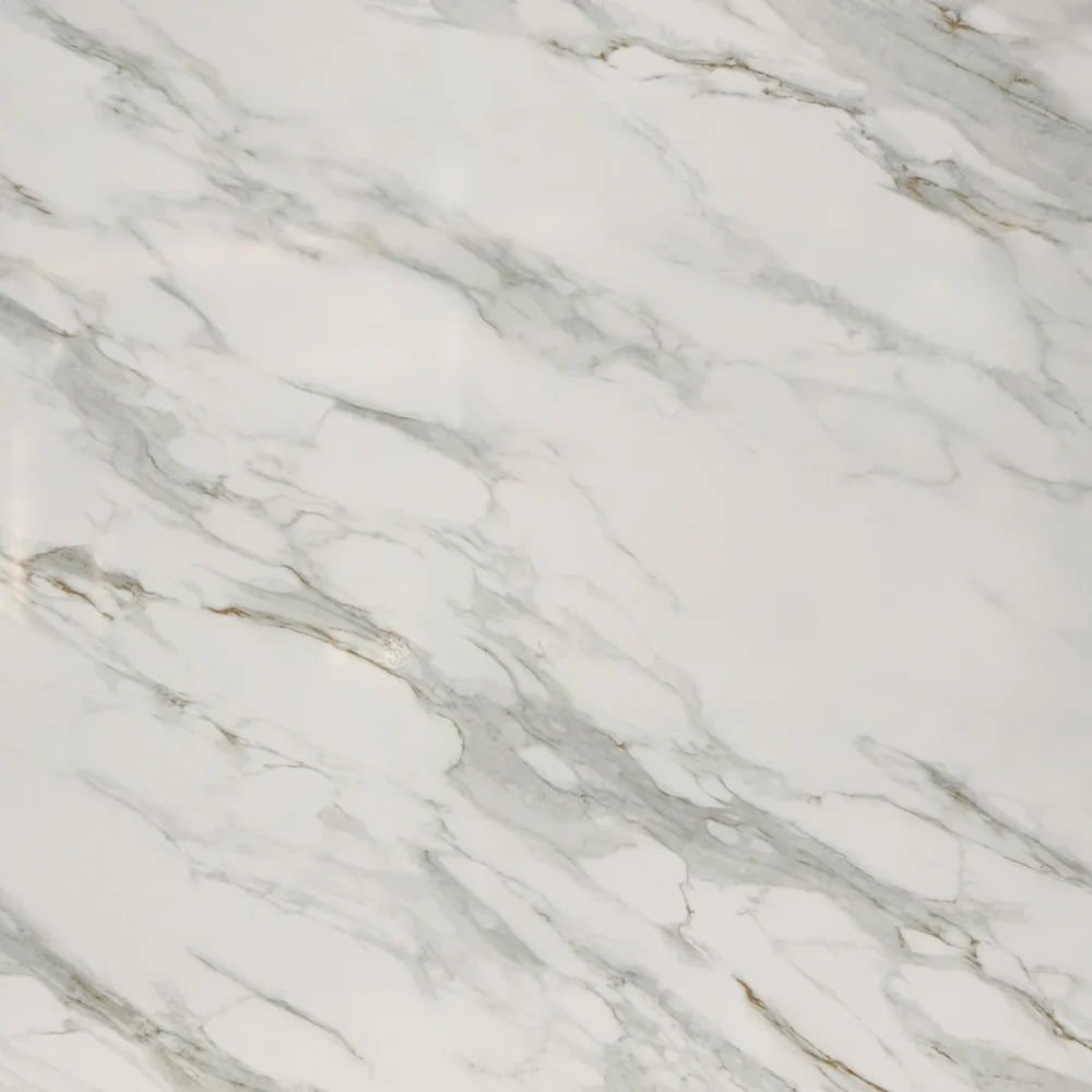
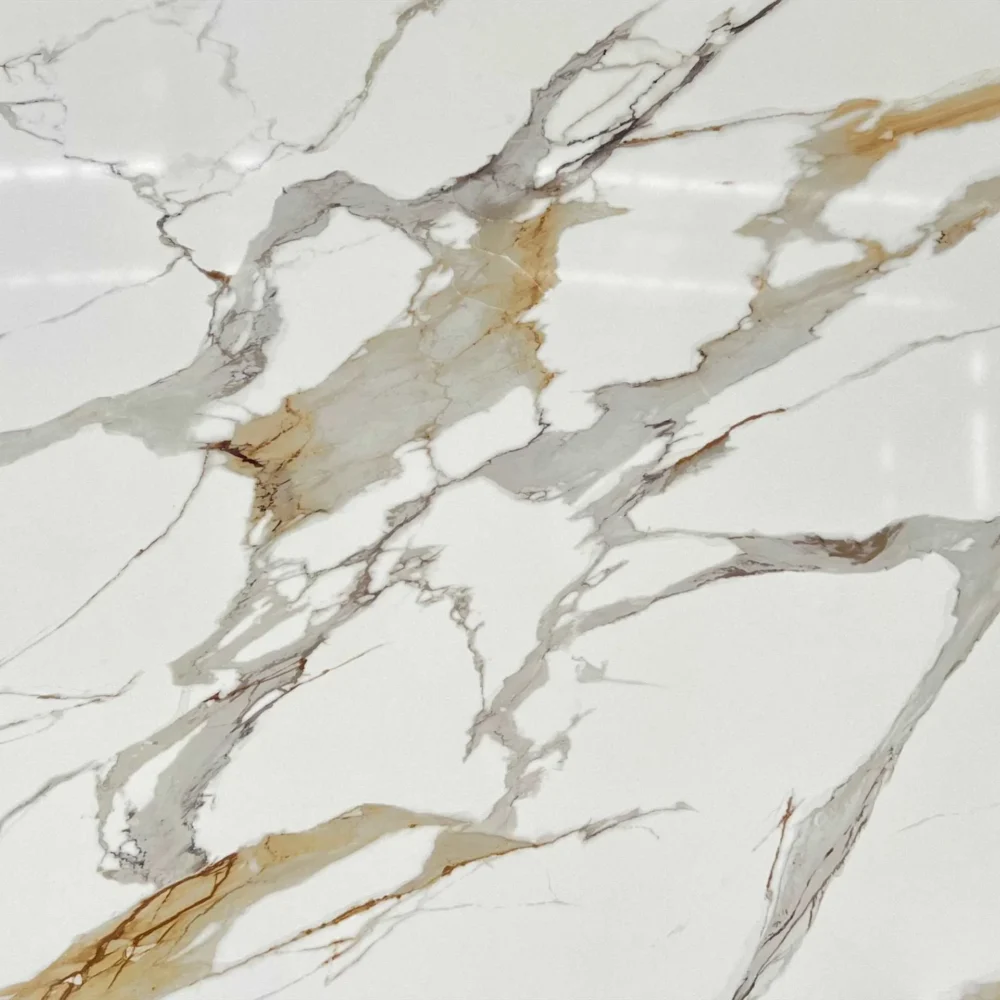
- Zero Silica Off White Quartz Slabs GQ-FG517 for wholesale
Zero Silica Off White Quartz Slabs GQ-FG517 for wholesale
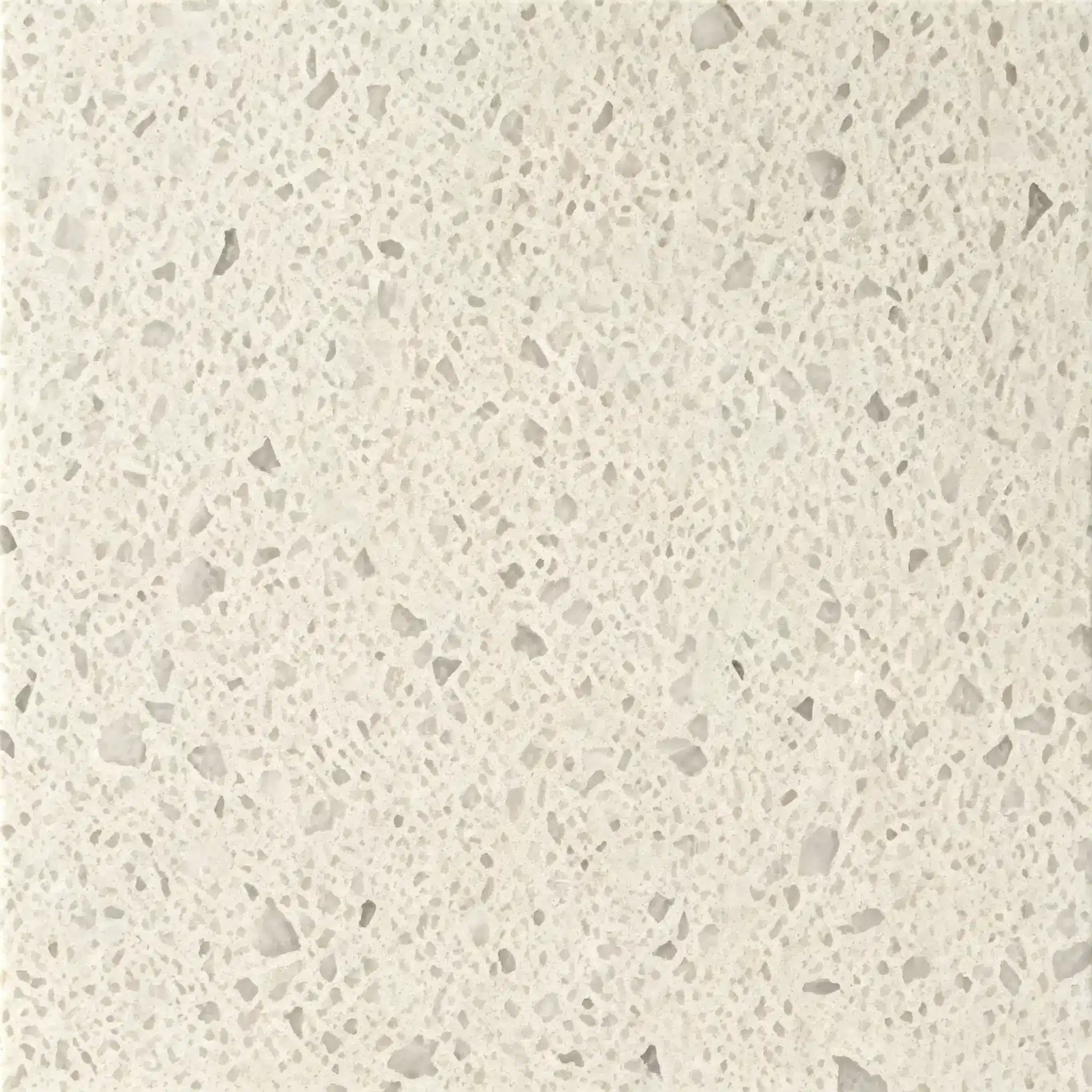
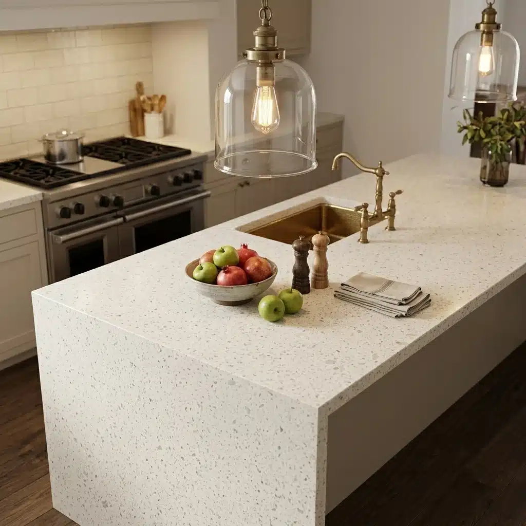
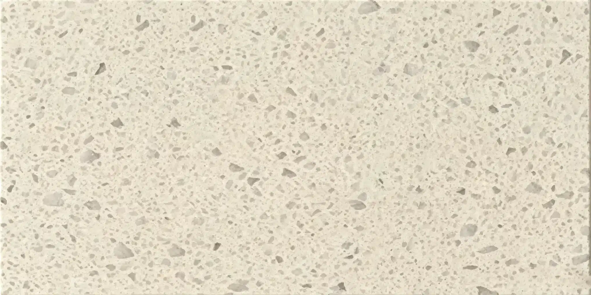
| Primary Color(s) | Creamy Off White |
| Accent Color(s) | Translucent Gray |
| Craft | Regular |
| Finishes | Polished / Honed / Suede / Leathered |
| Customized Size | 138″ × 79″ / 126″ × 63″ / Customizable |
| Thickness | 20mm/30mm/Customizable |
| Edge Style | Eased polished edge/2+2cm laminated edge/Mitred edge |
| Full Body Quartz | Yes |
| Bookmatch Available | Yes |
| Place of Origin | Thailand |
| Port of Transportation | Thailand |
| Packaging | Foam or carton inside + strong wooden crates with reinforced straps outside and fumigation |
| Delivery time | 15-20 days / Express service is negotiable. |
| MOQ | 10 ㎡ |
| Payment terms | 30%T/T after confirm the order and the 70% T/T by copy of B/L |
| Countertops Residential: Yes Commercial: Yes |
| Wall Residential: Yes Commercial: Yes |
| Flooring Residential: Yes Commercial: Yes |
Description:
Frequently asked questions
How to Choose the Right White Quartz for Kitchen Countertops?
Most fabricators will tell you: white quartz isn’t just white—it’s a spectrum of undertones, veining density, and light response.
Pure whites like GQ-FG517 read crisp under cool LED but can look flat or even bluish in north-facing kitchens with overcast light.
Off-whites with subtle cream or gray undertones—especially those with full-body printed veining—hold up better across lighting conditions and don’t clash with warm wood cabinets or painted finishes.
In real-world kitchens, polished white slabs show fingerprints and water spots more than honed or matte finishes, especially on darker veins.
Bookmatched installations amplify pattern consistency but expose variation between slabs—so always review full-slab photos before cutting.
Also, resin content affects UV stability: some whites yellow slightly near south-facing windows over time.
GQ’s low-silica, full-body printed quartz avoids pigment migration, so what you see in the sample is what you get after fabrication.
Bottom line: match the quartz’s dominant undertone—not just the name—to your cabinet finish and primary light source, not the showroom lights.
Should I choose black or white quartz countertops for my kitchen?
It comes down to light, use, and how much maintenance you’ll actually do—not just how it looks in the catalog.
White quartz reflects light and opens up tight spaces, but polished versions show every smudge, especially around sinks and stovetops.
In high-traffic commercial kitchens or homes with kids, many installers recommend a soft-honed white finish to cut down on visible wear.
Black quartz hides spills and works well with light cabinets or brass hardware, but it telegraphs scratches faster—especially on glossy finishes—and absorbs heat, which can matter near cooktops.
In real-world installs, black quartz also reveals dust and lint more than mid-tone grays.
If your kitchen gets strong afternoon sun, black can feel oppressive unless balanced with reflective backsplashes or open shelving.
GQ offers both in super jumbo slab sizes (up to 138" x 79"), which reduces seams—critical for large islands where seam visibility matters most.
So ask yourself: do you prioritize brightness and flexibility, or are you willing to clean more often for that bold contrast?
There’s no universal right answer—just what fits your actual daily rhythm.
What color backsplash goes with a white and gray quartz countertop?
White-and-gray quartz—like GQ-FG517—has built-in tonal range, so your backsplash should either anchor or lift that balance.
Solid-color tiles in warm white, dove gray, or soft beige work best when the quartz has fine, consistent veining; they keep seams clean and avoid visual competition.
If the quartz has bold, high-contrast veining, go solid—no mosaics, no busy patterns.
Matte-finish tiles hide grout haze better than glossy ones, and they reduce glare from under-cabinet lighting.
Glass tile in frosted silver or light taupe adds depth without overwhelming, but avoid anything with green or yellow undertones—they’ll clash with cool-gray quartz.
In real-world kitchens, grout choice matters as much as tile color: medium-gray grout bridges white and gray tones seamlessly; stark white grout can make joints look dirty fast.
Always test samples *on* the countertop slab—not next to it—under your actual kitchen lighting.
And if you’re using a printed quartz with directional veining, orient the backsplash layout to complement, not fight, that flow.
Simplicity usually wins here.
What color quartz countertop goes best with white cabinets?
White cabinets are neutral—but their undertone changes everything.
Cool-white cabinets (bluish or stark) pair cleanly with crisp, high-contrast quartz like GQ-FG517, especially when polished and lit by LEDs.
Warm-white cabinets (ivory, cream, or yellow-based) need quartz with matching warmth—off-whites with faint beige or taupe veining, not sterile brights.
In real-world installs, mismatched undertones create visual tension no amount of staging fixes.
Light gray quartz with soft, organic veining works across both, but avoid overly linear or metallic-looking patterns—they read cold next to painted cabinetry.
Many contractors skip pure black with white cabinets unless there’s strong natural light or intentional contrast (e.g., dark island base).
For resale value, mid-tone quartz—think warm gray or greige—holds up better than extremes.
GQ’s full-body printed technology means veining runs through the slab, so edge treatments and cutouts won’t expose filler or mismatched cores.
Always bring cabinet finish samples to the slab yard—and view them together in morning and evening light.
Your eye adapts; your buyer won’t.